The upcoming #10260 LEGO Creator Expert Downtown Diner, the latest in the LEGO Modular Buildings series has been officially announced today. Below are all the details of this very unique-looking set. Enjoy! 🙂
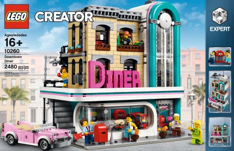
Discover a place where music is on the menu! Drop in at the #10260 LEGO Creator Expert Downtown Diner, where you’ll discover a healthy portion of fun and surprises. This impressive model features removable building sections for easy access to the detailed interior, which comprises a ground-level 1950s-style diner with a large curved front window, red bar stools, jukebox, counter and an open-plan kitchen. The mid level has a gym with boxing ring, punching bag and weight training room, while on the upper-level you’ll find a recording studio, complete with vocal booth, mixing desk and a refreshments cabinet. The facade of the building features pink-and-teal Streamline Moderne styling with a large ‘DINER’ sign. Other external features include arched windows, balconies and a staircase, plus a pink convertible car and a detailed sidewalk, complete with mailbox, parking meter, flowerpots and a streetlamp. This incredible collectible toy has been designed to provide a challenging and rewarding building experience with a touch of nostalgia and charm. Includes 6 minifigures.
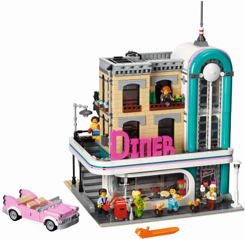
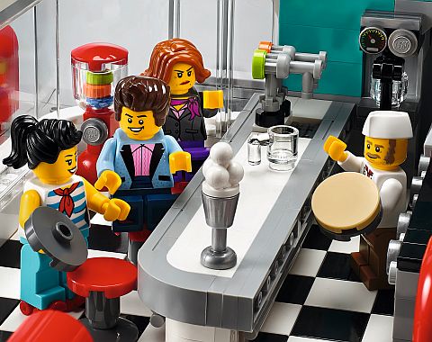
- Includes 6 minifigures: a chef, waitress, boxer, rock star, manager and a bodybuilder.
- The 3-level Downtown Diner comes with an array of brick-built details, including a detailed facade with pink-and-teal Streamline Moderne styling and a large ‘DINER’ sign, external staircase, arched windows, drainpipe, balconies, decorative roofline, opening skylight and a rooftop terrace, plus a detailed sidewalk with a mailbox, parking meter, flowerpots and an ornate streetlamp. This set also includes a pink 1950s-style convertible.
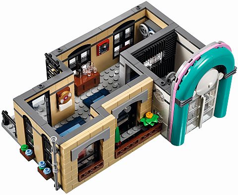
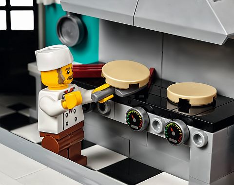
- Ground level features 1950s downtown American diner styling with a large curved front window, red barstools, benches, jukebox, candy machine, counter, 2 soda dispensers, and a kitchen with a coffee machine, stove and a cooker hood.
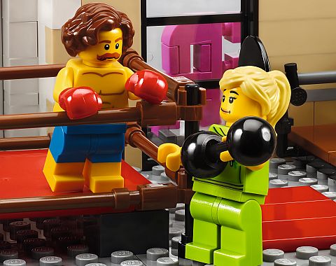
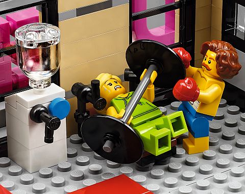
- Mid-level features a gym with a boxing ring, punching bag, weight training room, water dispenser and a wall clock.
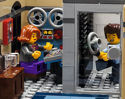
- Upper level features a recording studio complete with vocal booth, soundproofed walls, mixing desk and a refreshments cabinet.
- Take a ride in the stylish convertible and head for a diner where fast food and music are on the menu.
- Help the chef prepare the fastest food in town while the roller-skating waitress lines up the orders.
- Drop in at the gym for a couple of rounds in the boxing ring or a good workout on the punching bag.
- Open the skylight and eavesdrop on the making of a hit album.
- Accessory elements include roller skates, guitar, golden record award and a buildable barbell.
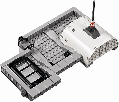
- Remove the building sections to access the detailed interior.
- New decorated elements include a decorated door, album cover, lots of teal-colored and pink-colored elements, and a dual-face minifigure with singing and smiling expressions.
- Special elements include new flower stalks and flower heads, plus 1×3 ‘jumper’ plates, 2×2 plate with 2 studs and a minifigure torso with boxing gloves.
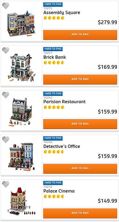
- Collect and build an entire town with the LEGO Creator Expert Modular Building series #10243 LEGO Creator Parisian Restaurant, #10246 LEGO Creator Detective’s Office, #10251 LEGO Creator Brick Bank, and #10255 LEGO Creator Assembly Square.
- Measures over 13” (34cm) high, 9” (25cm) wide and 9” (25cm) deep.
- Recommended for Ages 16+.
- 2,480 pieces.
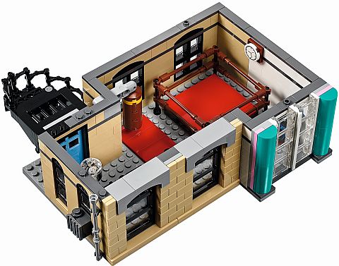
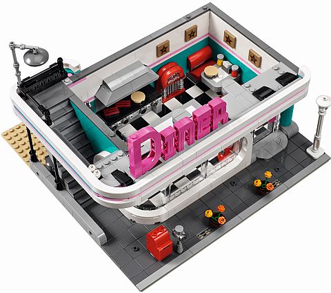
What immediately catches the eye about this set is the very unique architecture. LEGO refers to it as Streamline Moderne, but most people probably would just call it Art Deco style. In fact, according to Wikipedia, Streamline Moderne (or Art Moderne) is a late type of Art Deco architecture and design that emerged in the 1930s. Its architectural style emphasized curving forms, long horizontal lines, and sometimes nautical elements (see: Wikipedia). Buildings like this are quite common in at Miami Beach, Florida, and the LEGO Downtown Diner even has the typical Florida teal and pink color-scheme. The style has many other examples from around the world.
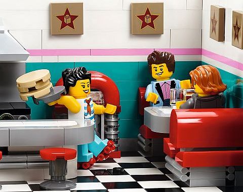
Speaking of teal, you may notice that LEGO is bringing back this long-retired color, mostly remembered from the LEGO Rock Raiders line of the late 1990s. The color is going to appear in other 2018 sets as well. I know many older LEGO fans are going to be very happy to see this.
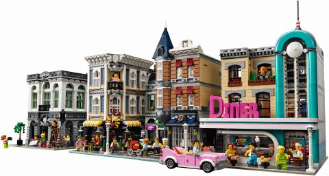
The #10260 LEGO Creator Expert Downtown Diner will be available on January 1st, with no early access to LEGO VIP members. Prices are as follows: US $169.99 – CA $219.99 – DE 149.99€ – UK £129.99 – DK 1399.00 DKK (Euro pricing varies by country). See the LEGO Creator section of the Online LEGO Shop.
What do you think? How do you like the #10260 LEGO Creator Expert Downtown Diner? Are you planning to add it to your LEGO collection? Do you have the other LEGO Modular Buildings? Feel free to share and discuss in the comment section below! 😉
And you might also like to check out the following related posts:








It’s a bold and creative design, but I’m not sure if it goes so well with the other modulars. The Palace Cinema is also different, but it blends in well. These type of art deco houses are seen at Miami Beach, but AFAIK Miami beach doesn’t have buildings like the Town Hall or the Parisian. Also, what happened with the minifigs? We no longer get classic smileys?
Yeah, it looks like the minifigs have been updated. Maybe the Diner can be placed by itself or on a separate block from the other Modulars? Many Art Deco buildings are standalone structures in real life too because of the odd shape and design. 🙄
Okay, I do think that having the official presentation helps. I think I’ve warmed up to it a fair amount, particularly with the interior details, which I’m really loving here. I’m also thinking part of what kinda put me off on the original picture what the gap between this model and the Assembly Square. Although this isn’t a corner building I think it presents itself better as either a corner building or maybe the first building on the street on the left as you face the front of the building if you get my meaning. 😉 Still getting used to some of the exterior details, but I think this has moved from ‘not sure’ to yeah, probably gonna get it when I have the means.
“what the gap” should read “was the gap”.
Rob, I agree that this set would work well as a corner building. It is kind of similar to the Parisian, where there is a wraparound porch and staircase. I actually use the Parisian as a corner building myself. We will just have to play with this odd Diner to see how it fits. 😀
I really like the interior, especially the diner, and the car. I’m not positive about the exterior, but I’m not so familiar with this building style. It seems like that the teal, pink and white section is Art Deco, and the other side is just a plain tan building. Maybe they did that to create a transition to the other Modulars? Do building mixes like this exist in real life? Overall it looks fun, and I’m glad teal is back.
I agree with this. It seems like an old building (the tan part) was wrapped in an Art Deco facade. A real Art Deco building would be the first story diner, and the tall tower section (maybe not that tall), and just take out the tan part. Or the whole building would be Art Deco. I think it might be worth modifying the tan section. Even changing the color to white, or light yellow, or some crazy Art Deco color would help. The tan is just out of place.
That might work, although turning the whole building Art Deco would make it stand out even more from the other Modulars that it already does. But that’s the point of Art Deco anyway. They are always the sore thumb in the city, or piece of art – depending on if you are fan of the style or not. 🙄
I just did a Google image search, and I can’t say I found a building with a mixed style like this. I agree that LEGO may have done it to bland the unusual colors and shapes of the Art Deco building with the rest of the Modulars. Sometimes I think it works, and at other times I think it doesn’t. I would really like to see some of the inspirations LEGO designers used for this building. Hopefully the designer-video will be released soon.
I want , I want . Mine ,mine, mine . But I’ll probably get it in summer around my birthday. I’m practicing the art of patients trying not to get new big sets as soon as they come ( on some sets. ). The smaller and medium size sets I can handle and afford ( maybe).
Yes, patience is a virtue. On the other hand, there is a really-really good freebie coming out in January that you might not want to miss, and it is only valid on larger orders. 😉
What is it?!?!
While I like the Diner, I think we are getting too many food places. We really need something like a bike shop, or antique shop, bookstore, etc. on the first floor. My minifigs are going to get even more overweight if every building on street level is a food place!
That’s a really good point. I would also like to see a post office, besides the ideas you mentioned.
Not my cup of tea, like the Persian Restraunt way better, this one Meh. However everyone is different and have different taste 😉
Laure, yes, that’s the nice thing about the Modulars; you can just get the ones you like, and make your own unique city layout. 🙂
Did you notice that the mini figures have facial expressions as suppose to the vacant smile look. That’s so cool.
Funny, I never heard anyone referring to classic smileys as vacant smiles. But you have a point. Some people like this change, others don’t. The good thing is that we can always swap the heads out! 😀
The Pretty Vacant…
I wish this was simpler. I like it but I don’t $150 like it.
Yeah, it’s pretty different, isn’t it? I know it will not appeal to everyone due to the unusual style. A lot of people don’t like Art Deco in real life either. 😀
I like these vintage modulars! (palace cinema, detective’s office and this one…) 🙂
Yes, those are some of the most unique in the bunch! 😀
t think anyone has mentioned that THIS IS THE FIRST modular to have different faces!
A couple of other people did already bring it up. It is a pretty interesting change.
This may be the first modular I don’t buy. Perhaps I will warm to it, but right now, I’m not a fan. It’s looks very out of place/style with the other modular (in my opinion), and I’m actually not a fan of the new faces for the minifigs. These updated faces will be a stark contrast to all of the other figs in my city, and I’ll not longer be able to easily discern when my kids take my figs. 🙂
Yes, the style is very different. As far as the minifigs, I know that many people who have been collecting the series aren’t happy about it. Younger fans, who don’t have any nostalgia towards the classic smiley faces are happy about the change. They were probably louder, so they got their wish. The good thing is that we can always swap the heads around and replace them with whatever we like the most. 🙂
I’m not sure. I agree with others that it doesn’t quite fit with the existing modulars. I do like the idea and the interior looks great but, I’m not crazy about the color scheme, maybe I’ll warm up to it. I’m already thinking about how to modify it with the colors I’d like. I was thinking of putting it on a corner and adding a parking lot next to it for the roller skating orders. And a parking meter? Who would park there? It would be the only meter in town. I don’t see much revenue coming out of that. 😉
Melanie, I’m actually very curious to see how people will modify this building, and/or integrate it with the other Modulars. A could see a roller skating park/parking-lot working really well with this building. 😀
A freebie ! O k now you are playing dirty Admin, ” just when I thought I was out , they pull me back in”. Now I am curious and it’s all your fault.
He-he… this is the one: https://brickset.com/article/32295/60-years-of-the-lego-brick-set-revealed
Oh, I can live with out that. I thought iit was a mini figure that can go with the Diner. It’s not so I’m good . All is forgiven Admin. You had me worried there.
That actually would have been nice. I liked when in previous years LEGO released something like the flower cart with the same time a modular launched. That was a nice little extra. They may still do something like that in February or March. So yeah, you should be good then waiting for later. 🙂
Seems like that crooner is dating his manager, but he still flirts around with waitresses…
LOL! Yeah, I noticed that too! She doesn’t seem to be very happy about it. It’s really funny, and could be the main reason they switched over to expressive minifigures faces. They can add a lot more humor like this. 😀
So, why do I get the urge to sing the theme song to Happy days. Lol!
Because… it’s a happy day? Just a wild guess? 😀
I like the set, the designers obviously put their hearts and creativity into it, but boy, I hate this architectural style! I wonder if there is a way to keep all the interior (which I really like) and modify the outside, or at least tone it down. How could this be rebuilt?
I guess if it was AL’S diner and motorcycle with a guy in a leather jacket. Maybe that’s what I’m thinking of.
What?! No standard smiley faces?! What is this blasphemy?
Plenty of cool building techniques, namely the punch bag, the curved edge of the bar on the first floor (same as used on the Brick Bank, I think), and the use of lamp holders to attach the to hols on the rim around the front on the bottom floor. Actually, I originally thought those were that 1×1 round with stick from Ninjago City, but I see now that they’re not. I noticed the 2×2 star tiles from the Palace Cinema are back. Those are the same ones, right? The rock star reminds me a lot of Dareth from Ninjago. I wonder if that’s intended, or if it’s a coincidence, or just me making things up. The car… meh. Not a fan. It looks kind of comical and ridiculous IMO.
Besides Rock Raiders – who had an extremely mismatched color scheme of teal, yellow, brown and grays (although its flagship Tunnel Transport is rather fascinating due to the extremely stupid idea of a flying behemoth used for ore transportation in a deep cave) – teal was also used rather frequently in the Technic theme Competition (along with retired Light Purple), which is remembered more for its colors than for the quality of the sets, and its subtheme Cybermaster, an early foray into electronic programming, which today is both hopelessly outdated, and also a female canine to reverse-compatibilify* into working order.
*Not a proper word according to less creative minds…
Yes, teal’s history is fascinating! I might ask Gary Istok if he would like to write an article about it. I wonder how Mark Stafford feels that he won’t be known as “The One Who Killed Teal” anymore. 😀
Ha! Looking it up on a Lego Wiki.
“Unfortunately, the set did not come with full printed instructions. If you wish to build the models from these sets, you will have to use the CD-ROM that came with the set. For every step of the build, the CD contains a short movie clip in the folder shared/build. Playing these steps after one another allows you to build the models of the set, although some details such as axle length may not be present.”
Brilliant idea to change a winning formula into tedious, lo-res CD-Rom clips… Technology for technology’s sake… Priceless!
It reminds me a bit of Edward Hopper’s painting “Nighthawks”.
Oh! Interesting! I remember seeing that painting a long time ago, but then completely forgot about it. But yeah, you are right, there is definitely a resemblance. A lot of Art Deco diners have that curved corner window.
A bit, although the crowd is a tad too emotional.
I really like the interior of the diner. The exterior is a bit over the top but I think it is a good representation of old style diner. So I won’t be putting it with other modular building. I am going to put it with my theme park. It will go nicely there.
Nice idea! 😀
Well, I haven’t got a modular yet, and this sure wouldn’t be the one I’d get if someone suddenly gave me a $170 LEGO gift card, but I would really like to see someone stick it on top of a Ninjago City style canal base, add a few trees randomly growing out here and there, and throw in some wacky signs and Japanese roofs. 😀
Personally I don’t like the move away from plain smiley faces, although I am in no way, shape, or form a fan of plain smiley faces, but I liked the distinctive feel they gave to the modular line. But, on the other hand, the face of the waffle chef is great!
I cannot see throwing the money at it, unless you are a collector and must have everything. We are building our own diner, since the minifigs wanted a more casual place to eat than the Parisian Restaurant. The second floor will have a hostel with pool table etc (from the displaced Detective Modular). The fun of Legos for us is building your own. Only time will tell if this new diner from Lego is a new departure or just a one off. I think new departure (unless it bombs) since, really, after ten years of more or less on style….But Art Deco?! Well maybe it can transition somehow.
Nancy, sounds like you are working on a great diner! I like the idea of having a hostel on the upper floor – it’s a good combo. As far as the Diner, yeah, it’s a pretty bold style. I’m also very curious to see how LEGO fans will receive it. 🙂
Art Deco is probably a better choice than brutalism, though…
(Although the gray colors and square shapes lend themselves easily to Lego adaptation…)
Oh, dear! Brutalizm… 🙁
It is said to actually be derived from the French “Béton brut” (“Raw concrete”), but many people saw the connection to the adjective “brutal” very fitting, so the term stayed…
Every one of those buildings looks like a post-apocalyptic prison… 🙁
Well, yeah, it’s sort of a common criticism…
A nerve-racking analysis…
https://ramblingbrick.com/2017/11/30/teal-we-meet-again-in-search-of-staffords-choice/
That was a very good article! Thanks for sharing. 🙂
I come from a family of musicians, and I am into weightlifting myself, so when I saw this set I had to have it. I love that lego finally released a gym!!! Already have mine preordered:)
Awesome! I can’t wait to build it myself. Just a few more sleeps. 😀