There has been some interesting developments at the LEGO Ideas platform, including a brand new look and new features for the website. The LEGO Ideas team has been working hard in the past couple of years to make the LEGO Ideas platform not just a place to share ideas for future LEGO sets, but also the crowd-sourcing and co-creation hub for teen and adult LEGO fans. You can find below a list of all the updates and changes. 🙂
One of the most obvious changes is the look of the LEGO Ideas website, with a completely redesigned homepage and navigation and improved mobile experience.
Another major change is that the LEGO Ideas sister site, LEGO Rebrick, will close in September, and all future contests for teen and adult LEGO fans will be hosted on the LEGO Ideas platform moving forward. The LEGO Ideas team believes that by combining product ideas and contests under one platform and brand, they can offer LEGO fans more and better opportunities to share their ideas and connect with the LEGO Group.
There is now a news feed that shows you top items according to a score by default. You can also toggle the feed to show the most recent items first by selecting New in the Sort By box underneath the left menu on any news feed page. The redesigned navigation menus also make contests more visible.
LEGO Ideas projects are now called product ideas. The Product Idea Guidelines and Terms of Service have been updated. Most notably, now all product ideas must be submitted on your own behalf and not on behalf of an employer or client. Another addition is that if your product idea achieves 10,000 votes and goes under review, but is not approved, you will receive a consolation prize including up to three LEGO products totaling $500 USD in combined value (subject to availability).
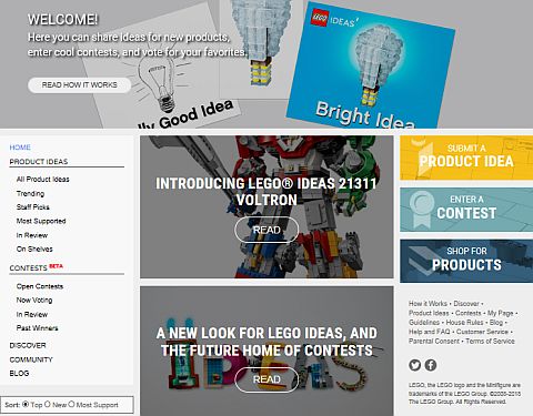
Below the Product Ideas header and Contests header in the left-hand navigation bar, there is also the Discover header, which lets you search product ideas, contests, contest entries, and blog posts. I actually like this navigation method the best, as the others don’t give such a good overview.
As mentioned above, LEGO Ideas contests will replace LEGO Rebrick contests at the end of summer. This means that LEGO Rebrick will run contests over the summer, and transition to LEGO Ideas on September 1st. If you entered any LEGO Rebrick contests, you’ll want to save your data before the site goes offline. The LEGO Ideas team will send a couple reminders as September 1st approaches.
Another change is the removal of Clutch Power Points. Until now, LEGO Ideas members could earn Clutch Power Points for doing certain things on the site like earning followers or receiving likes for comments. While this was a way to rank active members, the cumulative nature meant newer members couldn’t easily break into the rankings. The LEGO Ideas team prefers all members to be on equal footing, with the focus being on great submissions. LEGO Ideas badges, however, will remain.
Due to new data protection laws, if you’re between 13-15 years old you will need to submit your parent or guardian’s consent to allow you to continue using LEGO Ideas. If you have active product ideas or contest entries, these are de-activated until you submit your parents’ consent. You can read more on this at the Help and FAQ section.
While these are all the changes for now, there will be more updates coming during the rest of they year. There are plans to improve the look and feel of the contests section, along with other design enhancements across the site. You can read more about all the changes at this LEGO Ideas blog post. I also recommend reading the comments, as some of the new features don’t seem to work that well and members are giving insightful feedback.
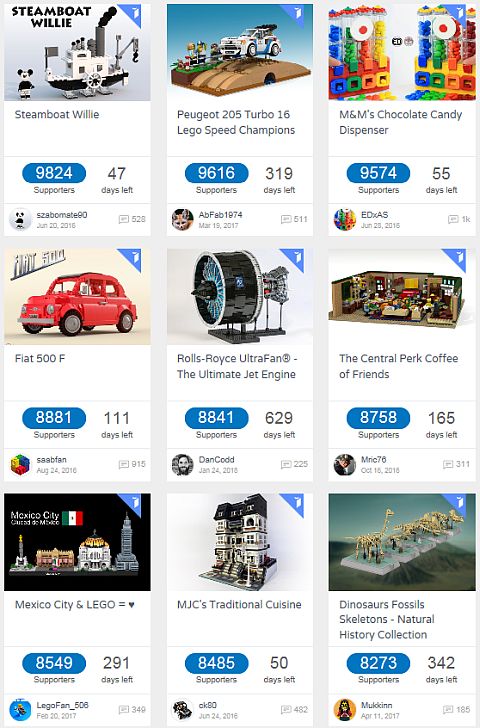
Honestly, I’m not a big fan of the new homepage which now looks more like a blog than an official LEGO website, although it does look better on mobile, as the projects are below each other rather than on a grid. On a larger screen, I found the Discover tab to be the most useful, as it lists projects in the way the old website used to. However, I do like that the LEGO Ideas and LEGO Rebrick platforms are merged together. They were both catering to teen and adult LEGO fans, so the consolidation and streamlining makes sense.
Also, since we are talking about LEGO Ideas, I thought to also include the last LEGO Ideas Review Results. We have briefly discussed this before, and most of you already know that the LEGO Ideas Pop-Up Book is going to be the next LEGO Ideas set. I’m really looking forward to it!
It will take a bit to get used to the updated LEGO Ideas platform, but that’s a good incentive to visit the site, find some projects that you like, and support them with your vote. And, you can also take a look at previously approved projects at the LEGO Ideas section of the Online LEGO Shop.

What do you think? How do you like the changes at the LEGO Ideas platform? Did you run into any issues navigating the site? Feel free to share your thoughts and discuss in the comment section below! 😉
And you might also like to check out the following related posts:









The homepage is useless, but thankfully, the discover tab still lets you search the old way. I think they should add another big navigation button in the right sidebar that links directly to the discover page.
You know, I’ve been meaning to create a product idea for some time. Kept getting distracted with other projects.
I like the sound of the new changes perhaps I’ll consider entering something!
As long as I can still navigate the site and vote, I don’t mind the changes. I like that they made the site mobile friendly, so that’s good.
The new site is okay. Lots of empty space, and the pictures are unnecessarily big, but I can live with that. I’m looking forward to seeing what contests are they going to run, and how the contest section of the website will look.
I’m just looking forward to the Popup Book! As long as they continue with Ideas and run contests, I can get used to the changes. If they don’t work, they will change them anyway.
Lego really needs a better website design team. I don’t say this to be mean, but their shopping site is bad too, and full of glitches.
Could you specify? Constructive criticism should be welcome.
Sorry, I didn’t see your comment until just now. Different parts of their website don’t load properly on modern browsers. Pictures are out of alignment, videos won’t play, clickable buttons don’t click are just some of the issues I ran into. And the shopping site is often full of glitches, so much so that you can’t check out. And navigation is not nearly as easy as it used to be. For example, if you try to sort results by newest first, or most expensive first, the page won’t load. Or you want to see all the items in a category, the page won’t load, or just reloads the old results. These issues were reported by many people, so it’s not just me.