(Written by William)
The #90922 LEGO Batman Movie The Joker Manor was first released towards the end of 2017. Despite of the somewhat lackluster reception from adult LEGO fans, I was still looking forward to building it. Thus, my wife and I treated ourselves to the set as an anniversary gift (it is now retired, but you can still get it on Amazon). Overall, my impression is that the set is quite nice with its substantial size, attractive design, and pleasing colors. In fact, I’m glad LEGO chose to create a Joker Manor from The LEGO Batman Movie. This way, it is more enjoyable and accessible to the general public. 🙂
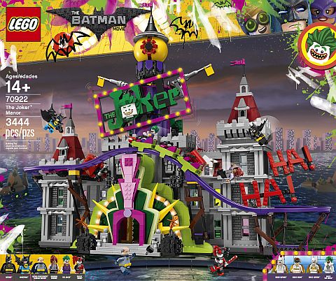
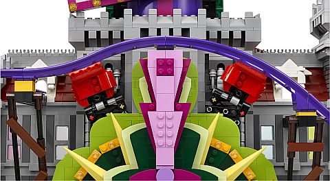
However, there are also some issues with The Joker Manor. For example, the back of the set gives us a dollhouse-like layout with a number of different rooms to interact with. Unfortunately, this is hampered by having the coaster tracks in the way. Next, we have the trap door that empties out into the giant Joker mouth. The mechanism works fine, but unlike with trap doors in other sets, there really is no reason for a minifigure to go up and stand where the trap door is. There is no treasure or anything else of importance in this area. In fact, the floor that has “Secret Plans” marked on a box is where the trap door drops the minifigure to. Does this mean that the whole trap is designed backwards? Then, there are the boxing gloves. This is a pretty cool visual effect, and I didn’t have too much trouble turning the knob that activates them. However, the gloves don’t actually interact with anything, so there is no real reason for them to be there. The coaster itself works well, however since I already built the large #10261 LEGO Creator Roller Coaster, and the #31084 LEGO Creator Pirate Roller Coaster before this one, I wasn’t that impressed with how it functioned. Still this was the first set that introduced the new roller coaster system, so from that perspective it’s historically significant.
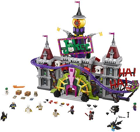
One feature I did not mention yet is the giant eye at the top of The Joker Manor. It’s striking to look at, easy to play with, and makes a great top piece to the whole model. In summary, I would say that wherever this set tries to do something to set itself apart, it comes with room for improvement. Still, I didn’t feel cheated by the price. It’s just that when the price tag hits this level, my expectations rise with it. But let’s look at some of the interesting building techniques found in this set, which is what I like to focus on in this Brick Breakdown series.
➡ SCISSORING EXTENSION IN THE LEGO JOKER MANOR
Those familiar with older cartoons might recognize the extending boxing glove mechanism. It’s something that looks physically interesting while completely ridiculous all at once. Personally, I was a bit surprised to realize I’ve never seen this feature used in a LEGO set. Much less see it in all its cartoony glory. Yet, here it is.
The device itself is a fairly straightforward concept. You take two beams and attach them in their centers to form a flexible “X” shape. Then, you put the same size “X” frame you just made in a series of “X” shapes. Each will connect at the tips. What you end up with is a scissor feature that will either contract when fully open or extend when closed. It’s rather an efficient way to conserve space while also getting a good deal of expansion when activated.
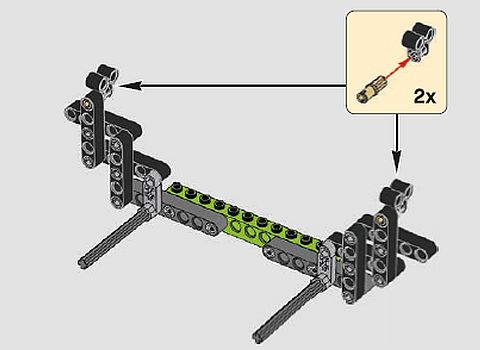
The real challenge with this mechanism is working out what to connect on the far ends. For example, the boxing glove used here needs to be steady to work. Therefore, LEGO designers had to create an expanding joint to absorb some of the excess movement caused by the scissoring. It is possible that if the designers used two beams that were about half the length of the beams being used in the scissoring, the action would result in a straight punch. However, the boxing glove is working against a tilt.
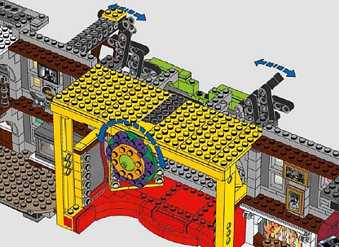
That brings us to the other end of the scissor frame. There are a couple of options for the point of activation. The first is having only one beam trigger the action, which is what’s used in this set. The result is that the extension will produce a natural tilt in the direction of the beam that is not moving. It is essentially giving no resistance so it will naturally move in that direction. If you have limiters added to the beam that is not being moved then you can compensate for some of the tilt. However, too much limitation may make it hard for the mechanism to work properly.
The other option is to have both beams extend at the same time. This will give you the ability to force the scissoring to move in a straight line. This option is not seen in this set but can be accomplished by using two small gears. The issue is that each beam needs to rotate in opposite directions. If you use two gears side-by-side then no matter which one you rotate, the other will move in the opposite direction.
➡ MISMATCHING AESTHETICS IN THE LEGO JOKER MANOR
Sometimes you may want to build something that represents a badguy. But this can be difficult when using something as bright and cheerful as LEGO. Fortunately, there are many ways to accomplish this through the aesthetics of a model. A common approach is to use a dark color palette. People associate dark colors with dark feelings and moods. Another option is to incorporate asymmetry in the model. Perhaps one tower is taller than another or maybe the windows don’t match up. This style of unbalance tends to mean ugly in people’s minds. And, unfortunately, ugly is often associated with evil or bad.
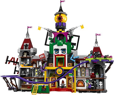
The Joker Manor uses one of the more subtle methods of representing a baddy. Have you ever seen a scary show or saw something that unnerved you because it had something that didn’t belong? Perhaps it was something bright and colorful in an otherwise drab setting that made you a bit wary. This reaction is caused by our sense of pattern recognition. Humans have a good sense of what belongs just by glancing at something, which is probably a leftover survival instinct. Video-games often use mismatching aesthetics when they want to scare you. In building with LEGO, we can use this technique to an equal effect.

Take someone who doesn’t know anything about the Batman lore, and they will probably say that The Joker Manor is where the badguy lives. The serious straight lines of Wayne Manor are in direct conflict with the bright Joker façade. This mismatch in aesthetics tells people at a glance that something is not quite right at this place. Throw in the asymmetry of the track and tilted sign and they can’t help calling this place evil.
➡ APPLYING WHAT YOU LEARN
As mentioned above, the scissoring expansion is not something commonly seen in LEGO sets. The reason being that it does tend to take a larger footprint given the pieces we need to use to make it work. However, it is still a very interesting way to move things around. As it is, it’s a fairly untapped technique that could lead to some really fascinating builds.
When it comes to a mismatched aesthetics, you’re definitely leaving the realm of pure building technique and entering the world of LEGO as art. When you get to this level of building, you are trying to express an idea as much as you are just building something cool. Studying the subtle nature of human reaction to certain things goes into thinking about how to get inside their heads. The downside is there is no right way to use this technique as many times it is all subjective. However, if you can make anyone feel something when looking at your creation, then you are on the right track.
What do you think? How do you like the #90922 LEGO Batman Movie The Joker Manor? Do you have it already? And what do you think of the building techniques discussed here? Are there any interesting techniques you found in the set that you really liked? Feel free to share and discuss in the comment section below! 😉
And you might also like to check out the following related posts:


I like the set. It was just too expensive when it was available, and I don’t remember ever seeing it on sale. The scissoring action is something they should use more often. But as Will said, it takes up a lot of space.
The pop-up book has a little bit of scissoring action with the beanstalk. It’s not truly a scissor, but close. I agree that it’s a great play feature they could include more often.
The set would have been more successful if Wayne Manor was complete, and the Joker parts could have been removed. For kids, this set is too expensive, and for adults, it was too bright. The new tracks were exciting, but we all knew lego was going to release them in other, cheaper sets.
That’s probably true. The Joker colors are great, but if I could restore Wayne Manor any time I liked, I would have been more interested in this set.
Hm… that’s a good observation about Wayne Manor.
So, what would happen if you remove the jokercoaster sections? The manor would look bare in places, or what?
Yes, for example, the whole entrance section is fully integrated with Joker’s re-décor. You can’t just take it off to reveal Wayne Manor behind. It would have to be completely rebuilt.