(Written by Geneva – gid617)
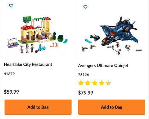
If you read my previous articles you know that I have been working on a series of LEGO amusement park projects by combining sets from different themes (see links at the end of this post). So far, we discussed combining a LEGO Friends set with one from LEGO Ninjago, and a LEGO Creator set with a LEGO City Space Exploration set. And now it’s time to give hungry thrill-seekers a place for lunch! What’s a better place to eat than the #41379 LEGO Friends Heartlake City Restaurant? And since this is supposed to be a mash-up, why not land the #76126 LEGO Marvel Avengers Ultimate Quinjet in the middle of the restaurant? I’m going to guess that this was not the pair of sets you expected next in this series.
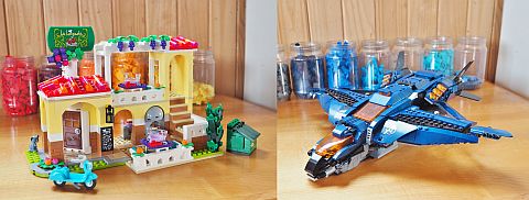
So what happens when the Avengers crash into Heartlake City? You get an eating house like no other, where you can have dinner under the wings of the Quinjet, or feel like you’re flying on the grape vine balcony! (Please note that the minifigures in this mash-up are from the #60234 LEGO City People Pack – Fun Fair.)
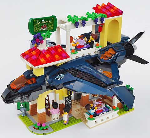
As with my other mashups, I tried to stick with just pieces from the Heartlake City Restaurant and the Ultimate Quinjet. But I ended up having to use four white pieces (two 2×1 bricks, one 1×1 brick, and one 2×2 corner plate, if you’re very curious). This was mostly because I needed to make the left front of the restaurant narrower in order to accommodate the front of the Quinjet, which is only 6 studs wide.
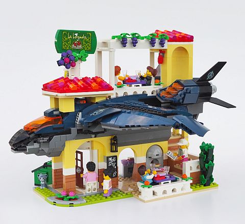
From this lower angle you can see that the Quinjet is very securely built into the restaurant walls. I would have liked to angle the plane, but neither set had a whole lot of clips or other types of joints, and besides, this is much sturdier.
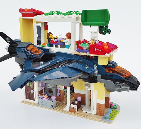
Around back, the connection between the Quinjet and restaurant wasn’t quite as smooth. Like most LEGO buildings, the restaurant has an open back for easy play access. I could have cut the Quinjet in half to accommodate, but fitting the whole plane into the restaurant was more satisfying.
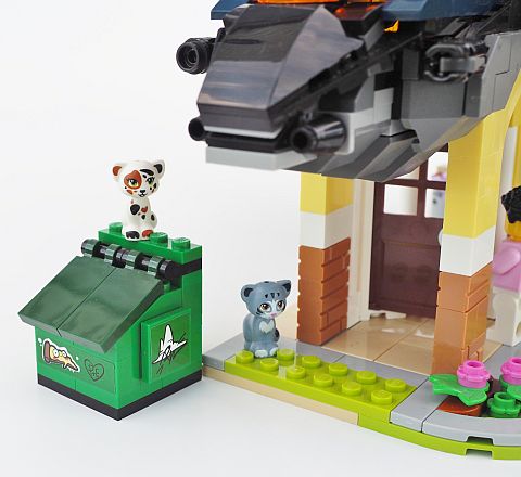
Both these sets were impressive pieces to begin with, so my goal was to change as little as possible. The red Spanish-style roofs were one of my favorite things about the restaurant, along with the cleverly designed grape vines. Another neat part of the set is the green garbage bin out back. A couple of graffiti stickers give it some nice detail.
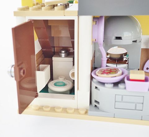
I also have to point out the compact bathroom under the stairs. Definitely an important room for a restaurant but I think they expect you to wash your hands while you’re still on the toilet!
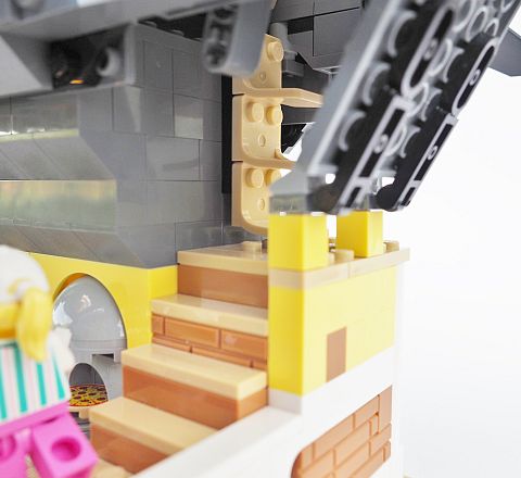
Speaking of the stairs, adding the Quinjet made this mash-up much taller than the restaurant was by itself, so I made do with the Quinjet’s seats sideways for a ladder. No waiters need apply unless they have serious climbing talents.
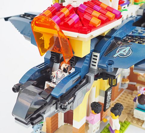
Although I used the seats for stairs, I was able to leave the Quinjet’s cockpit fairly functional.
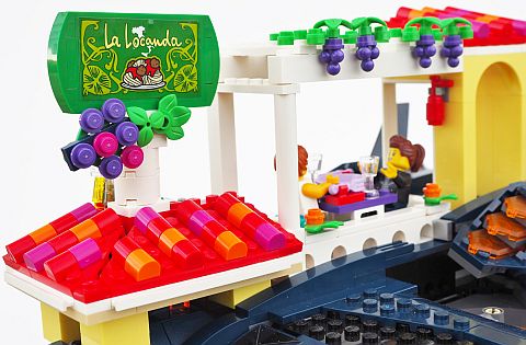
The end product of this mash-up is definitely a little unusual. I like the wild difference in style between the Quinjet and the restaurant, but it’s almost too much. The balcony and arch over the stairs are disproportionately high, since if they were going to be included in the mash-up at all, they had to stick pretty far out of the jet. So there were a few interesting trade-offs in building this; I could have gone for a more normal sized restaurant, with maybe just one Quinjet wing, no balcony, and no stairs – but instead I decided to keep both sets almost intact.
What do you think? How do you like this mash-up? Would you have gone for a smaller restaurant with less of the Quinjet sticking out? Or would you have tried something even more wild, like setting up tables on the wings? What are the strangest two sets you’ve ever paired together? Feel free to share and discuss in the comment section below!
And you might also like to check out the following related posts:









Best combo so far. Please submit to Lego Ideas.
😀 Since they’re both already LEGO sets, I don’t think that would be legitimate, but I’m glad you enjoyed it so much!
It looks like the jet is flying through the restaurant! It’s really trippy. I like it!
Exactly the look I was going for, glad it worked for you!
I can see this restaurant flying away! Very cool combo. Kind of unexpected. I would put a few chairs and tables on the wings.
I like this idea. And there could be a special dining experience in the cockpit. Geneva didn’t mix the colors of the two builds, but that’s another thing that could be done to blend the two completely different builds together.
My mom suggested that about the colors too, I thought it might be visually confusing. But I could see building a restaurant that used just the Quinjet colors – that could really look good!
I thought chairs and tables on the wings might have been a little too wild. 😛 But it would be fun. Expanding the cockpit is a cool idea too. In fact, you could turn the original inside of the Quinjet into a second story, since it had lots of cargo space and room for the Avengers to sit and control the plane.
Thanks! 🙂 Chairs and tables on the wings would be quite wild, but someone should try it out!
Lego should make a theme like this with all kinds of crazy mashups. It reminds me of that “rebuild the world”, or whatever it was called ad they recently released.
Yes, that would be fun! They kind of did a little of that with The LEGO Movie 1, with those transforming trash trucks and stuff!
Ah yeah, that was a pretty cool concept…
Why does this remind me of 9/11? The technique could actually be used for something like that. A battle scene with aircrafts crashing into things. I like the contrast between the cheeriness of the pizza place and the dark colors of the jet.
That would make for a darker themed build for sure, but could look amazing if well executed!
I’m not familiar with that Italian restaurant set. Is that a friends set? It looks really nice with the grapes and those red roofs. Are the walls regular yellow or light yellow?
Yeah, it’s a Friends set. Looks like Light Yellow to me. If I recall correctly, my niece received this set as a birthday gift a couple of months ago.
It might have been the smaller 41311 Heartlake Pizzeria, though…
https://brickset.com/sets/41311-1/Heartlake-Pizzeria
Yes, one of the best Friends sets this year IMHO! https://www.lego.com/en-us/product/heartlake-city-restaurant-41379
The walls are light yellow, so a great way to start your collection in that color!
Haha. This is something my kids would build! 😀
😀 Good to tap into that kind of creativity every now and then!
I would not have expected or thought about mixing these two sets. They don’t blend in as well as the other ones. But I guess that’s the idea? Creating a shocking effect?
Yes, I have to admit, looking at the final product light yellow walls, red roofs, and nougat brick foundation are not the colors I would have picked for a Quinjet restaurant. Plus, the traditional Italian style of the restaurant is poles apart from the very modern jet. But, like you say, that’s part of the eye-catching shock value for the mash-up!
My feelings on the result are a little mixed: artistically it just doesn’t work, but there’s something about the utter wildness of the combination that makes it fun as a LEGO creation!
Now that’s Pure Imagination at its best. No rules just creativity from an idea or a concept. Very cool. I was thinking of combining the bat cave and the teenage mutant ninja turtle lair . ( not the movie version). To make it bit more complete. Also have the best of both worlds in one.
Oh yeah, I guess the overall sensibilities could go together, despite Batman’s seriousness, and the Turtles’ teenage tubularities…
Thanks! 🙂 That sounds like a neat combo, both underground hideouts. Could make for a good sized base!