I mentioned last year that I participated in the pre-launch demonstration of a very interesting new website called ToySphere, developed by Sphere Research Ltd, a web development company based in the UK. Their attempt is to revolutionize the way we browse the internet, search for information, and shop for products. As the founders also happen to be passionate LEGO fans, one of their first test sites is related to LEGO. If you are interested to learn more, you can follow the links at the end of this post.
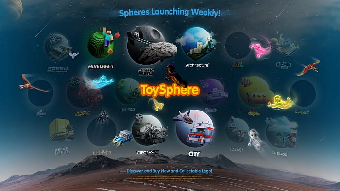
After the launch of the ToySphere website, the LEGO Group also became interested in this new way of presenting information, and they collaborated with the creators of the site to integrate the experience into the Ninjago section of the official LEGO website.
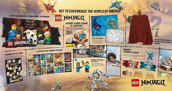
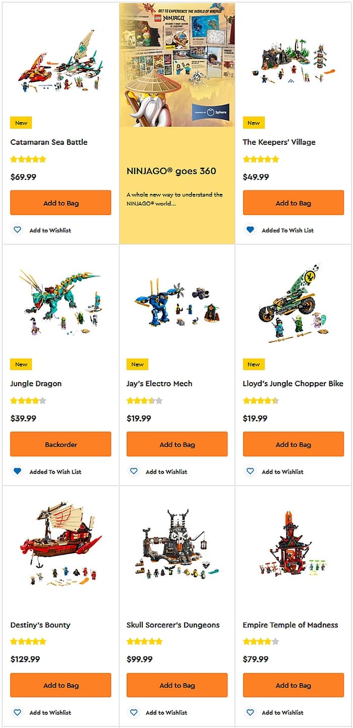
The new LEGO Ninjago website experience is advertised on several places on the LEGO website, with the title, “LEGO Ninjago Goes 360”, and the following description: “One thing we’ve learned from our 10 years, is kids LOVE the Ninjago world. But it’s hard for parents to know where to begin! So, we made an immersive experience to help parents like you share the passion of your ninja-loving kids.”

Once you click on the link, you are taken to the LEGO Ninjago ToySphere experience. If you previously used the ToySphere website, you are already familiar with the fully immersive 360-degree visual layout that you can scroll through with your finger or pointing device. When you want to explore some of the sections presented on the main page, you can zoom in and/or click on headers for further information.
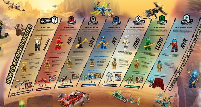
Basically everything is there from the original Ninjago page, including information about the world of Ninjago, characters, sets, videos, etc., but instead of presenting them in a static fashion accessible by scrolling down, the new page mimics looking around in a 3D environment, and then pulling up information that you’re interested in. Please note that headers and titles are not the only things you can click on. You can also click on minifigs, vehicles, posters, maps, and pretty much everything else that you see. It’s a pretty cool experience, and I recommend that you check it out.
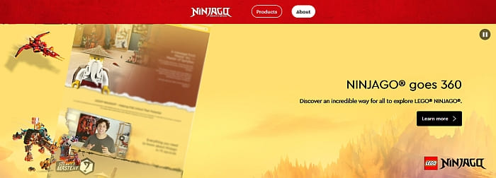
The new version of the LEGO Ninjago site seem to work well on all the devices I tested, but if for some reason you run into any trouble, the traditional version of the site is still available. My guess is that LEGO is going to do some testing to see which version of the page performs better and if users run into any issues with the new page.
What do you think? How do you like the new LEGO Ninjago 360 page? Or do you prefer the traditional version? Feel free to share in the comment section below! Also, if you run into any problems or glitches with the new page, feel free to share that as well. I can pass on the information to the ToySphere team. They really appreciate any feedback.
And you might also like to check out the following related posts:







It takes a little bit to get used to it, but I like the idea.
It’s looking good! One issue I ran into is that sometimes when I zoom in, I can’t zoom back out, and I have to completely refresh the page.
Maybe I’m just too old for this type of fancy technology, but the zooming in makes me feel dizzy. I’m more used to static sites with standard scrolling. But I understand that technology keeps moving forward with more immersive experiences.
Cool! I like it! They should make all the other pages like this! And on the Ninjago page they should include all the episodes!!
I suppose this type of site looks the best on a big screen. On a phone or handheld device, it’s chaotic to constantly have to zoom and pinch in and out. Frankly, I would be happy if the Lego site wouldn’t constantly glitch on me and throw error messages.
It’s a little gimmicky for my taste, but it works well, so no real complaints. What they do need to change is the kids section of the site. It’s a horrible mess.