(Written by William)
We recently discussed a couple of the LEGO Marvel Super Heroes bust/helmet sets (see links at the end of this post), and today, we will look at a similarly designed set from the LEGO DC Super Heroes collection; the #76183 LEGO Batman Cowl. The brick-built bust/helmet sets started with Star Wars characters, followed by Marvel Super Heroes, and we finally get the first such set in the DC Super Heroes line. So, let’s take a look at how the #76183 LEGO Batman Cowl lives up to its predecessors.
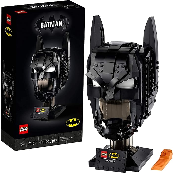
I imagine that when LEGO was preparing to release a bust/helmet set from the DC Super Heroes universe, they wanted to start with a safe yet exciting character. As far as the safe part, they needed to stick with a helmeted/masked figure, as normal human faces built from LEGO bricks often look creepy (especially on a smaller scale). Trouble is, many of DC’s biggest heroes don’t wear helmets. Even the masks they wear tend to just cover the eyes. Thus, the choice fell on Batman, who turns out to be one of the most covered-up DC superhero. And as far as the exiting part, given how many comics and movies Batman has been featured in and for how long, it’s safe to say that fans will be excited about the character no matter what version they grew up reading or watching.

The #76183 LEGO Batman Cowl sculpt perfectly captures the dramatic angles of the ears and nose, while also framing the eyes perfectly. LEGO designers even used transparent black elements to form the stand and mouth sections to give the model that sophisticated dark knight feel. But I also feel that this might have been a misstep.
In general, transparent pieces are cool to look at. The issue with them is that, well, you can see through them. But if dark pieces are placed behind them, the coolness of the transparent parts is pretty much nullified. I would still say that in person, the #76183 LEGO Batman Cowl looks fantastic, but when sharing pictures, the effect is not as great.
The mouth portion is not the only feature that makes this model hard to photograph. The fact that nearly every surface is solid black makes it a tricky thing to even light properly. In person, you can move the model around and see it in all kinds of lighting, which makes the details really pop. I wish LEGO designers either used a different color to contrast all the black (like maybe an opalescent-blue like Mysterio’s helmet) or if they went with the 1960’s blue Batman cowl. The bottom line is that this set is beautifully sculpted, but it’s hard to share via pictures, which can get a little frustrating.
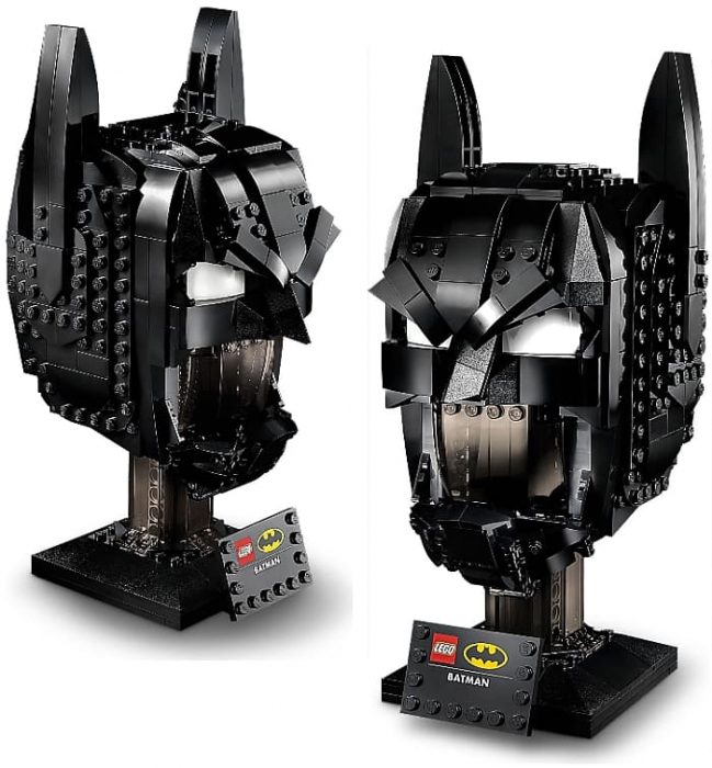
Although I like the set in person, I also wanted to point out that it’s not perfectly constructed. I had an ongoing fight with the base of the stand. In the middle, there is a pillar with a square stand. This is decorated with slopes that form a secondary outer frame. Locking these two elements is the square base of the pillar as well as triangular tiles on top. While building the set, the outer frame kept catching and separating from the pillar. Each time it did, the triangular tiles went flying. I got tired of tracking them down so I left the bottom assembly as a lose fitting ring until the end. It may not sound like a big deal, but when it’s one of the first things you build, it can get annoying throughout the entire building experience.
I must admit that I’m a bigger fan of Marvel than DC. However, I do like both brands as well as other publishers like Dark Horse Comics and Image Comics. It’s just when people talk about superheroes, Marvel and DC often take center stage. I like each for different reasons, and what is odd to me is that I see these differences in how the LEGO busts are made for the two brands.
With Marvel, I’m all about the character. Their twisted storylines and struggles really suck me in. They feel very personable to me. Likewise, the related LEGO busts try to capture the character as best they can. Venom and Carnage are truly present in their LEGO model, and even though the LEGO Iron Man helmet is fully covered, I have no problem imagining him in that helmet being both standoffish and superior.
With Batman’s Cowl, you don’t see Bruce Wayne at all. Where his face would be is just an empty stand. But what is there is what I often associate with DC heroes; a symbol. DC’s lineup tends to have characters that stand for something. They embody an ideal. The closest Marvel has is perhaps Captain America’s shield. Batman’s Cowl is a symbol of dark justice. A character born out of fear to turn it on those who would do harm to Gotham. The who is not as important as the what he stands for. That’s why this mask represents Batman.
Keep in mind, this is just my interpretation of the art. And it is important to stress, these are meant to be art pieces. So, impressions will vary based on the person viewing the piece. But I do feel there is an underlying difference for the intent of these sets between the two major comic brands.
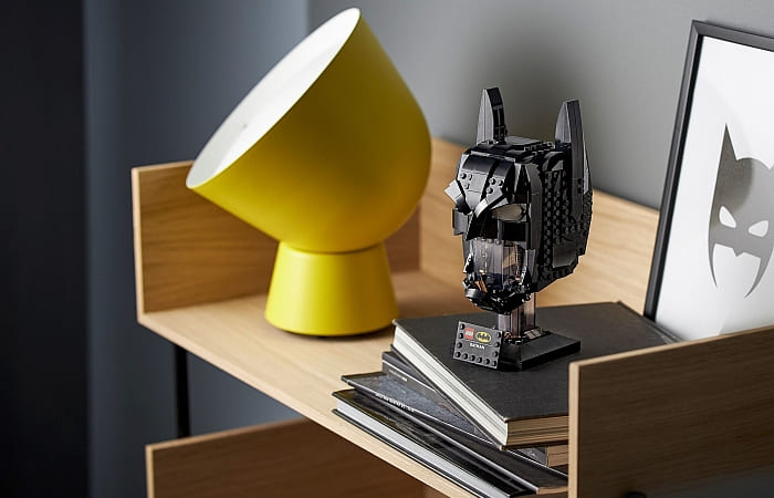
Overall, the #76183 LEGO Batman Cowl features excellent sculpting, and it’s a faithful representation of Batman’s cowl. I generally like the set and would recommend it if you plan to have it close to hand. As for a display piece that might go up on a shelf, as I mentioned, there might be some issues. The transparent portions of the model are hard to appreciate the more distance involved (this can be actual distance like far away up on a display shelf or metaphoric distance as in, not in person). This model really shines when up close and personal, which is very different compared to other statues built from LEGO bricks (usually distance smoothes out rough edges and make LEGO sculptures look better from far away).
Another issue that doesn’t help if you put the model on a high shelf is that it has almost too much black. Up close the details are easier to pick out. Far away, all the black just blends together. This can be neat if you just want a shadowy head with the outline of Batman. After all, that does really fit his character. You can even get a more ominous impression if you put lights behind it. So, it’s not like there aren’t display options that would make the model pop. They just might involve more work than you would really want to do. In the video below, I will share some additional thoughts about the set.
I have seen a lot of split opinions about this set from LEGO fans, and I tend to agree with them. Its good points are very good and its flaws are noticeable. What will tip the scales for many is just how much they like Batman as a character. If you want to check it out, it’s available at the LEGO DC Super Heroes section of the Online LEGO Shop.
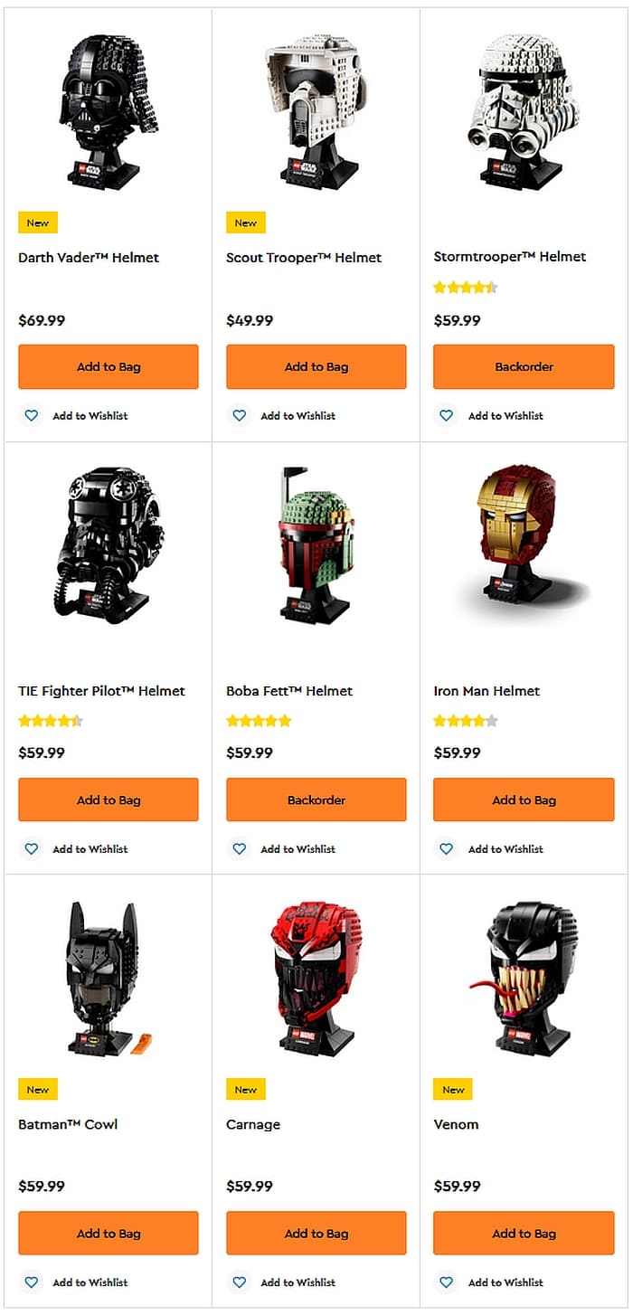
What do you think? Do you collect the LEGO bust/helmet sets? Which one is your favorite? And how do you like the Batman Cowl? Feel free to share your thoughts in the comment section below!
And you might also like to check out the following related posts:







I wonder if this would have looked better with a pair of lips.
Of course, it might have been hard to achieve that looking good, while still maintaining a solid build and acceptable piece count.
I’m thinking the same thing. I understand why they did the transparent pieces, but I don’t like it for the reason Will talked about (merging of the colors) and because I can’t help but see a spaceship windshield.
Same as others said. That canopy in the mouth just doesn’t work for me. Too bad because the rest of the mask is pretty neat. I wonder how it would look like if you just omit the canopy.
Perhaps you could just keep the column inside and remove that windshield. It might look better. Personally, it doesn’t bother me too much.
I like the design of the cowl, but I agree that the mouth section is problematic. They could have put a mouth there. But it may be as William said, the cowl is meant to be a symbol, and this was the best way they could achieve that.
I still think the Star Wars ones are the best. But that’s because I’m a Sith! 😀
I’m more of a Marvel guy, but I have to agree with you.
Well, the Iron Man mask looks okay, but the rest of them feel somewhat lacking…