(Written by Geneva – gid617)
Last year, the LEGO Art theme launched with four mosaic kits. I thought the idea was fascinating and the mosaics looked really good, but none of them featured subjects that interested me. But it was just a matter of time until something came along that I would like, and the #31203 LEGO Art World Map is way more up my alley than Iron Man or The Beatles!
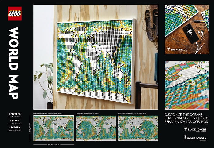
The World Map is huge, 41 inches wide and 26 inches tall—in LEGO talk, 130×82 studs. That’s 10,240 1×1 plates or tiles laid down on the surface of the map inside the one-stud border! The total number of pieces in this set is 11,695, for the reasonable price of $249.99 USD/$249.99 EUR/229.99 GBP/399.99 AUD/349.99 CAD.
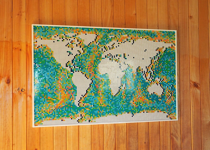
As you would expect from a mosaic, it looks its best from at least four feet away. It’s incredibly eye-catching on a wall!
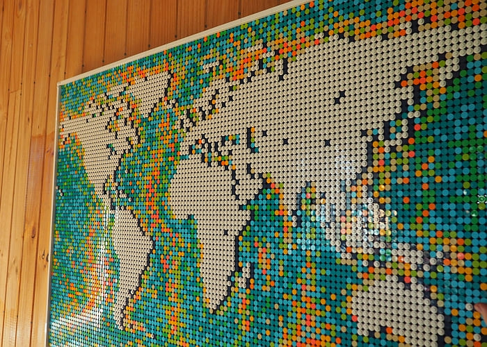
From closer up, the bright-coral, orange, and lime bother me a little. The set does include a host of extra dots so that you can design the sea however you like it—but most of these extras are orange and coral. I would have liked to see more extra blues and greens.
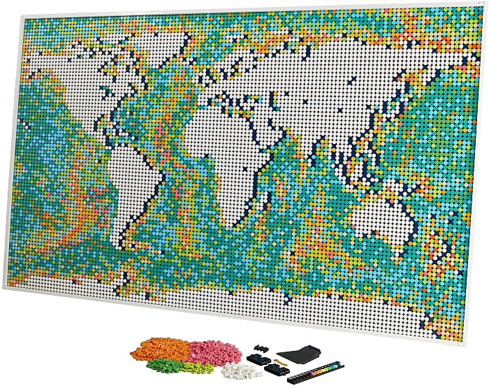
Using a bathometric map as the basic design was a great idea, since it allowed the designers to include a lot of fun colors which really help sell the customization aspect.
There’s also a fun detail hidden in the map off the coast of Asia—those green dots form the set designer’s middle name (Lee) in Chinese!
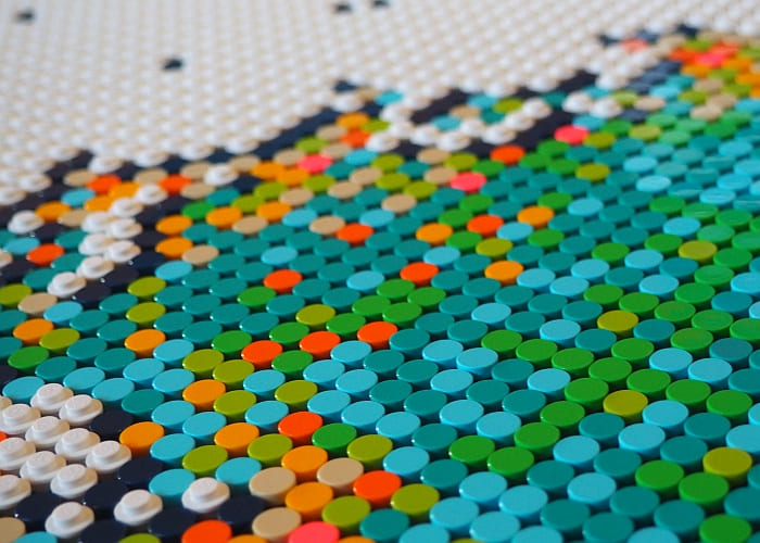
If you decide to customize the oceans (am I the only person who thinks that sounds funny?), you can skip all the colors of the instructions and just lay down the continents and their shadows.
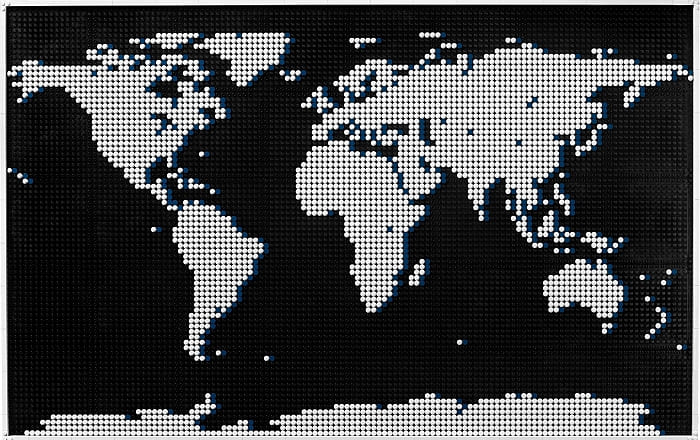
Here’s an example of the customized oceans from the official images:
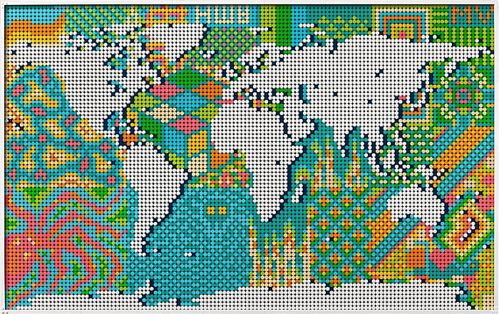
Pretty vibrant, right? Of course, the building process for a LEGO Art mosaic isn’t quite as exciting as the usual LEGO set building process. I put together a time-lapse video (one picture every sixteen seconds) so you can see how it comes together.
I’m a little surprised LEGO hasn’t put more stress on the educational value of this map. I don’t know if adults are really interested in putting 10,000+ LEGO dots down one by one, but I’m pretty sure kids would enjoy this kind of a break from normal school projects, After growing up in a homeschool family, I can think of dozens of ways a LEGO map could be useful—it’s easy to stick pieces onto it to highlight a country you’re studying, or you could build representations of cultural icons to add on, or trace historical voyages around the globe… but I’m getting ahead of myself here, that’s for the next part of my review!
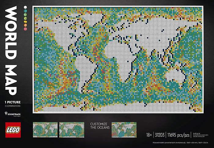
If you are interested to check it out yourself, you can find the #31201 LEGO Art World Map, along with the other LEGO Art mosaics at the LEGO Art section of the Online LEGO Shop.

What do you think? How do you like the LEGO Art World Map? Would you customize the oceans or stick with the bathometric design? And what do you think about using such vibrant colors for the water and leaving the landmass white? Feel free to share your thoughts and discuss in the comment section below!
And you might also like to check out the following related posts:









I’m still debating if I should get this. I like it, but the colors throw me off. I would love to have the oceans blue and the continents landscaped.
I have seen somebody do that. They were sharing it on Facebook. Unfortunately, I don’t remember the name of the person or the group they shared it in.
Unfortunately there aren’t enough blue tiles to do the whole ocean, although it probably wouldn’t be that expensive to order enough extras. I do think that would be pretty cool!
I would love to see how you customize this. You made some good points about the educational possibilities with this set.
I’m taking a stab at it! We’ll see what I can come up with. 😉
How about putting some dolphins and sharks into the ocean and land animals on the continents? I would love to dress up this map to make it more interesting.
That’s a fun idea! I wonder whether it would be easy to attach the prefab LEGO animals or better to design 2D versions. I will have to try it out. 😀
That one with the octopus design is cool. Is that the only artsy design they offer in the instructions?
I don’t think there are actual instructions for it. It’s just an image meant as a source of inspiration.
Like Håkan says, there aren’t actually instructions for that design, though it couldn’t be too hard to get a rough approximation by eyeballing it.
It’s a shame they didn’t make this into a normal looking map. I would have bought it in a heartbeat. I don’t like these washed out colors.
Part of me definitely feels the same way, but at the same time, these colors do offer a lot of potential for variety. It was pretty clever to get them all in there by doing a bathometric map. And if you’re really serious about having more normal colors, you could always get two, that would give you plenty of blue tiles for the oceans and probably enough tans and greens to do the landmass.
Also honestly I think it looks better in person than in a picture. 🙂