(Written by Geneva – gid617)
When I reviewed the #31203 LEGO Art World Map (see: LEGO Art World Map Mosaic Review), I mentioned that I thought this set had a lot of educational potential. Today we’ll take a look at a few designs I came up with—and maybe I can inspire you to customize the set your way!
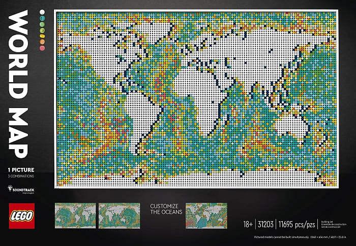
As a reminder, the World Map comes with instructions for a bathymetric design that looks like this:
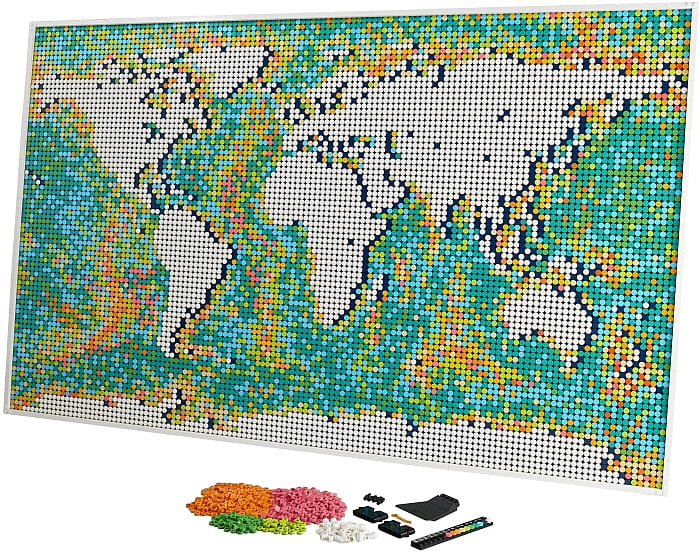
But it also has a lot of extra tiles, especially coral and orange. Coral and orange really stand out though, and I definitely wanted to get rid of them before I started adding stuff. There were almost enough extra greens and blues to replace all the orange and coral. Greenland grew a little.
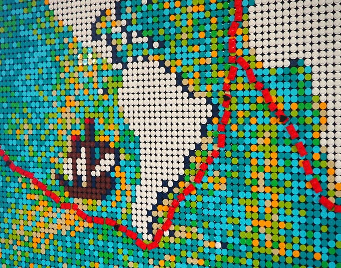
For my first customization, I traced Ferdinand Magellan’s route around the globe. Magellan was the first to circumnavigate the globe in recorded history—although he didn’t personally make it all the way around. In fact, only twenty-nine of his men made it back home.
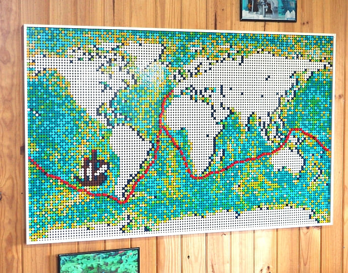
Besides removing the coral and orange in order to make the red line stand out more, I also had fun adding a mosaic ship. You could easily do this same kind of thing for other voyages of discovery!
Next I wanted to trace a world empire. The Roman Empire came to mind. But the Roman Empire was actually very small!
So I tossed that idea and did some research to find a larger Empire. Turns out, the British Empire was the largest ever. Depending on how exactly you define areas of control/conquest, the British Empire covered about 25% of the world.
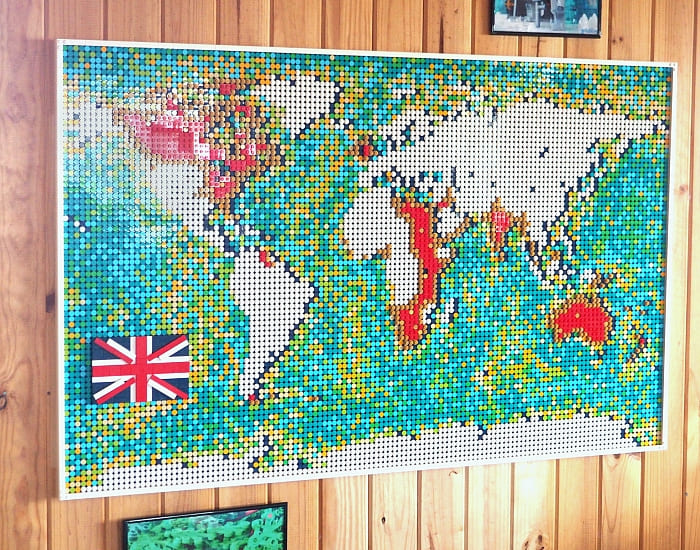
I outlined the British Empire in gold… and ran out of gold, so I went for red plates inside. This would have looked better with a less multi-colored ocean I’m sure.
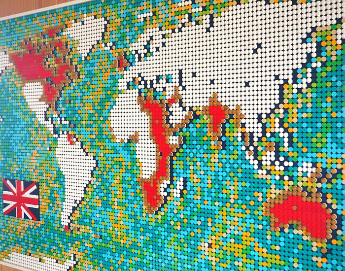
Besides tracing empires, this technique would be useful for highlighting any country you might be studying.
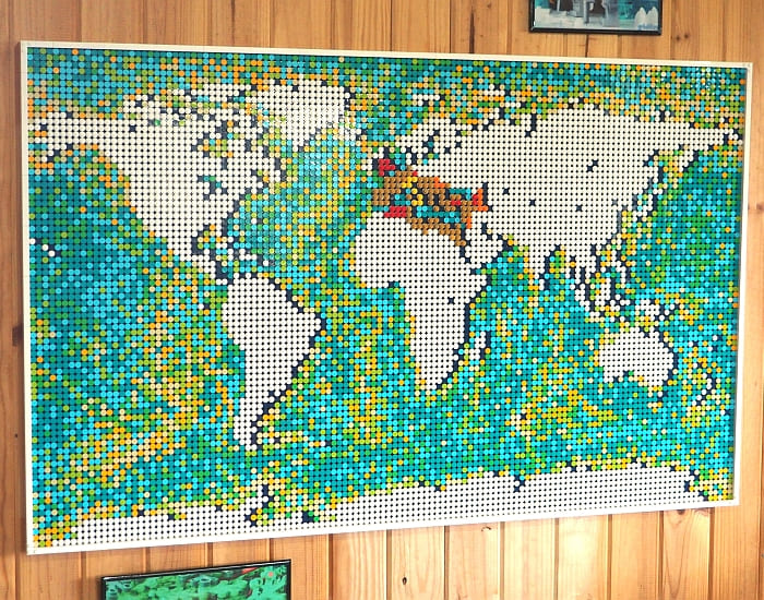
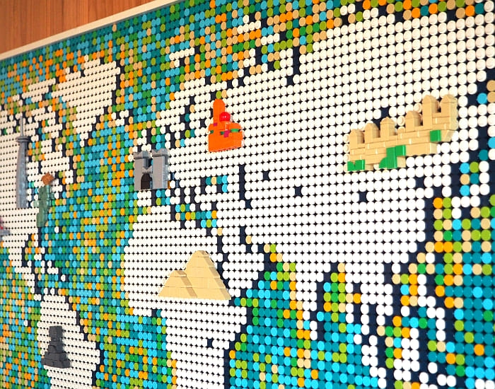
Now for a third version of the map – which was actually the one I thought of first – I built micro versions of a few famous landmarks and attached them in the right places (more or less). You could get a lot more in depth on this, but since my oceans are still colorful, I wanted to keep the landmarks fairly uncluttered.
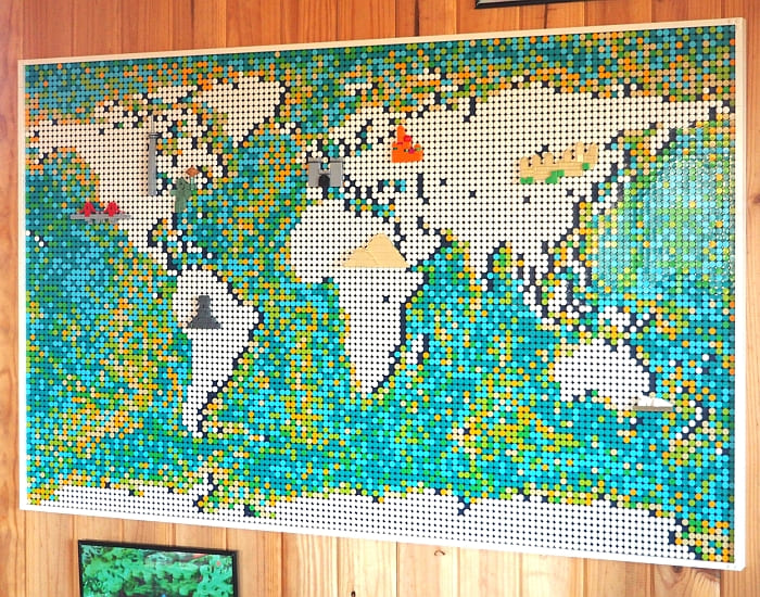
If you really wanted landmarks to stand out (you could also try animals, minifigures in different cultural themes, foods from different cultures, what have you), the best thing to do would be to get some extra blue dots and make the oceans less colorful.
After all the scholarly research I had to do for those maps, I couldn’t resist trying something a little more whimsical for my last customization. Arr, me hearties—I built a pirate map!
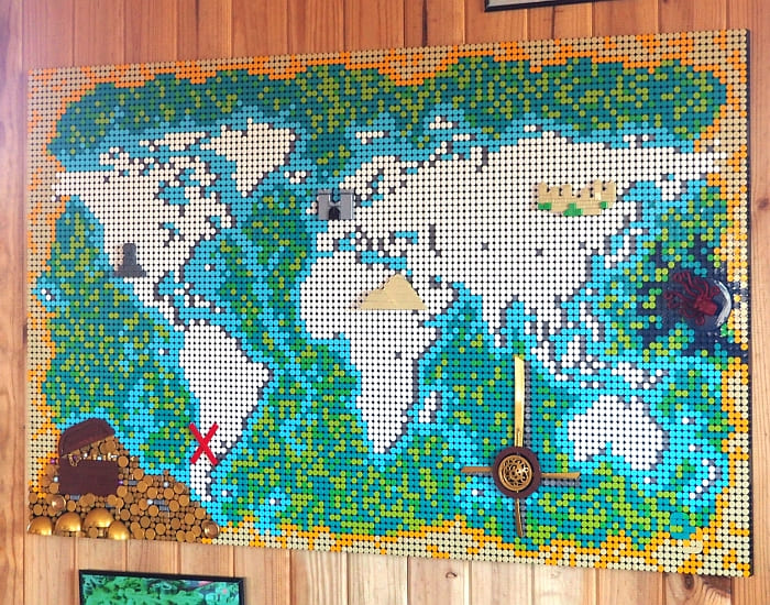
My line of thought here was: “There’s nothing like enough blue and green, so I’m going to need to use the tan and yellow… hmm… tan and yellow… a parchment border? Pirate map!”
Of course, taking all those dots off and putting them all back down was about as much fun as it sounds. But I went one better and moved the continents down by six studs. Hey, if you’re going to do it, you might as well do it right!
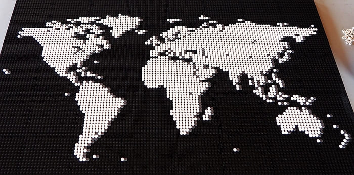
You may also have noticed that I switched the dark blue shadow for a silver shadow. I got that idea from Elspeth de Montes’ map (a great example of an all-blue version of the World Map). I had lots of silver dots, and I wanted to keep the dark-blue in case I needed them for the oceans.
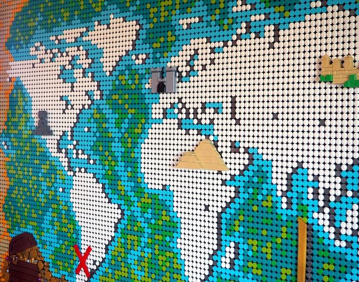
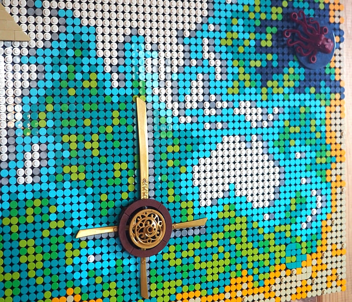
Then I added a few fun things to make the blue and green dots go farther (getting rid of Antarctica meant I had a lot more ocean to cover!). A few of my landmarks stayed, too, and I also hid my initials in the bottom right corner. And I live in South America, so that’s where the X had to go!
If you’re feeling inspired to customize the #31201 LEGO Art World Map, you can find it, along with the other LEGO Art mosaics, at the LEGO Art section of the Online LEGO Shop.

What do you think? Do you agree that the World Map could be a fun way to teach kids some geography and history? Does the map look better to you without the orange and coral? Which of my customizations would you leave on the wall if you were me? Let me know what you think in the comment section below!
And you might also like to check out the following related posts:








Oh, wow! These are great ideas! I love the voyage tracking map with the little ship!
Thanks! That’s also one of my favorites, I don’t know why. Maybe it’s because of the way the red line draws the eye!
These are good ideas. Thank you. I like your pirate map. 😀
Thank you! I hope they’re inspiring! 🙂
Adding landmarks is a great idea. Sure, you can’t add much, but it’s a good opportunity to practice micro building.
It sure is, and you could always rotate the landmarks out to get more practice!
Good job with these. The pirate map has great potential for further customization. I would change the colors to all brown and tan to make it look old and worn.
That’s a great idea. I’m thinking about getting enough blue dots to replace the greens. 🙂
I really think the map would look so much better if those brown shades are removed from the oceans. Make the oceans all blue and the continents shades of brown and green. Then add customization like what Geneva did here. I like her ideas, but it still bothers me how colorful the oceans are.
Yes, I agree. I really wish there had been more extra blues and less orange and coral…
I am looking to have a compass rose in the ocean. Any suggestions?
Maura, nice idea! It should be doable. You could either do it as part of the mosaic, or you could make it from uniquely shaped parts (like pointy blades, etc. There is also a nice printed compass in the LEGO Ideas Ship In A Bottle set which you may consider incorporating. 🙂
For the pirate map. Did all the beige pieces come from the set or did you buy additional ones?
Do you know why that one dot in north Canada doesn’t have a dark blue drop shadow like allllll the other white dots do?
Ha! No idea and never noticed it until you mentioned it, but now it bugs me too! 😀
Now make the One Piece world map with a marked travel line 😛