(Written by William)
I’m not exactly sure what it is about LEGO Ideas projects, but I tend to forget what’s coming out right before they get released. This is especially true for the projects that don’t go through the normal LEGO Ideas project cycle. So, when LEGO offered the #21352 LEGO Ideas Magic of Disney for review, I was a bit puzzled as to what it was.
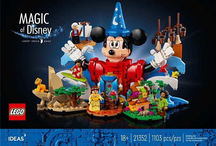
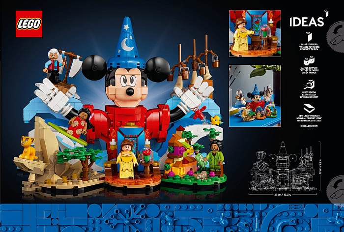
Don’t get me wrong, I vaguely recalled the competition that asked fans to build something that represented Disney magic, but since I didn’t compete or vote, I only heard about it as a distant story. In order to avoid biasing me any further, I made sure not to look up anything about the set before it arrived. After all, I’m always excited to build adult-oriented Disney displays and I reviewed several of them in the past. The question is whether or not this one would hold a candle to the others? The short answer, yes, yes it does! Now let’s dig into the set and see why I think it’s so magical!
LEGO MAGIC OF DISNEY – VIGNETTE COLLAGE
How does one build a LEGO model with lots of variety and distinct characters without it feeling disjointed? Well, it all comes down to choosing a thematic element that can connect small vignettes that might otherwise clash if placed next to one another. And boy oh boy, is this technique showcased to perfection in the Magic of Disney set!
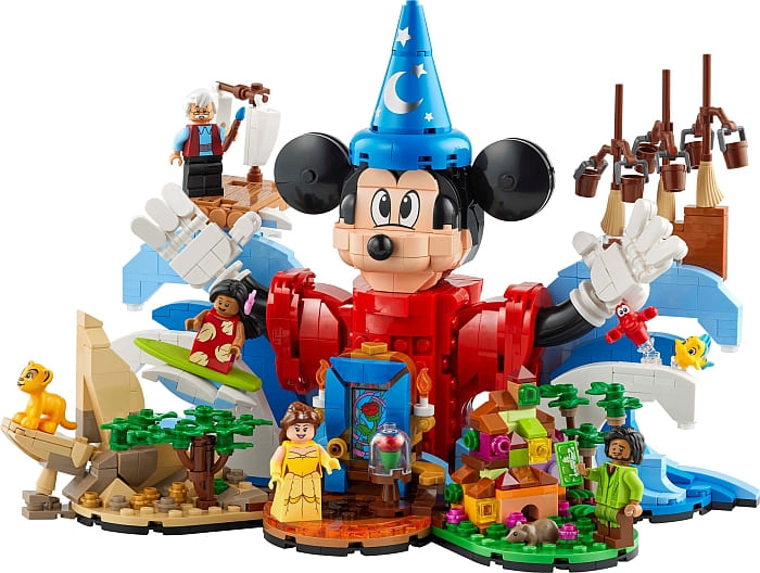
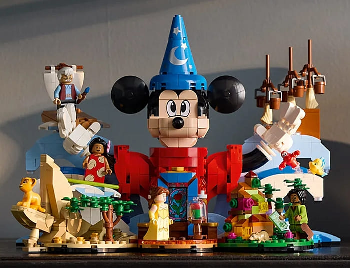
The overall connecting factor is simple. The seven scenes around Mickey are all Disney properties. However, a good collage will then make all these scenes stylistically work together. This often starts by focusing on scale, which is actually trickier than one might think.
Consider the Casita from Encanto. This is a micro-scale building. Then you have the stained glass from Beauty and the Beast, which is a normal scale. Then you have Pride Rock from The Lion King. This last is an abstracted scale where it’s more of giving the impression of something without scaling to any one thing in particular. So, how does a builder still maintain the impression of scale?
Again, the answer is simple. Keep the focus of each build on the characters and how they scale to one another. That is easy since all of them are minifigure-scale. We have Bruno for Encanto, Belle for Beauty and the Beast, and Young Simba for The Lion King. This scaling gives a point of comparison to prevent the model from feeling disjointed.
The feature that turns this collage from good to great is that LEGO designers built context into the entire design. Using Mickey as a focal point, we have the general shape of each vignette looking as if they were bursting into life from him (note the waves crashing outward from Mickey on the left and right). Even the base of the front three scenes have a rounded cloud-like explosiveness and radiate outward with each vignette tilted like spokes on a wheel. This combines to create a brilliant composition, which makes a wonderful display piece.
So, to recap. If you are looking to make several vignettes and want to connect them all together, try to remember these three tips. Have a theme or story that connects the scenes together. Next, choose something from each little display to act as something that can scale with all the others – characters are often the best for this but don’t need to be the scaling object. Finally, choose the right composition that helps showcase and frame everything together. Elements that do well to connect things include overall shape, similar colors, or an expressed action like the explosion of magic happening in this set.
LEGO MAGIC OF DISNEY – THE BUILD
This model is broken down into three major phases among nine numbered bags. Due to this compartmentalizing, it is a rather easy set to put together. This often means expert builders might be a little bored, but I found the composition of the build interesting and LEGO designers even managed to hide in a couple of secrets in the model. As to not to spoil it, I will only say that there are a couple of hidden characters expressed in colored stacked plates inside Mickey’s body and in his head.
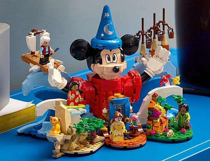
I personally call these hidden characters pixel pals, where stacks of plates are meant to represent a character almost purely by color alone. As a side note, there is a LEGO fan who goes by the name jtheels and creates 2×2 versions of characters they call Brick Buddies. And still, others just stack 1×2 plates and have you guess what character they made. Any way you look at it, it’s pretty interesting just how iconic a character can become. I was building with my wife when she looked at the side of Mickey and chirped, “Hey! That’s-” I won’t spoil it for you, but you might miss it if you aren’t paying attention.
As for the parts, fans will be happy to know that all the decorated pieces are printed. There are no stickers at all in the set. Plus, the characters are very nice. Belle, Bruno, Simba, Lilo, and Geppetto are all new characters in minifigure form. I was stunned to find that Lilo’s legs are printed 1×2 brick instead of short legs. Also, the back of Belle’s dress slope is also printed which is a little different for that particular type of dress/robe slope.

The first phase of the build is to create the front three platforms. On the back of this single unit is a LEGO Technic brick so that it can be easily attached to the back half of the model. Or, if you want to display it on its own it can also work that way.
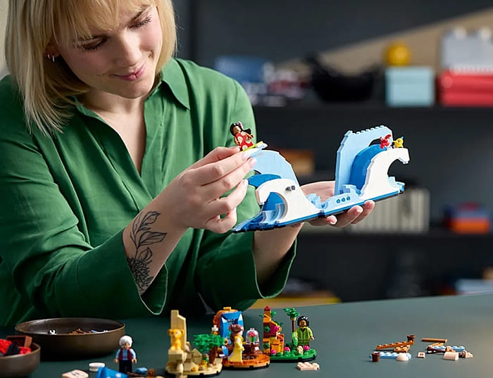
The next stage of the model involves building the opposite waves of water that act like four stands for Lilo, Geppetto, Sabastian & Flounder, and the brooms from Fantasia. On their own, they do look a little empty in the middle. Plus, the exposed LEGO Technic brick in front is hard to ignore. However, if you put the Mickey statue in the center, this could work as another decent display piece.
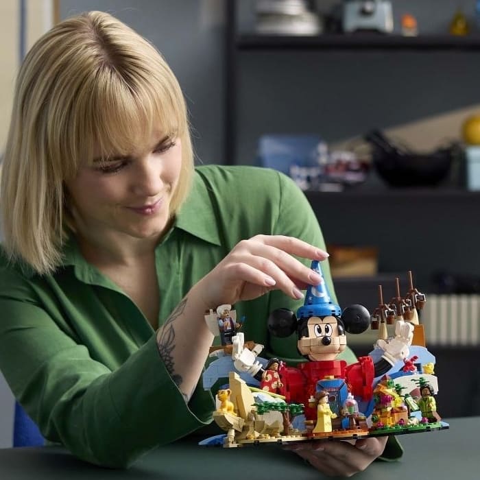
That leaves Mickey as the final character to build. This is a much more scaled down version of Mickey compared to the Mickey and Minnie statues we’ve seen before. However, I think I had more fun building this one. The size of this wizard Mickey is large enough to feel substantial – especially with the hidden secrets built inside – but he’s small enough to be cute. His hands are probably the only thing that looks a little bad from the back. That means with some clever angling, like putting his hands palm up, you can make him look good from most angles.
LEGO MAGIC OF DISNEY – PARTS
As mentioned before, all decorated parts are printed. This includes the stained glass window behind Belle as well as the parts on Mickey like the slope that makes up his eyes, the half conical panel that makes up the middle front of his hat, and the cone that makes the top of his hat. All other printing is on parts you’d expect like minifigures.
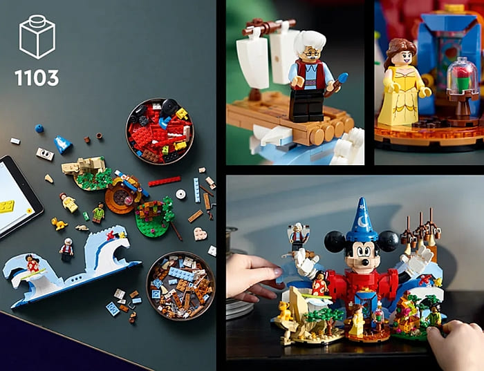
Other parts that caught my attention include the rose inside the glass dome. It sits on an ice cream cone bottom, but the flower is a solid piece with a receiving hole on its underside. This means it fits easily on any stud. We also get some nice slopes that look like elongated cheese wedges in blue. I’ve only run across these slopes in white so it was nice to see another color.
And finally, a special 1×1 slope that helps make Mickey’s face. The new slope is a 1x1x1 1/3 quarter dome. This puts it at four plates tall and helps round out corners that would have taken a lot more creativity to smooth out. I do recommend checking out the accompanying video below where I show this element off.
LEGO MAGIC OF DISNEY – FINAL THOUGHTS
I’ve personally built quite a lot of Disney display pieces over the last few years. There was the large #43222 LEGO Disney castle, the #43179 LEGO Mickey & Minnie Buildable Characters, the #43225 LEGO Disney Little Mermaid Royal Clamshell, and the #40600 LEGO Disney 100-Year Celebration, just to name a few. Compared to all of these, dollar for dollar, the #21352 LEGO Ideas Magic of Disney has got to be my favorite.
At $100 MSRP, the price seems fair. Collectors will want the set for its unique minifigures that are exclusive to the set. Builders will have a decent time building the model and if they don’t want to keep it together, I think this makes a fantastic parts pack. It is accessible for old and new fans of Disney and LEGO. And if that wasn’t enough, I think this one travels a whole lot better than any other Disney art piece. Most of the others I was afraid to move and I tended to knock off half a dozen things just moving it short distances.
In short, this has the quality I’d expect from both a Disney and LEGO product designed to be a collector’s item. However, it has the sensibility of what a fan would want thanks to it being a fan-created project to begin with. And it does all this while still being more affordable compared to some of the monstrous sets we’ve gotten in recent years. It checks off a ton of great things in my book and hopefully, it does the same for you. In the video below, I will show you the set in a bit more detail, and if you want to check it out, it will be available starting on October 1st and you can already pre-order it at the LEGO Disney section of the Online LEGO Shop.
What do you think? How do you like the adult-oriented LEGO Disney display sets? Do you have any of them already? And how do you like this latest addition to the collection? Feel free to share your thoughts and discuss in the comment section below!
And you might also like to check out the following related posts:
- LEGO Ideas Magic of Disney Available for Pre-Order!
- Brick Breakdown: LEGO Disney Stitch
- Brick Breakdown: LEGO Disney Villain Icons
- Review of the LEGO Walt Disney Tribute Camera
- LEGO Disney Little Mermaid Royal Clamshell Review
- Brick Breakdown: LEGO Disney Up House
- Brick Breakdown: LEGO Disney Celebration Train






Hm… better than I thought. I liked your insights about the vignettes. That was interesting.
I also found that interesting. Good technique to remember.
All the parts are printed?! That’s phenomenal! I know some people who would really like this set.