

About a month ago, I was approached by a LEGO fan who goes by the name AFOD (Adult-Fan-of-DUPLO, real name Marc), with an interesting concept; LEGO sets for adults, using LEGO DUPLO bricks. I was immediately interested in the concept, because it was the DUPLO Castle line released 2004-2008 that brought me back to LEGO as an adult, not regular LEGO sets. As a side note, I have no idea how the DUPLO Castle collection was ever approved, as it is one of the scariest themes LEGO ever released, with huge dark castles and frightful looking badguys. I’m not at all complaining, as I love the theme, but it was really not appropriate for 3-year-olds. Anyway, I very much appreciate building with DUPLO, as you can build big things in little time with surprising amount of nice detail. 🙂
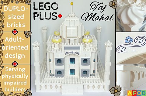
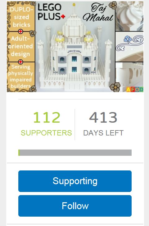
Marc’s idea actually goes deeper than just getting adult LEGO fans to play with DUPLO – after all, anyone can do that even now. While building with DUPLO bricks with his daughter, Marc realized that DUPLO has some significant advantages for older builders as well. He envisions an entire line of LEGO products with adult-oriented display models, but instead of using thousands of small pieces, the sets would be made of big, easy-to-handle DUPLO bricks. This could be particularly interesting for those who are visually impaired or have limited motor skills, or anyone who prefers to use larger pieces. Marc calls this proposed line LEGO PLUS+ with the first project already submitted to LEGO Ideas; the LEGO PLUS+ Taj Mahal.
Marc shares at his LEGO Ideas page: “LEGO PLUS+ is my idea for a potential new LEGO product-line dedicated to senior builders as well as visually and/or otherwise impaired brick fans.” The PLUS+ name and symbol incorporate different aspects of the potential new line’s approach: PLUS+ can refer to the older age of builders, and the bigger size of bricks. The + sign can also symbolize the healthcare aspect of the product line, helping people with different impairments. In addition, the + sign can also be seen as a reference to the 16+ age recommendation of many of the larger and more complex LEGO sets. Just as LEGO Juniors introduces kids who grew up with DUPLO to standard LEGO bricks, PLUS+ re-introduces adults to DUPLO bricks. Besides offering a less complex, less difficult building process, LEGO Plus+ will also come with instructions including bigger pictures. This enables impaired LEGO fans to have a pleasant building experience without having to turn to themes and sets designed for preschool kids.

Furthermore, LEGO PLUS+ sets are also suitable for anyone who likes big models but doesn’t like to handle thousands of pieces in the building process. To recreate a given set built with LEGO bricks, you only need about 1/8 (13%) of the number of pieces using DUPLO bricks for a model of the same size. For example, recreating a 1,000-piece LEGO building takes only about 125 DUPLO pieces to get an equally large model. (This is one of the main reasons many LEGO fans already use DUPLO bricks to build up the bulk of large models.)
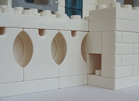
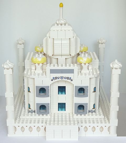
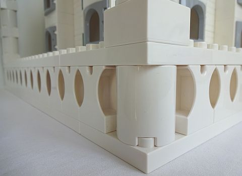
The LEGO PLUS+ Taj Mahal is made entirely of DUPLO bricks, and features many authentic details of the real UNESCO world heritage site in India. Including the world-famous marble dome, the four smaller domes around it, four minarets at the corners of the base platform, calligraphic ornamentation around the big center doors, the base’s distinctly patterned wall, and the base’s entrance including the small door to the stairs leading up to the platform. The LEGO PLUS+ Taj Mahal is intended to be a display model, although it is also playable, like all other LEGO and LEGO DUPLO sets. This means that LEGO PLUS+ sets have the potential to connect some of the youngest LEGO fans with the oldest, building a bridge between the building styles and interests of two generations, and thus giving the + symbol an additional meaning.
So far, the LEGO PLUS+ Taj Mahal reached about 100 votes, and received some enthusiastic response from LEGO fans. Here are a few comments from supporters:
- “Certainly one of the best and most original concepts that I’ve seen on LEGO Ideas in a long time.” (Pretzel829)
- “My brother is in his 70’s and has very poor eyesight. I would get this set for him in a heart beat and others like it.” (sosewsuzi)
- “This takes DUPLO to a whole new level and several new audiences. Great job. I would buy one.” (Oltemative)
- “Fantastic idea for those who wouldn’t otherwise be able to access the wonderful world of LEGO! Support very much deserved!” (FreewheelLego)
- “It’s amazing to see what you can build with DUPLO bricks!” (abcd1719)
- “At first I thought it was made out of LEGO bricks but DUPLO!!! I was fooled by skill.” (Sleepy17)
- “I would buy it for my parents.” (Cris9984)
As I mentioned above, I’m a big fan of DUPLO, and would love to see some sets geared towards older kids and adults. This is why I really liked the LEGO DUPLO Castle line. It provided a lot of gray, black, tan, brown, and other earth-colored elements that were perfect for more serious building. I don’t think LEGO would approve the whole LEGO PLUS+ idea, as they don’t allow suggestions for whole themes within the LEGO Ideas framework, but perhaps something like the LEGO PLUS+ Taj Mahal would open up the discussion for adult-oriented DUPLO sets within The LEGO Group. If you would like to learn more about the project, and would like to vote for it, visit its LEGO Ideas page. Marc also has other ideas for adult-oriented DUPLO sets, so if you are interested, you can follow him at his LEGO Ideas page. And you can also check out the currently available fan-submitted sets under the LEGO Ideas section of the Online LEGO Shop.

What do you think? How do you like the idea of a LEGO theme with bigger bricks geared towards older LEGO fans and those with various health challenges and disabilities? Should LEGO release such a collection? What kind of sets would you like to see in an adult-oriented LEGO DUPLO line? And what do you think of the LEGO DUPLO Taj Mahal? Feel free to share your thoughts and discuss in the comment section below! 😉
And you might also like to check out the following related posts:


