(Written by William)
I have to admit that the Transformers line from LEGO has been a major point of nostalgia for me. Growing up, I had the original Optimus Prime and Bumblebee. I don’t recall having too many Decepticons. However, the one I do recall having was Soundwave, along with several of the cassettes. So, I needed to get the #10358 LEGO Transformers: Soundwave set to see if it lived up to my memory.
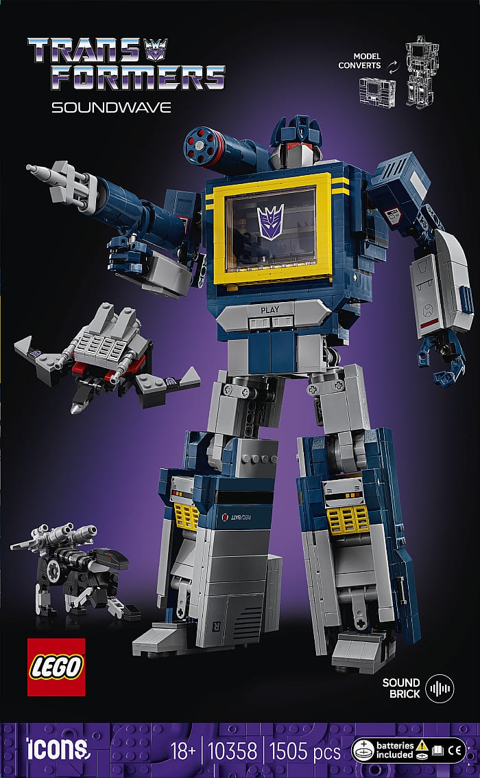
It is worth noting that the original toy only came with one cassette. The instructions even mention that it was the yellow bird called Buzzsaw. Honestly, I didn’t remember that since the more popular one was Laserbeak, which was sold separately, and the one I had. So, it is really nice that this set comes with the more popular bird as well as Ravage. Throw in a micro-scale model of Soundwave in its tape recorder form, and the set really does give you a lot. But does it hold up? Let’s find out.
LEGO TRANSFORMERS: SOUNDWAVE – SCALED UP
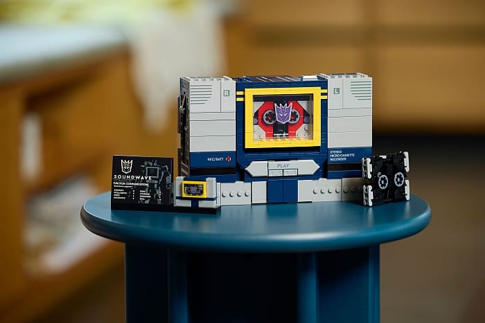
Right off the bat, the most noticeable difference from the original toys is just how much larger the LEGO Transformers sets are. Back in the day, it was safer to call Soundwave a micro cassette player, given its size. The LEGO versions are more to scale with a full-size cassette. This is, of course, due to the limitations of LEGO parts, but it is nice since my adult hands probably aren’t as nimble as they used to be.
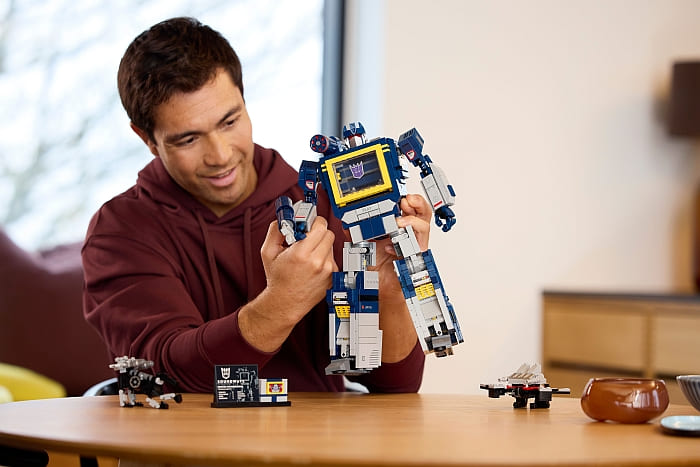
Thanks to the upscaling, the cassettes do transform just as they did in the past. I think the only difference is that this Laserbeak’s head folds out, whereas the original sort of pulled out from the body. But the rest of the transformation is spot on. The Same goes for Ravage, right down to the frustration I had trying to fold those legs just right.
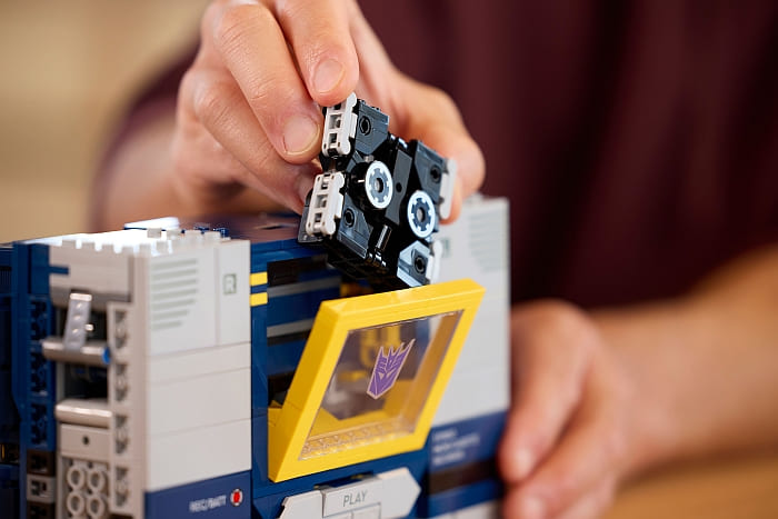
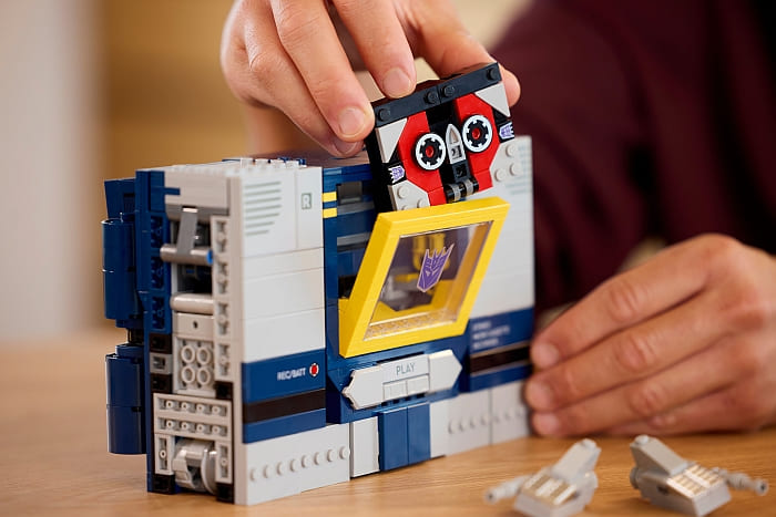
One element I wasn’t expecting was that the laser guns that were attached to the cassettes were also recreated. This does leave you with awkward extra elements you have no idea what to do with, if you want the robot in its cassette form, just like the original!
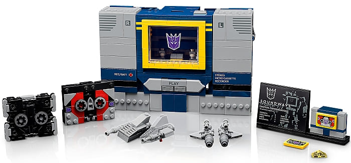
As for the main model, there are some pluses and some minuses. The biggest plus is the extra features LEGO designers were able to add to the model. When folding out the feet on the legs, there are unfolding shin panels that look amazing in action. The articulation of the figure also seems to be a bit more robust than the original toy. And, of course, there is room for a sound brick, which feels like a feature Soundwave should have always had, but never did until now.

As for the downsides, I don’t think this model transforms as well as the original. It’s not that it doesn’t look good, it is the fact that some angles look really bad. This is why most pictures focus on the front face of the model. This is what you want people to see. But as soon as you turn the model, things look rougher than I’d hope.
The other major downside to be aware of is the weight of the model. The parts usage is rather dense. This makes the set fairly heavy in both the legs and the torso. Normally, this would work great to stand up a model and balance out any arm positioning. However, the joints around the hips and where the feet fold out are barely enough to hold up this weight. So, the more attractive way to display the model, that is, the robot version, is the more precarious form to leave out.
LEGO SOUNDWAVE – MOVING ELEMENTS
Without a doubt, this model has an astounding number of moving parts. Let’s break this down by looking at an arm, a leg, and finally the torso. You will see just how much thought went into every aspect of the set.
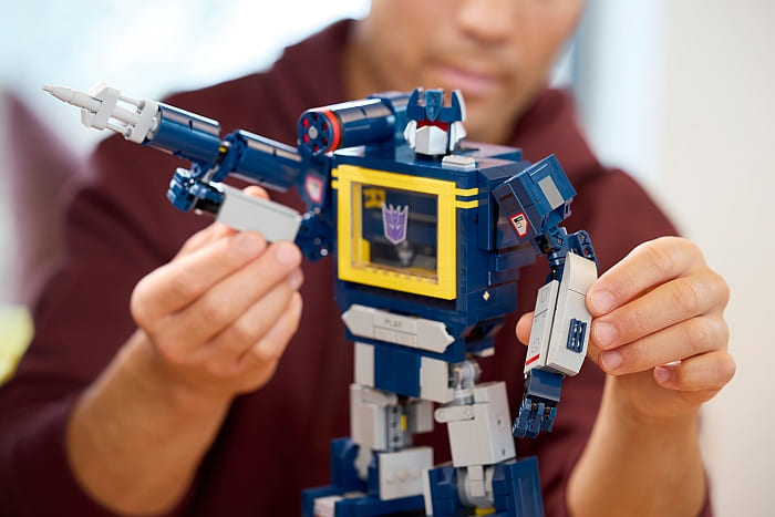
Each arm has movable fingers. There are four in total on each hand. The thumb is limited by how it is connected. The wrist on the hand can turn. Inside the forearm, there is an extra joint for transformation purposes. The elbows have not one, but two ball-joints to increase the expressiveness of each arm. The shoulder can tilt and rotate on locking hinges, which help hold up the arm in whatever position you want. Additionally, the shoulder joint is built on a frame that can swivel for transformation.
Next up are the legs. Each leg has two movable panels for transformation. These are for covering up elements when Soundwave is in its player form. Each of these panels has two points of articulation in order to be positioned in the correct spot. The foot can fold out, which then activates several hinges to operate the shin panels. The knees have a large clicking hinge to help position the leg into a more stable stance. Finally, the leg is attached to the hip socket with both a double tilt hinge and a rotating large hinge. Despite its sturdy construction, the locking friction of these hinges feels like a bit of a weak point for the model.
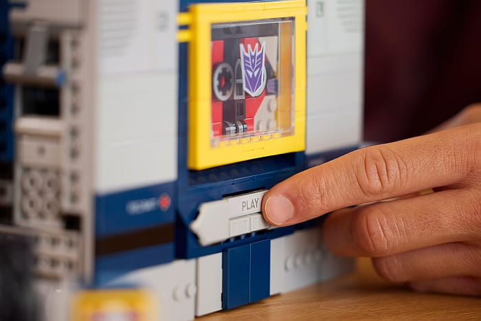
Finally, we have the torso. There is a hinge for the Play button to operate the sound brick. The cassette bay can open up via a press of another working button located on Soundwave’s left shoulder area. As for Soundwave’s head, there are three points of articulation. The ball joint for the head, a swivel hinge to fold the head back, and a covering housing to help hide the head when it is not needed. The torso is a bit simpler when it comes to joints, but its action elements have more functionality.
LEGO TRANSFORMERS: SOUNDWAVE – FINAL THOUGHTS
Boy, does this set deliver on the nostalgia! Not only that, but it gives you small touches to enhance your memories that the original toy never offered. Having the talking brick is a big part of that, but even the little touches like having the option of giving Soundwave yellow or red eyes are nice. Even the increased size makes it feel more substantial, which helps with accepting the $179.99 price. I think a big Transformer fan will definitely feel like they get their money’s worth out of this one.

Even LEGO builders who are not Transformers fans will enjoy what is possible with a transforming model. Before Transformers were a major license in the U.S., they were interesting puzzle toys in Japan. So, the fun doesn’t need to be dependent on being a fan of Transformers, but it does help. In the video below, I will discuss the set in a bit more detail.
Honestly, the only thing that gives me pause is that I wish this model was a better toy. Even though transformation is possible, I constantly have the feeling I’m about to break something. I really want to play with this model more, but I don’t dare because of the feelings it evokes. Plus, I prefer the robot version, but just like the transformation process, I’m constantly worried that the model will fall over and shatter as soon as I look away.
So, with that said, this is a good model, but I would only recommend it if you’re more into a display piece than a toy you want to play with to revisit your childhood. Or get it because you’re a collector, and I’m unsure how many Decepticons we’ll actually get from LEGO. If you want to check out the Transformers sets, visit the LEGO Icons section of the Online LEGO Shop.

What do you think? How do you like the LEGO Transformers series? And what do you think of Soundwave? Do you have the set already? Feel free to share your thoughts and own reviews in the comment section below!
And you might also like to check out the following related posts:


