
Several of my favorite LEGO customizers who specialize in custom printing on official LEGO elements have some really sweet new custom printed parts and accessories. So, I thought to write up an update on what’s available.
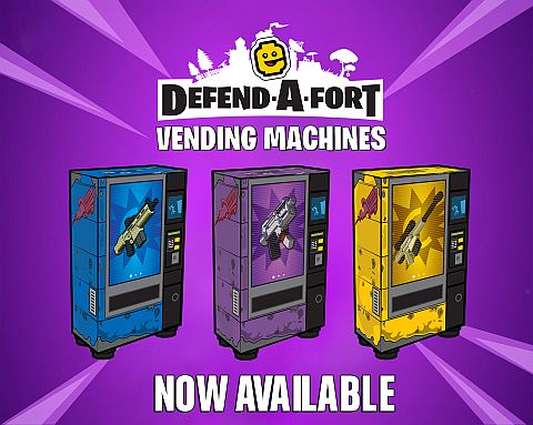
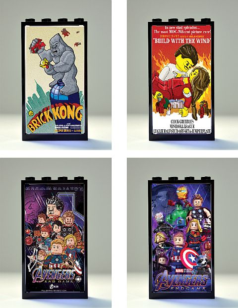
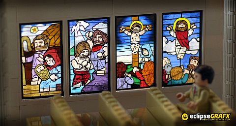
➡ CUSTOM LEGO PRINTS BY ECLIPSEGRAFX: LEGO customizer EclipseGRAFX continues their line of custom printed movie posters and stained glass windows on official LEGO windowpanes. They are beautifully designed and printed and go well with numerous official and custom LEGO models. Below are the four latest designs, and you can find more at their website. EclipseGRAFX recently added to their inventory a series of custom printed vending machines (see above). They are printed using the latest in UV technology to give you a vibrant, smooth, and long lasting print. Several different designs are available. Also, check out their latest custom printed tiles and other pieces at EclipseBricks.com.
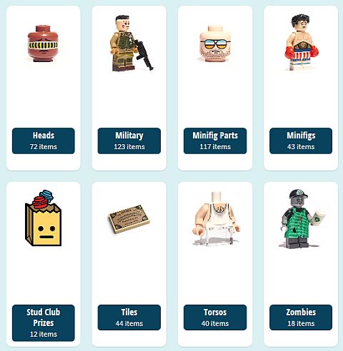
➡ CUSTOM LEGO PRINTS BY CITIZENBRICK: CitizenBrick also got some new prints. They are well known for the gorgeously detailed military minifigures and printed accessories, and they also have a great selection of zombies, and other unusual items. Minifigs can be purchased as a whole, or as separate printed body parts. For the full selection, visit CitizenBrick.com.

➡ CUSTOM LEGO PRINTS BY MINIFIGS.ME: Minifigs.me is a UK-based customizer, but they have very reasonable international shipping rates, friendly service, and fast turnaround times. They have a wide selection of custom printed LEGO minifigures and accessories, and they also provide custom printing services for very reasonable prices. Visit their website at Minifigs.me.
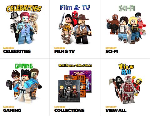
➡ CUSTOM LEGO PRINTS BY MINIFIGURES.COM: Minifigures.com is another UK-based custom LEGO printer. They have a smaller range of products and focus on highly detailed bespoke minifigures with beautifully designed details; celebrities, film and TV characters, characters from sci-fi, gaming, and more. Each of the minifigs comes in high quality, custom designed packaging, which makes them perfect as gift items or collectibles.
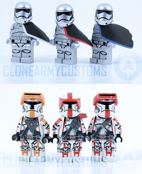
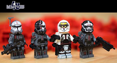
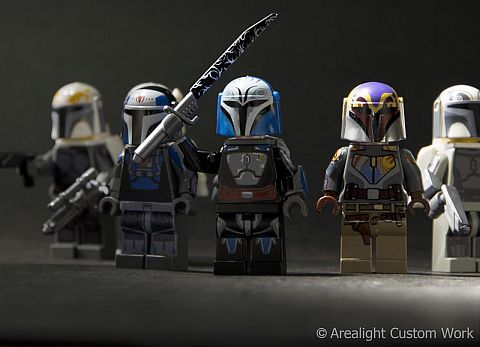
➡ CUSTOM PRINTED LEGO STAR WARS MINIFIGS: If you are a LEGO Star Wars fan, there are several custom LEGO printers who specialize in LEGO Star Wars minifigures. Some of these printers have been in business for many years and provide great service and exceptional quality printing. My personal favorites are CloneArmyCustoms.com, Minifigs4U.com, and ArealightCustoms.com. I personally own many of their products, and would highly recommend them.
If you would like to order custom printed LEGO minifigs and accessories from several different providers, you can also take a look at FirestarToys.com. They are resellers of custom LEGO items from pretty much every quality LEGO customizer and custom printer from around the world, and have a vast selection. Although they are based in the UK, they ship worldwide for reasonable fees.
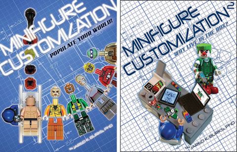
The custom LEGO printers mentioned here are all well established and well known within the LEGO fan community. They have been providing quality products for many years through their websites and through LEGO conventions. Besides them, there are many other customizers who may not have their own websites but instead sell their products through eBay, Etsy, and other outlets. The quality of these custom printed items can vary greatly. If you do run across some custom prints from lesser-known customizers or unknown sources, I recommend placing a small sample order first. Also, keep in mind that the parts customizers print on may be genuine LEGO elements and high quality custom parts (which is the case with reputable customizers), or they could be cheap imitations. Always check the feedback and reputation of the seller before placing an order. And, if you want to learn customization yourself, check out the Minifigure Customization books at Amazon.
LEGO customization is a wonderful hobby and art form. I’m personally a big fan and supporter of the work of talented LEGO customizers who offer quality products. If you are looking to add something unique to your LEGO collection, or you would like to get LEGO minifigs and LEGO parts with your own custom designs, there is likely a LEGO customizer who offers exactly what you are looking for.
What do you think? Do you have the products of any of the custom LEGO printers mentioned here? And do you have a favorite LEGO customizer? Feel free to share your thoughts and own reviews in the comment section below!
And you might also like to check out the following related posts: