(Written by William)
In this Brick Breakdown series I review official LEGO sets, from the perspective of looking at interesting building techniques we can all learn from. Today we will be looking at the #10243 LEGO Parisian Restaurant. I have written a previous general review on this set (see: LEGO Parisian Restaurant Walk-Thru Review) that you may want to read as well. You can also check out the previously discussed LEGO techniques found in official LEGO sets at the end of this article. So let’s begin! 🙂
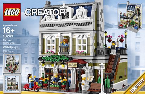
From the distinct architectural style to the well thought-out floor plan, this set is a work of art. It is this level of detail why we feel spoiled with every LEGO modular building. The LEGO Parisian Restaurant is definitely one set you’re going to want to save up for. Unlike most of the other LEGO modulars where only two sides are developed with greater detail, here the front, back and the side are all full of eye-candy. When it comes to LEGO building techniques used in this set, it is expert level in every sense of the word. So make your reservations and prepare for a fine dining building experience.
➡ NEW LEGO ELEMENTS IN THE PARISIAN RESTAURANT
It’s often the case that we get our first glimpse of new and exciting LEGO pieces in the larger sets, like the LEGO modular buildings. Many times it’s just a new color we’ve never seen before, or something purely novel like the scooter-bike in the LEGO Parisian Restaurant. And occasionally we get something truly ground-breaking.
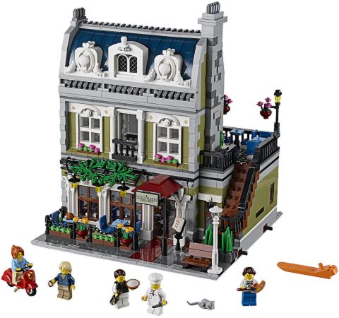
The LEGO Parisian Restaurant features three elements that fit the last category of revolutionary new parts. The first of these is the inverted dome. The top rim is designed like a barrel so it will fit most 2×2 surfaces. Inside the bowl there is a stud, which provides a secure connections for elements that fit a 1×1 space. The stud and the hole underneath are hollow, which makes it perfect for any type of bar usage. Plus the tube at the bottom is designed just like a 1×1 round plate, which means you can fit openings – like the mouth of a goblet – around it and it will be very secure.
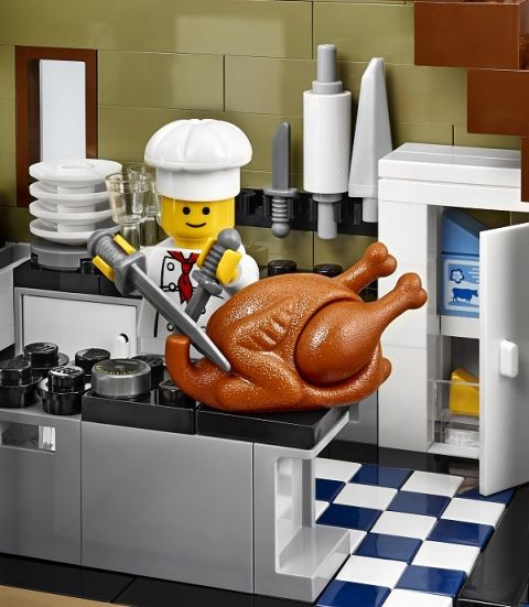
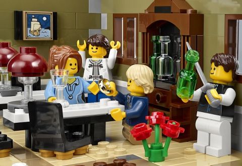
Next up is the 2×2 round tile with a hole in the center. That’s right, this element is specifically designed to hold a stud from both the top and the bottom. Just to give you an idea how well this works, we see them in action in three places on the first floor of the LEGO Parisian Restaurant. First is in the kitchen; the tile is on the counter and the white dishes are turned upside-down to stack them as plates. The other two instances are with the lamps on the table. You have the tile, followed by an upside-down wine bottle, finally capped off with the inverted dome as a lamp shade! 😀
The third piece of note is the slope that makes up the pillow on the bed. It is a 2×1 slope with no studs on top, a curved surface, and only raise up to be two plates tall. There is a 1×1 plate’s worth of space open under this very thin slope. What makes this a game-changer is its applications for detail work. It’s a lot like an elongated 1×1 “cheese-slope”. And if it follows the same trend, you can’t go a set without seeing at least one included.
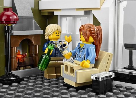
I should also note that there are plenty of other exciting elements in the LEGO Parisian Restaurant. For instance, the slope that helps make up the back of the armchair is very interesting, it’s just that the three elements I mentioned above hold some of the greatest potential for innovative creations.
➡ HIDDEN MESSAGES IN LEGO
A mark of a great LEGO builder comes in a variety of ways. Usually it involves a never-before-seen combination of pieces that creates an innovative design, and other LEGO fans admire and start using in their own creations. There is a more subdued sign of a great LEGO builder as well; when they hide little designs that are only really evident during the building process and others may not even notice it. The LEGO Parisian Restaurant gives us a perfect example of this in the outdoor seating area on the first floor. While building the model, you may notice that the tan plates spell out “CHEZ”. This detail is quickly lost among the color plates placed around it and later the chairs and tables – but as a builder you know it’s there.
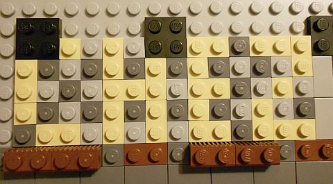
Adding letters of words are one of the best ways to include hidden messages or clues in your LEGO creations. You can do this in a wall or floor with little difficulty. It can be as simple as your initials or a short word. If you want to do it on the floor, like in this set, I recommend creating the floor design first, and figure out how much space you will need for the letters. Then practice adding those letters to the designated area.
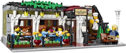
Just like with normal writing, you can create a wide range of font styles. Sure, they will look a bit pixilated made out of LEGO, but they should pop, if given enough distance. Since the letters match better when they are the same size, start with the letter you think will take up the most space; for instance “W” is notorious for being very wide. Once you are happy with the largest letter, you can then work on the smaller ones, which now should be fairly easy to create. Floors are the simplest ways to write on, followed by simple bricks in walls. As you get more experienced with writing with LEGO elements, you will start to incorporate plates and even sideways building techniques. Each method has its pros and cons, but this is generally how it ranges from least to most difficult in terms of designing.
➡ MAKING LEGO WALL FURNITURE
When you’re crammed for space in your LEGO creation but still want to furnish a room, the most obvious technique involves using the wall when creating your fixtures. The LEGO Parisian Restaurant gives three very distinct approaches on how this can be done. These methods involve functionality, stability, and finally decorative detailing.
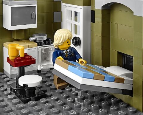
Functionality is the most obvious method. Just examine the Murphy-bed on the second floor of the LEGO Parisian Restaurant. The wall provides a convenient space for the bed to fold up into. The thing to consider is a solid mechanism to fold the furniture in and out. Namely, it needs to not fall apart every time you use it. And it will also need clearance. Note that there is a panel right around the pillow. If that wasn’t there, the bed wouldn’t fit.
Let’s follow that up with stability. From the Murphy-bed, head over to the kitchenette. The cabinet above can’t really be supported in the normal way. So it uses the wall as a stabilizing element to mount the top cabinet in place. One stud in from the top and bottom and you’re done.
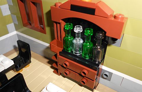
Finally the most subtle use is decorative. Take a look at the wine-display on the first floor. It really looks like a single piece. However, it is built in four steps. The first is the small unit the bottles stand on. Steps two and three are the left and right panels that are built sideways from the wall. The fourth step is the top which is also connected to the wall. Throw in the right elements and you’re using pieces for their natural shape and aesthetics rather than any functional use.
➡ USING LEGO TECHNIC PIECES AS DECORATIONS
I wanted to make a special reference here about certain LEGO elements we don’t normally think of as decorative. In this case, LEGO Technic pieces. LEGO Technic pieces are not known for their beauty, but their functionality. All these axles, pins, and pin-holes look very mechanical and machine-like, and we won’t consider them as decorations.
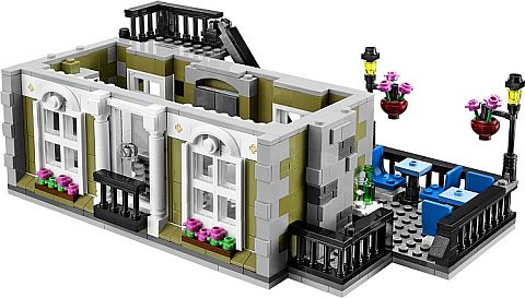
The LEGO Parisian Restaurant set takes a much different approach. Look at the windows on the second floor. Above the right and left of each window is a filled in axle hole being used as a decorative touch. This technique is hard to teach since it requires you to use your imagination to find the decorative potential in some of the least decorative elements. To incorporate this technique in your own LEGO models simply go through your LEGO collection and ask yourself; “What does this look like?” Keep in mind that you may have to turn the piece around several different ways to get inspired.
➡ ROCOCO ARCHITECTURE IN LEGO
Now it’s time to pay homage to the architectural style that was built into the LEGO Parisian Restaurant. Rococo originated in the 18th century in the latter half of the Baroque period. Like Baroque, it features stark three dimensional designs made to provoke emotions. However, where Baroque was mainly religious, Rococo was secular. At the time, it was considered a very frivolous design. This was probably in part to its more serious religious counterparts. Today Rococo is viewed as being an ultra classy posh design. It is almost an indulgence in excess.
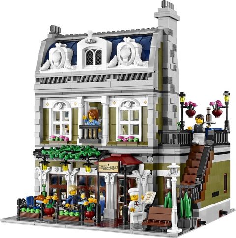
The signature features are the natural shapes in the designs. The sea-shells in particular are a prominent feature of Rococo. Other natural shapes like the feathers and croissants add to the type of detailing that defines the architectural style. Many of the other details like the fancy pillars on the first floor and rounded designs above the windows look nice, but they probably would not clearly be Rococo. This is why the ornate shell on the top floor is so important to establish the style.
➡ MAKING A LEGO FOLD-OUT ROOF
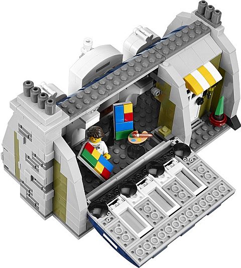
This feature is rarely if ever seen in LEGO sets, as they are almost always completely open at the back. Surprisingly, there are only two factors to consider when using this technique. The first is to make sure that the mechanism works; it swivels freely and has secure stops to hold it in the right place when closed. The other major factor is all about having the right texture for the roof. This model uses a variety of curved slopes to not only form the right angle, but they also create an interesting texture.
➡ ANCHORING WITH LEGO CLIPS
The most creative designs tend to use LEGO elements in very strange angles. Essentially this is what makes the Studs-Not-On-Top (SNOT) technique so appealing. One of the less common SNOT techniques involves using bars and clips to anchor elements in place. The LEGO Parisian Restaurant gives two examples of this technique. The first is the frames that fit around the two sea-shells. The frames are made in two parts and each is anchored by a bar and clip connection. The second example is the roof directly behind the sea-shells.
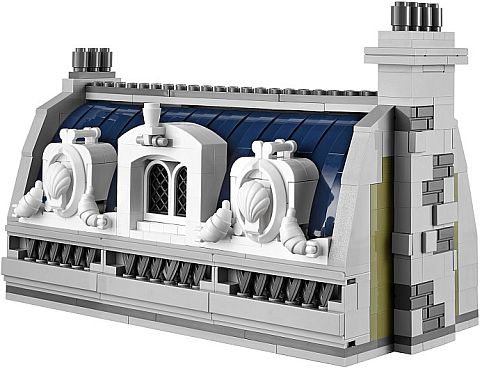
The reason why it makes sense for each of these are very different. The shell-frames are used purely to get the bars on the top in the right position and the round fender elements at the right angle. The fenders are the tricky part since there is nothing small enough stud-wise to fit them at that angle. Therefore it needed a much more creative connection-point to orient the frame. The roof, on the other hand, could use alternative types of connection. However, the bar and clip anchoring is both very secure and uses relatively little space. This is a major plus since the top loft is not the biggest space. The challenge to overcome with this technique is making sure the bar and clip does not swivel. Therefore, when designing, you have to keep in mind what pieces will hold it in the position you want it to be in.
➡ APPLYING WHAT YOU LEARN
Just using one of these many techniques can create a good LEGO model, and using multiples of them can help you make something great. Seeing all of these in a single set is the reason why people save up and buy multiple copies of the LEGO modulars. The new pieces in this set are particularly nice and allows you to build features that were not possible before.
This set is full of creative decorative ideas you can learn to use in your own LEGO models; the hidden messages, the compact furniture, using LEGO Technic pieces as decorative elements, making fold-out roofs, and using clips for anchoring are all advanced techniques you can study and experiment with for your own LEGO creations.
As far as using an actual architectural style like Rococo, it can add so much realism to your LEGO creations by giving them a time period and a story to connect to. The charm of the LEGO Parisian Restaurant is a good example of why we should study our subject before we begin to build.
As you can see this was a tremendously long post. But this is the kind of detail that the LEGO modular buildings offer. So what do you think? How do you like The LEGO Parisian Restaurant and the techniques we discussed here? Feel free to share your own experiences, tips or ask questions in the comment section below! 😉
And you might also like to check out the other reviews in this series:
- Brick Breakdown: LEGO The Hobbit Dol Guldur Battle
- Brick Breakdown: LEGO Winter Village Cottage
- Brick Breakdown: LEGO Winter Village Market
- Brick Breakdown: LEGO Lord of the Rings Council of Elrond
- Brick Breakdown: LEGO Castle Dragon Mountain
- Brick Breakdown: LEGO Lord of the Rings Pirate Ship Ambush
- Brick Breakdown: LEGO Ninjago Golden Dragon
- Brick Breakdown: LEGO Superman Black Zero Escape
- Brick Breakdown: LEGO Tower of Orthanc
- Brick Breakdown: LEGO City Dump Truck
- Brick Breakdown: LEGO Monster Fighters Ghost Train
- Brick Breakdown: LEGO Lone Ranger Silver Mine Shootout
- Brick Breakdown: LEGO Lone Ranger Constitution Train Chase
- Brick Breakdown: Ninjago Temple of Light
- Brick Breakdown: LEGO Lone Ranger Colby City Showdown
- Brick Breakdown: LEGO Lone Ranger Comanche Camp
- Brick Breakdown: LEGO Lone Ranger Stagecoach
- Brick Breakdown: LEGO Star Wars AT-RT
- Brick Breakdown: LEGO Arkham Asylum Part 1
- Brick Breakdown: LEGO Arkham Asylum Part 2
- Brick Breakdown: Legends of Chima Polybags


Before this review I never paid much attention to this set, because I don’t purchase City. But WOW!!! What a fun-looking build!!!
Yeah, a lot of Modular fans say this is the best in the line-up. 🙂
I want that chicken/turkey! in other words. my pprreecciioouuss
I know its not in the line up above, but I have the Hunted House(have not built it yet, but looks very cool.)
OOPS, Haunted house. To early to spell.
I see a lot of “grape juice” throughout the set. It’s nice that LEGO is relaxing a little in those areas.
Yeah, grape-juice is good for you!
I’ve heard so too. BUT IN NO WAY AM I IMPLYING FERMENTATION OF ANY SORT.
Fermentation? What’s that? 🙄
That is sooo cool
I wish I could get this set……. Its sooooo awesome! Best of the Modulars, really.
Also, I’ve finished setting up the layout and boards for my forum (http://starbricks.createaforum.com/ , its a LEGO forum). I’m the only user and it feels really lonely…… 😛
Any views would be really nice!
Yeah, running a forum is not easy. In fact, even with the thousands of readers we have right now, I would not consider adding a forum. Forums take a lot of work and a lot of very active membership. Otherwise it feels pretty dead. I prefer starting a website or blog first, and when the readership is huge maybe add a forum. An inactive forum looks a lot worse than an inactive website. 😕
Awesome design for your forum LK901. I’m ~SpartanElite~ because Brick is not allowed. 😀
Thanks for joining EliteBrick! 🙂
I also joined under this name! I really like the layout of the site. Also, great set review! I never would have used some of those techniques.
Thanks! 😀
I’ll join your forum too! It sounds like a lot of fun :). (I’ll be going as Bard the Bowman,)
Sorry changed my mind I’m actually Strider over there too. And btw I would highly recommend the forum to anybody else on here. And for anybody interested I started a page on Brickfilming, I know one person was disappointed that I left that out on my previous post.
Just watched the tutorial on making your own Finn hat on this page… It was brilliant !
I got so many great ideas from watching the techniques shown. My son is in his room right now getting pieces for me to alter. Can’t wait to get started ! Thanks for the inspiration and instructional video. You are the… FIRST person I have seen do these techniques… Bravo !