According to the information found on The LEGO Group History page, the Online LEGO Shop opened in 1999. That’s a long time ago! Previously LEGO fans could only shop for LEGO sets at official LEGO stores (if they were lucky to live near one), from various toy retailers, or via the phone from the LEGO shopping catalog. Bringing the LEGO shopping experience online was a major milestone that changed the way we interact with our favorite company. Since its original launch, the website went through several updates to keep up with changes in technology and the way people shop online. Right now LEGO is gearing up for another major update, and they would like to get your thoughts and feedback. 🙂
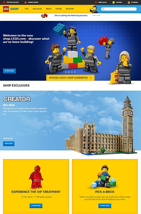
This is the email I got from Jesse Grab, LEGO’s Assistant Marketing Manager a few days ago: “This morning, we unveiled our new Shop.LEGO.com site in Switzerland, and we would love for you and your readers to check it out. We have been working hard to improve Shop.LEGO.com in order to provide our fans with an awesome shopping experience. Our team is still working on the new site, so we only made it live in Switzerland, in order to complete testing and gather feedback before releasing it in other countries. We value feedback from you and theBrickBlogger community, so please come take a look and explore the new site. If you want to share your thoughts, we set up a survey for you and your readers as well.”
If you would like to check out the new website and see how you like it, you will need to change your region to Switzerland when you visit the Online LEGO Shop. You can do that by clicking on the small “Change Region” link in the upper right corner of the site. Or you can just go directly to Shop.LEGO.com/en-CH (this is the address of the Swiss website in English). Once you took the new site to a spin, you can fill out the survey at the following link: LEGO WEBSITE SURVEY (UPDATE: this survey is no longer active and has been removed.)

I have been playing with the redesigned site for a while now, and while there are some features I like, there are also others I’m not so fond of. I do appreciate that the new site has a responsive design that automatically adjusts to various screen sizes. However I don’t like the big headers and all the unused white space. I have other thoughts on the design as well, which I have included when I filled out the survey.
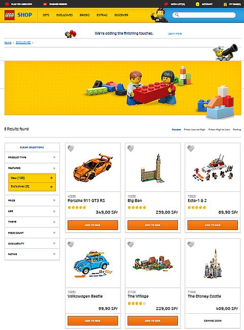
But what about you? What do you think of the new design? Do you like it? Hate it? What would you keep from the current design? And what would you change? Feel free to share your thoughts in the comment section below! And while you are welcome to discuss your opinions here, please also fill out the survey to make sure LEGO receives your valuable feedback. And of course you can continue using the current Online LEGO Shop, until the updates and changes take place. 🙂
And you might also like to check out the following related posts:









Survey filled out. I don’t like it. It is like a kiddie website instead of a shopping site. Useless huge headers and so much white space! And the set images are tiny. No way to easily see what’s within a category and sort it properly. I understand that mobile friendliness is the rage right now, but it doesn’t work well on mobile either. This is not a proper shopping site. I hope they will reconsider.
Pretty much my thoughts as well. The more of us share our opinions the better. Poor Swiss LEGO fans! 🙁
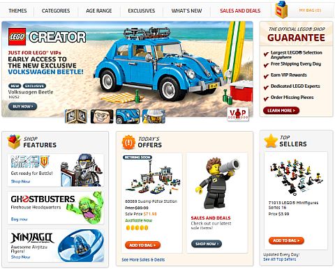
I just filled out the survey after having another test of the site. I wasn’t locked in again, thankfully. Of course, my computer is still outdated, so new functions won’t work, but the new site still seems to have odd image placement. For example, the 10252 on the home page is off the screen, save the back. The rest is empty beach. And then all the empty white is there too. It feels almost lonely and empty, which is not the feel shoppers want, I expect. There is the guy in the top right constantly waving at you, but he’s actually rather annoying. I also noted that the drop-down menu doesn’t work either: the list goes off the screen, and there’s no way to scroll down to see it. That is a major issue. Both these problems I noted in my survey response, although they weren’t all the issues I found. 😕
Also: http://brickset.com/article/22918/new-technic-parts-for-2016 I think this is the last straw… I have to get a Brickset account to comment on these kinds of articles. Huw missed some pieces…. 😕 On the topic of new pieces, admin, do you think I should write a roundup article of the best 2016 new pieces, since the previous four articles don’t have the best images or info? Or should I not bother, and wait for 2017.
I think you should definitely get a Brickset account. Your knowledge of new LEGO pieces is invaluable, and in general you have a lot of good thoughts and insights.
And yes, I think it would be a good idea to write a round-up article on 2016, because there are so many new pieces. For MOC-ers to have an idea on what are the most useful new pieces is very beneficial. It is something I regularly look for myself.
Yeah, I agree that the new website got a lot of problems. It seems like it was designed by people who don’t shop online, or know exactly what they want and only buy one item. Based on what I have read on Brickset and other forums, it seems like nobody likes it. 🙁
Thanks, I do try to keep good records. 🙂
I’ll write a cumulative new piece article. Although, it may be better to wait until the Rogue One sets and Death Star are revealed, so all their new parts are known.
I hope with enough feedback the LEGO team will redesign the new site, and fix the glitches. Otherwise, they should revert to the old site setup, which in my opinion works fine, although it too has a few problems. Maybe they should just fix the old site, rather than making a new one. 😕
BLProductions, do you right for the general public , and where would we be able to read your article? While I try to read each of the blogs admin writes, I’m just not able to, so I’m sure I’ve missed some interesting items.
I liked the pick-a-brick part. I really want to order some extras, but trying to use the current one is awkward for me. I’m sure it’s easier than I think, but when I try and search, I rarely find what I want. I plan on doing my survey as well.
Michelle, BLProductions’ articles are published here. Just do a search for “BLProductions” in the search box in the left-hand side-bar (about half-way down the page). 🙂
I don’t like the desktop site. They increased the size of everything and spread it out so much that you have to scroll a lot just to see what they recommend you look at, which one would think is something that they want you to see. I like seeing as much as possible with as little scrolling as possible. The way they redid the themes list makes it much too long, and delays you when you are looking for a certain theme. In general, the desktop site is just to large and spread out.
I really like the potential of the mobile site though. It has flaws, but at least we can access most of the desktop features. The old mobile site was so hard to use that I always just requested the desktop version and used that. So sure, it has a lot of strange bugs now, but it is still in development, and I can tell you from experience that developing something good looking for mobile is hard. Appearance aside, at least it mostly functions correctly. (on iPhone 6 chrome, at least)
I tried the new site out and I think there are things to like and things to dislike about it. I didn’t like all the empty space, it added a lot of scrolling up and down. Another issue I had, I don’t know if anyone else had this problem, was firefox would quit responding while the site was open. However, I think it was very easy to understand and move around on the site. I also liked the loading time, it was nice and fast for every page I opened 🙂
Sean, I had that issue with FF as well, but I figured it has to do with the site still being under construction.
Is BLProductions Boys Life?
Maybe ask him? 😉