You may remember that LEGO recently ran a survey to test out their new website design (see: Test Out the New Online LEGO Shop!), and many of our readers, as well as members of other LEGO fan sites, have given their feedback. If you have visited the Online LEGO Shop in the last couple of days, you have seen that the new design is now live. Such drastic changes can be both interesting and jarring for both the website owners and visitors, and LEGO will likely get a lot of feedback as they work out the various errors and glitches. I have been playing around with the updated website to get familiar with it, and thought to discuss the changes here as well, so we can help each other out with navigating this new maze. 🙂
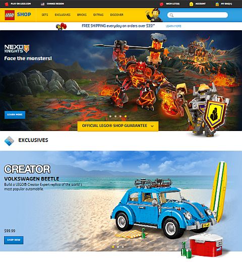
Releasing a major design change on a website always has its backlash. People get into a familiar routine of how to navigate around and get things done, and they don’t like to have everything changed up on them. It’s like one day you come home, and your entire house has been reorganized; you can’t find the bathroom, your bed is facing a different direction and is in a completely different room, and your favorite coffee mug is gone. In confusing situations like this, we often shut down, throw our hands up in the air, and threaten to leave and never come back.
Ideally, website updates should be done in small doses, so people can get used to changes in a gradual way. However when a site needs a major overhaul, and/or is transferred to a new platform, there is no way around it; you have to jump in the deep end, and brace yourself for lots of angry customers and damage control. For LEGO the major change was to make the site responsive with a fluid design that can adapt to whatever device you are using to access it. You can try this now; see how the website looks on your desktop, laptop, phone, or tablet. If you only have a desktop, you can just resize your browser window to make it smaller, and watch how the site adapts to different screen sizes.
The current trend in web-design is to primarily focus on mobile devices, and don’t pay much attention to how the site looks on a desktop or laptop. So while modern websites are able to seamlessly adapt to small screens, they look out of proportion on full screen sizes. Huge images that take up the entire screen and jump around, text that is either too big or too small, and lots of unused white-space is what desktop and laptop users are tortured with, plus the need for lots and lots of scrolling and clicking. I really hope that in the not-too-far future web-design will balance out between something that looks good on both large and small devices – but that’s a topic for another discussion…
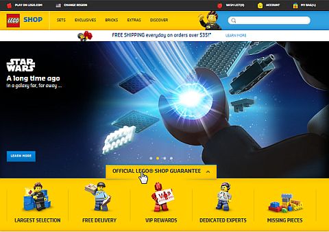
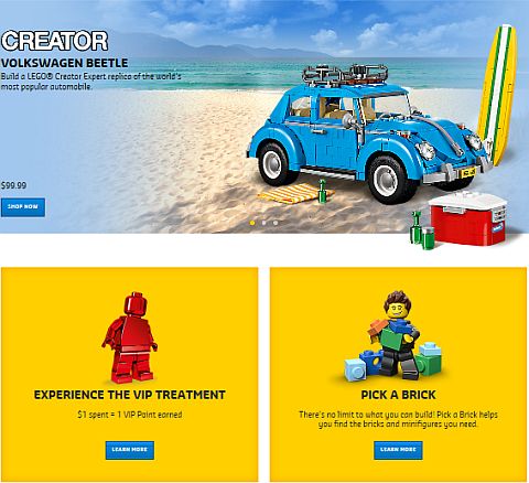
So, when you visit the new Online LEGO Shop, you will be faced with either some very big banners if you are on a desktop, or with a more proportionate layout on a small device. LEGO did take into consideration some of the feedback, and the banners on the homepage and the white space around sets are actually now smaller, but this is still clearly a mobile-first site. However, while it might not be obvious at first, there is some useful information on the homepage beside the shockingly big banners. Under the first banner, you will see a button Official LEGO Shop Guarantee. If you click on this, you will find five icons: Largest Selection, Free Delivery, VIP Rewards, Dedicated Experts, and Missing Pieces. It doesn’t matter which one you click on, they will all take you to the same page, where each of those headers are explained in more detail.
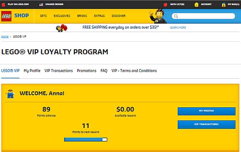
The VIP Rewards link is particularly useful because it will show you visually how many points you have, if you have any rewards available, or how many more points you need to get a reward. There are also two buttons; My Profile and VIP Transactions – the second of which will show you all your previous purchases and the points you earned on them.
The Dedicated Experts link will take you to customer service, where you can email, call, or access various help topics. The Order Missing Pieces section will take you to Bricks & Pieces, where you can either get a replacement of missing parts (this is a free service), or order extra loose pieces (this is a paid service).
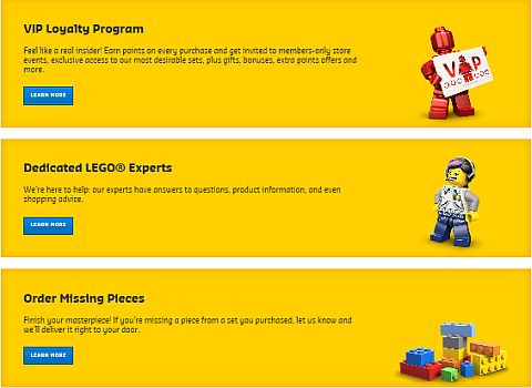
Going back to the homepage, there are two other pictures under the banners, one that will take you to the same VIP page, and the other is to take you to Pick-A-Brick (which is similar to, but also different, than Bricks & Pieces – a topic I will write about separately). There are also some other useful links on the homepage; Subscribe to LEGO Shop Emails, Check Order Status, Find a LEGO Store near you, etc.
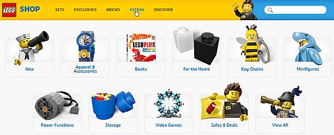
Returning to the top of the homepage is where you will see the main navigation buttons to actually do your shopping. On mobile devices this shows up as a dropdown menu under the Shop button, and on desktops it appears as a horizontal banner. You can look at Sets, Exclusives, Bricks, Extras, and Discover. You can click on any of these to reveal a sub-menu. I’m not going to go through all of them as most are self-explanatory, but I wanted to point out a few features that you may be looking for from the old site.
The Seasonal items section is now gone, and you will have to search for each set by name or set number. LEGO has been getting a lot of negative feedback on this, so hopefully, they will bring the category back. If you are looking for the previously very useful New and Sales & Deals sections, you can access them under the Sets tab. The Exclusives tab does pretty much the same thing as before, but now new exclusives are separated out with a sub-tab. The Bricks tab includes a mishmash of sub-tabs, including another way to access Pick-A-Brick and Sales & Deals, LEGO Classic sets, other sets with individual pieces (like LEGO Serious Play), and various Brick Accessories (i.e baseplates, train tracks, etc.). I don’t think I will ever use this section as it is too confusing.
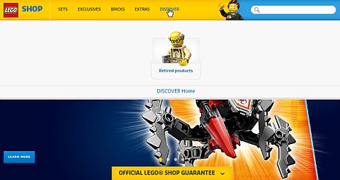
The Extras tab includes various items like Apparel & Accessories, Books, Storage, Video Games, etc. The last tab on the homepage banner is called Discover, with a single sub-tab for Retired Products. My guess is that LEGO may be developing this section more in the future, because right now it doesn’t make much sense.
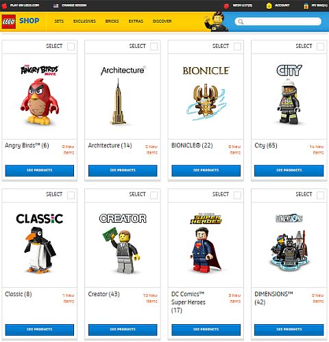
Okay, so you are ready to buy something. If it is a set, you can select a sub-category from the various themes under the Sets tab on the homepage. Let’s say you are itching for some LEGO City sets. You can open that sub-category and look at all the sets currently available. This section works much the same way as before. You can sort the results by Newest, Price: Low to High, Price: High to Low, and Rating. By default 18 sets are shown on the first page in three columns (or one column on mobile devices). If you scroll down to the bottom of the page, you can click View All to see all sets at once.
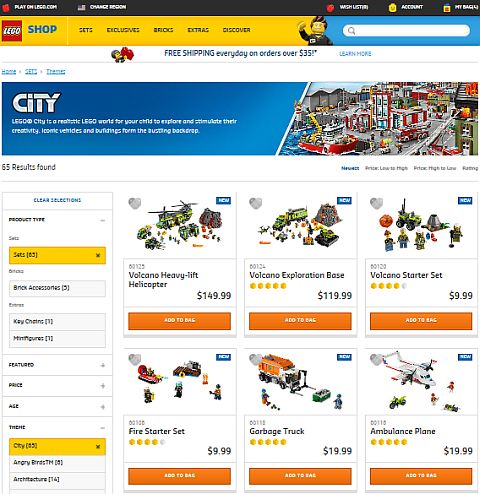
There is also a left-hand column, which you can use for filtering results (this appears as a tab on top of the page on mobile devices). The filters work much the same way as before, and especially in large themes with lots of sets they can be very useful.
Pages for individual items look nice. I especially like how viewing the set pictures works. You can blow them up really big to look at all the details. Everything else is there from the previous website; set description, reviews, link to building instructions, recommendations, etc.
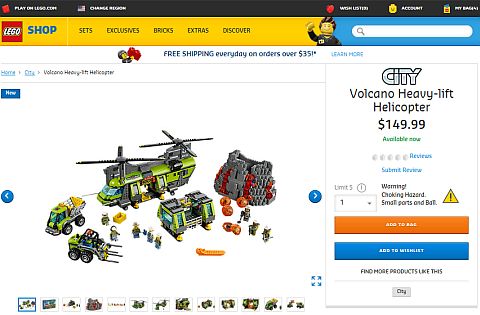
Besides each set there is a gray heart, which you should be able to click on to add the set to your Wish List. Unfortunately, for me this feature doesn’t work at all on any browser, however others reported it works for them. If you are ready to purchase, you can just use the Add to Bag button below the set. The checkout page also looks pretty much the same as before, so there is not much to address there.
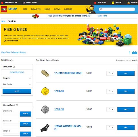
While most areas of the website seem to work, there is one section that got a lot worse since the previous website design: Pick-A-Brick. There are almost a hundred categories to choose from, all lined up in one column, with the Apply button all the way at the bottom. So if you want to see what’s within a category, you have to first scroll down to it, select it, then scroll down all the way to the bottom to hit Apply, then scroll all the way back up to see the results. You have to go through the entire process again and again with every choice you make. And as it turns out, most of the categories are completely empty. The mobile version of the site is slightly better, as it has an Apply button both at the top and the bottom, so you can hit whichever is closer, but you still have to scroll through all those meaningless categories to select anything. I really hope this will be fixed soon, as right now you can’t really place Pick-A-Brick orders without losing your mind…
So that’s pretty much it, as far as the new site. I have also included a short video above from LEGO, introducing the updated website. After the initial shock, I think it mostly looks and works fine. There are definitely areas that need fixing (like the Pick-A-Brick section, Wish List, more intuitive navigation, bringing back the Seasonal items category, etc.), but overall I’m warming up to the facelift. The site especially looks good on mobile devices, and on my laptop I just have to zoom out a bit to be able to see things better. I should mention that the first day I used the site it gave me a lot of error messages and pictures were all out of whack. I think this has to do with my browser history not being cleared. By the next day everything looked fine. So if you run into any glitches, try clearing your browser history and cookies.
If you are ready for an adventure, head over to the updated Online LEGO Shop and look around. Then come back and let us know what you think, what interesting things you find, and what features you discover. Is the new site working better or worse for you? What do you like? What you don’t like? Feel free to share and discuss in the comment section below! 😉
And you might also like to check out the following related posts:







The old mobile site was a pain (not that I used it much anyways, and when I did it was on a kindle, and my experience is that most mobile sites are annoying on a kindle – more watered down than necessary – but the problem with shop was that I couldn’t access the desktop version on any page other than home) so from that point of view this is better, but it is a little ridiculously large when it comes to a laptop and a desktop would of course be even worse.
I spent fifteen minutes or so playing around with it earlier today and it was easy enough to navigate (the heart button to add to wishlist worked fine for me, by the way, and I like how you can now either add to bag or to wishlist without actually opening the set page). The set pages themselves are also pretty handy though I miss having the piece count to the right (now you have to scroll down a bit).
I also like the new mobile version, expect for the Pick-A-Brick section, which doesn’t work well on either big or small screens. I don’t know why the Wish List feature doesn’t work for me, but I’m not the only one. A whole bunch of people are reporting the same problem on Brickset. I have discovered however that I can add items to my Wish List if I first log out. When I log back in, they are still retained, so that’s cool. But when I want to add the next item, I have to log back out again, add it, then log back in. 🙄
That sounds like a pain! haha (With regard to the Wish List – but I guess that means that it’s not your browser.)
I noticed that sets are apparently no longer always ordered by Available – Out of Stock – Sold Out. And it’s funny how sometimes there’s no price listed (as you scroll through) and sometimes there is for Out of Stock sets.
I noticed that too. I have also seen random blue buttons to put the item in your bag, instead of the orange one. No idea why. 😕
Admin, I keep trying to post a comment on here, but it always takes me to an error (404) page. I’ve tried about four times. Could my comment by too long? It’s only 209 words (according to Microsoft Word). 😕
Hm… I’m not sure. This comment came through, so I don’t think there is an overall commenting problem. As far as I know, I don’t have a word limit on comments, but WP may have some built-in limit that I’m not aware of. Maybe try breaking up your comment and see if that works?
Okay, I just read up on this a bit, and it is indeed something other bloggers have run into when their readers are trying to leave long comments. It has something to do with security, but that’s all I was able to find out so far. So yeah, try to break up your comment to two parts and see if that works.
Same problem with the wish list. I hope they fix this soon. And everything take so long to load!
OK, thanks admin. 🙂
After having another look at the site, I have to say that overall, if you know exactly what you’re looking for, it’s not too hard to find it. My biggest issue with the site is with the themes list. For some reason, the drop down list of themes will not scroll (I’ve said this previously), although the scroll bar says I’m scrolling down. So, I can only use it to get to themes listed before Dimensions. All others must be accessed with the filter, which I quite like, and it works well.
I also don’t like the setup of sets per page. It’s like they don’t fit on the page, but I suppose that’s because of the one-column mobile version setup. It just adds more scrolling…. 😕
Yeah, lot more scrolling and clicking than we had to do previously – that’s for sure. I can’t help with the scrolling issue because that part works for me. BTW, I just got an email from LEGO’s customer service (I opened a ticked because of the issues I found on the site). The rep said to try to clear my temporary internet files and cookies. I have done that before, and it didn’t help my Wish List problem, but it did solve the big error message banners. So you might want to give that a try. Also, they gave me 100 VIP Points for the trouble, which was a nice surprise. 🙂
How do you clear cookies? I’m not overly familiar with this Internet stuff.
I also noticed an issue with the themed banner at the top of each page on the site, where its picture wouldn’t change with the theme, only the logo. I found that slightly annoying. 😕
Also, completely off-topic, can I still write that article about the largest LEGO sets ever, now that the Death Star is revealed? I should be able to finish it quickly.
Yeah, if you have time, please do so. It’s an important article I definitely want to publish. So sure, as soon as you have it I can have it scheduled.
As far as clearing cookies, this is copy-paste from the email I got. It should help: No matter what the specific problem is, it usually helps if you delete your temporary internet files and cookies. You can quickly get to the right place to delete your cookies by pressing Ctrl+Shift+Delete if you’re using Windows or Shift+Command+Delete if you’re using a Mac. Once you’re there, tick the box or boxes for ”Cookies” and ”Temporary Internet Files” and then hit enter on your keyboard. It also helps to restart your browser afterwards.
Ok, I’ve already started working on the article. BTW, can I put a table in the text, or is that not possible for your format? Otherwise I can just type it in as a list.
Thanks for the quoted instructions, I’ll do that. But does that clear cookies for all websites I’ve been to, or do I need to be on LEGO.com/shop to clear just those cookies?
All your cookies will get cleared. Don’t worry, cookies suppose to update every few days anyway, so it’s not like you are going to loose anything. As far as tables, I have used them a few times, but they could be a bit iffy. Maybe you can include both a table and a plain version, and if I can use the table I will add it, if not, I will use the plain text version. (If it’s not too much trouble for you to do both.)
There are two major improvements in the pick a brick section. The search by exact color feature will prove quite useful to me; and the prices per part are at least in some cases considerably less than last time I looked.
Thanks for sharing that. I was so distracted by all the scrolling that I haven’t even noticed that. Will have to check it out. 🙂
Did anyone notice that you’re not getting VIP points for pick-a-brick? I tried contacting customer service about it, and they were “kind” enough to send me a form letter explaining the VIP program — and it still didn’t answer my question! (I was actually quite shocked because their customer service is usually pretty good but they got a zero this time.)
My understanding is that you don’t earn VIP points on Pick-A-Brick orders, but I could be wrong.