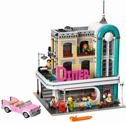
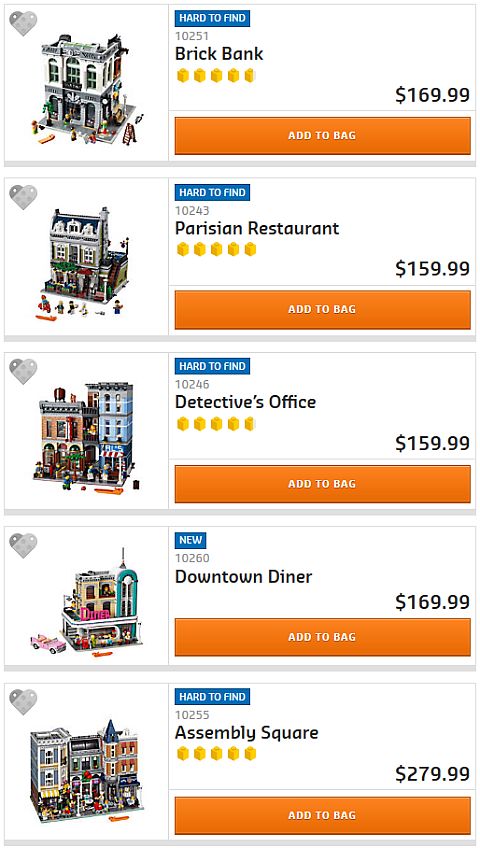
One of the most interesting structures in the LEGO Modular Buildings series is the recently released #10260 LEGO Creator Downtown Diner. The façade of the building mimics the late Art Deco architectural style of the 1930s, usually referred to as Streamline Moderne or Art Moderne. The pink, teal, and white color-scheme, curving shapes, and large windows of the LEGO Creator Downtown Diner are all faithful representations of this unique style. The ground level of the building features a 1950s-style diner, which fits in perfectly with the exterior. 🙂
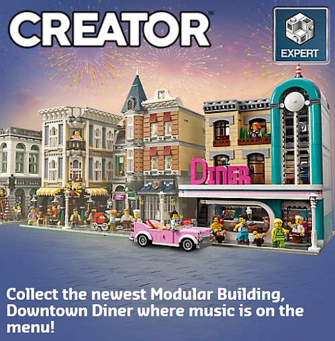
However, the rest of the #10260 LEGO Creator Downtown Diner is a much plainer tan and light-gray structure, that some LEGO fans feel is an out-of-place filler. Similarly styled real-life Art Deco building are usually one-story structures that stand by themselves, and aren’t part of a long and continuous street layout like the LEGO Modular Buildings. Or, if they are taller buildings, then usually the whole structure follows the Art Deco styling.
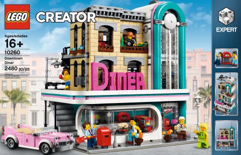
It is interesting to note that in the designer interview, LEGO Senior Designer Mike Psiaki shares that the idea for this set started with an Art Deco-style one-story car dealership, but since such a structure didn’t really fit with the rest of the LEGO Modular Buildings, it later morphed into the multi-story #10260 LEGO Creator Downtown Diner. You can watch the interview here: LEGO Downtown Diner Designer-Video
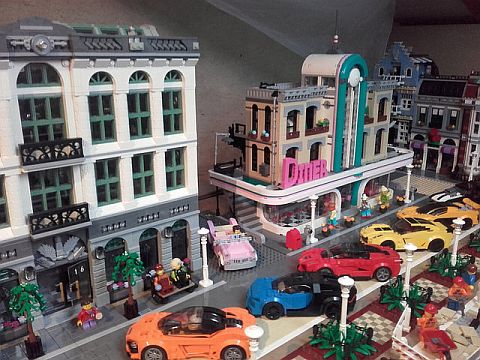
A number of LEGO fans have been working on turning the #10260 LEGO Creator Downtown Diner back to its purely Art Deco look. Today, I thought to show you some of my favorite ones.
The first modification is by LEGO fan Sjaak Lego (see above). He basically combined two of the sets into a larger standalone building. The curved tower was moved into the center, with the entry door below it, and the two sides of the building are mirror images of each other. Giving the building its own block allows the Art Deco style to shine without clashing with the neighboring buildings. This is the easiest modification to do, but you do need to purchase two of the sets.
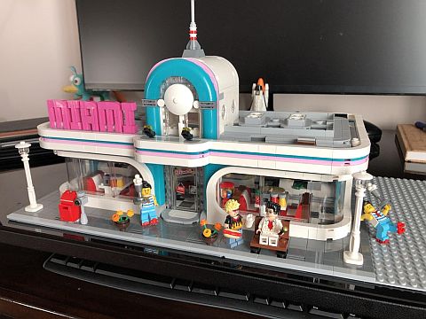
The second modification is by LEGO fan NoInternetMushroom. He also positioned a shorter version of the tower and the entry door to the center, and mirrored the sides of the building, but he also removed the second and third floors that weren’t really Art Deco style. This leaves us with a one-story, purely Art Deco diner. Also, notice that the lettering was changed from “Diner” to “Miami”, using the same font style. Looks nice, isn’t it? If you would like to build your own retro diner, the LEGO Digital Designer file is available here, and the PDF parts-list is here (the blue part numbers are clickable in the PDF file, and link directly to the parts on BrickLink). If you already have the #10260 LEGO Creator Downtown Diner, you will have most of the necessary parts, but you will also need some extra pieces to mirror the two sides of the building.

LEGO fan SpaceBrick created three modified versions of the #10260 LEGO Creator Downtown Diner. The first modification is similar to the one above, but the tower was kept tall, and one side of the building serves as a diner, and the other side as a car dealership (thus bringing back the original idea of LEGO designer Mike Psiaki). The second modification elongates the car dealership side with an added gas station. And the third modification improves on the entire structure, and puts it in an expanded environment. The central tower now serves as a radio station, adding an additional function to the building.
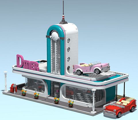
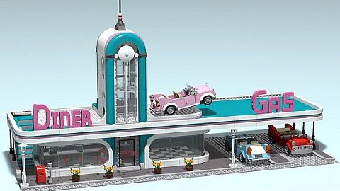

As you can see, there is a lot that can be done with the #10260 LEGO Creator Downtown Diner to improve its look. Of course, the original building itself is very nice, but if you would like to enhance and emphasize the Art Deco style, you have plenty of options to do that as well. If you don’t have the set already and/or you would like to give these modifications a try, the set is available under the LEGO Creator section of the Online LEGO Shop.
What do you think? How do you like the #10260 LEGO Creator Downtown Diner? And what do you think of these modified versions? If you have the Diner already, have you done any modifications to it? Feel free to share your thoughts and own ideas in the comment section below! 😉
And you might also like to check out the following related posts:





Ooohh! I like that car dealership diner combo!
The one-story diner version is how this set should have been done in the first place. But then, of course, it wouldn’t match rest of the modulars. I understand why designers did what they did, but it’s nice to see people taking the time to make it more accurate. Love the diner/dealership combination!
I like this three storey version done by cimddwc the best:
https://www.eurobricks.com/forum/index.php?/forums/topic/157896-mod-a-more-streamlined-diner/
That looks fantastic! Better than the original!
Wow! I like that too! 😀
How about a Diner / drive in movie theater. That might look interesting.
Would love to see that! 😀
Love these! It makes the set more like a real Art Deco style building rather than an old building with an Art Deco renovation. While most of them won’t directly fit with the Modulars (at least not in a row), the one Alison linked to could work well even on a Modular street.
I have to get the set first . It won’t be for while.
Thank Very Nice work
Wow! Thanks for sharing this information. I really like the back-to-back diner sets. I could see the one with the gas station being used as the carhop part for the diner. Oh, the possibilities!
Su, yeah, there are lots of possibilities with this set! Have fun! 🙂