
(Written by William)
Before looking at the unique building techniques in the #10260 LEGO Creator Downtown Diner, I just wanted to briefly address the biggest change in this set compared to the previous LEGO Modular Buildings; the minifigure faces are more detailed, instead of just being simple smiley faces. Personally, I like the more expressive facial features. I wouldn’t want to give up my singing Elvis, that’s for sure. However, if you are a traditionalist, and would prefer simple facial expressions, you can give LEGO’s customer service a call, and purchase the smiley heads separately. The element ID number is #9336, and the cost is around $0.28 per head, plus tax and $2.95 shipping. Now let’s talk about the building techniques! 🙂
➡ STREAMLINE MODERNE & GOOGIE ARCHITECTURE
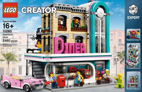
Both the official set description and the designer-video refers to the style of the building as Art Deco, or more specifically, a later version of Art Deco called Streamline Moderne. However, the LEGO Creator Downtown Diner is actually more of a combination of styles. Early Art Deco featured a monolithic look with lots of repeating geometric shapes – often with hard, sharp angles. It wasn’t until Streamline Moderne that we started seeing rounded shapes, like curved windows, porthole windows, and a more horizontal approach.
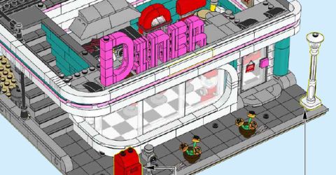
Besides the Streamline Moderne influence in the LEGO Creator Downtown Diner, there is also reference to Googie architecture. This is the style that you see in the typical 1950s diners, with oversized signs (like the “Diner” sign in this set). Large pylons that sort of look like the side of a giant jukebox are also typical for this style (as represented in the curved tower section of the LEGO Creator Downtown Diner). All of these unusual shapes were meant to capture the idea of speed and the atomic age, and what people envisioned the future might look like.
In the LEGO Creator Downtown Diner, Streamline Moderne and Googie are wrapped around a more traditional building, adding another architectural style to the mix. Some LEGO fans view this as perhaps an older building that got renovated with a more modern façade.
So, what does it take to design your own Streamline Moderne/Googie building? Start off by concentrating on having distinct shapes. Next, make sure to limit the number of sharp corners in these shapes, and focus on curves. Your style choices should be a bit bold, like having large pylons, but don’t overdo it. You want to stay as sleek as possible. It also helps to look at real-life examples of these styles. A good place to begin is on these Wikipedia pages: Art Deco, Streamline Moderne, and Googie.
➡ ABSTRACTION WITH LEGO
While we are on the topic of architecture, I want to point out a second architectural technique used by the designers of the LEGO Creator Downtown Diner, called abstraction. Abstraction is where you take an object, like a jukebox, and use it as a starting point for your building. The process is usually done like this; start with an object, and determine what aspects of this object are most important. For instance, the overall shape is usually kept, along with maybe a few distinct attributes. Then, the design is refined to add in necessary building aspects like doors and windows. This is also when the shape of the original object that provided inspiration may get expanded or stretched to help serve the needs of the building. After this, you give it another pass to clean up the model, and maybe tie it together with an architectural style, like we discussed earlier. The end result will, hopefully, be something that is rather iconic and unique.
➡ BUILDING FONTS WITH LEGO
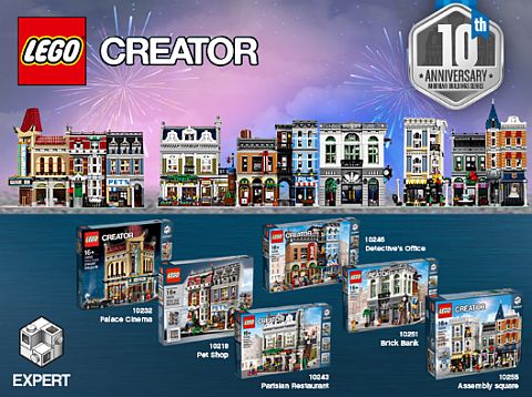
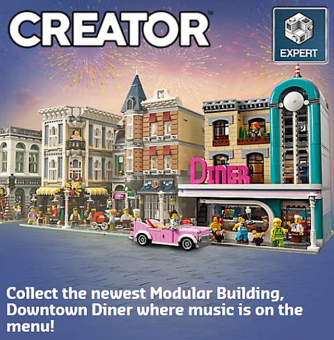
Over the years, LEGO gave us numerous examples of writing out words with LEGO pieces; the HOTEL sign in the #10182 LEGO Creator Cafe Corner, the SHOP sign in the #10211 LEGO Creator Grand Emporium, the PETS sign in the #10218 LEGO Creator Pet Shop, the PALACE sign in the #10232 LEGO Creator Palace Cinema, the POOL and AL’S sign in the #10246 LEGO Creator Detective’s Office, and now the DINER sign in the #10260 LEGO Creator Downtown Diner.
Learning how to build all these different font types in so many different ways is very inspiring and educational. I even used these examples to build my own signs over the years. The important aspect of building signs is, surprisingly, not “How do I build words?” but rather, “How can I make a consistent font?” If you can figure out the second question then you can probably puzzle out how to make it all work.
The best way to start is to first figure out what the word is you want to build. If you already have a particular layout in mind, this can provide a way to judge the amount of space you have to work with. For instance, having roughly eight studs worth of space will probably rule out any long words. I often like to figure out what my constraints are even before choosing a word to build.
Next, determine if you want capital and/or lower case letters. This will make it so that you can measure out what the space difference will be between the letter types. Are capitals going to be one brick taller? And, are capitals going to be a slightly different style? For example, a capital “A” in Times New Roman looks nothing like a lower case “a”.
In the case of the sign on the LEGO Creator Downtown Diner, LEGO designers used the architectural style of the building itself to direct what the letters would be like; using strong curves. They also decided that the font would all look the same, but capitals would be slightly larger. You can see this by looking at the letter “I” since that is definitely a capital style, but clearly, it’s not used as a capital due to its smaller size.
If you’re still not sure how you can choose a font, then try this. Go to a free font site and look up fonts with words that look like what you want to build. So, a train station might use words like “tracks” and “railroad”, and a BBQ place might use words like “grilled” or burnt.” You’ll find that many fonts have very straightforward names like that. After finding a font, study it, and see if you can make it out of LEGO parts. And that’s pretty much it. Sure, you’ll likely make adjustments later, but as long as you have the font designed right, then most of the work is done.
➡ USING NEGATIVE SPACE WITH LEGO
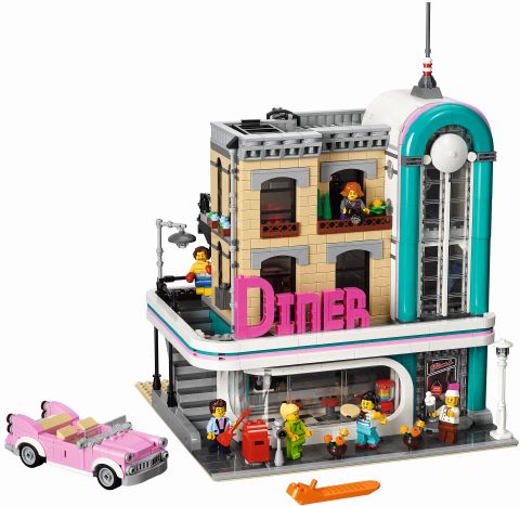
There are many pieces in the LEGO parts library that have extra space available in their nooks and crannies. I’m not talking about pieces with holes that you can stick a bar through, rather I’m referring to less obvious spaces like the underside of arches. These spaces might not form stable and traditional connections with other pieces, but they can still be useful. The LEGO Ideas Downtown Diner gives us three examples of such connections.
The first use I want to point out is in the light-gray trim right below the roofline. It is made of a series of modified tiles with bars that are placed upside down, framing finger hinges. What you get is a sophisticated looking design, when in reality all that’s happening is that the negative space of the modified tile is being used to frame another piece. The combination of the two elements tricks your brain into thinking that whatever you are looking at is very complex. Window frames (without glass or shutters) are particularly great for this purpose, as they have a natural negative space that can frame other elements.
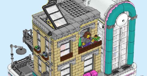
The next use of negative space is all about accommodating. For an example, take a look at the inverted arches for the porthole windows. The arch bricks use corner panels of two types to essentially accommodate an unusual building situation. When building the windows, it was necessary to have an upside-down arch brick, however, there is not a lot of room to make this happen. So the compromise is that if you can’t build it, can you at least accommodate it? In this case, the panels could do the latter. They are there to support the arch vertically while fitting around some studs that are kind of in the way. It does this by utilizing the panels’ negative space. It is important to note that these sections aren’t attached by any normal connection. They are simply built around and held in place by the geometry of the parts around it.
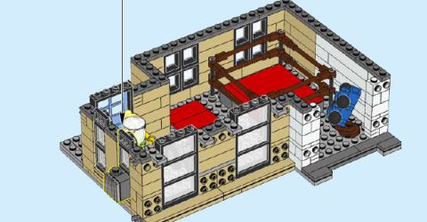
This brings me to the final example of using negative space, which can also be seen with the usage of the arches in this set. The inside of arch bricks is generally hollow, with enough space for just about one and a half plates, or the width of one stud. Although plates can stick inside the arches with a wiggle, the arches natural geometry works well to lock in the parts from falling out. Both the tall skinny windows of the left side of the tan building and the porthole windows use this technique in a very effective way.
➡ APPLYING WHAT YOU LEARN
Whenever you plan to design an intricately detailed building, it helps to have an overall style in mind. This helps to put your creation in the time and place you desire. Remember, anything that gives context to your builds will always be your friend on your path to becoming a master builder.
As for abstraction, I believe I mentioned it when we talked about the #21050 LEGO Architecture Studio set since it is one of the first things covered in the book that comes with it. The important takeaway here is that there is a difference between architectural technique and architectural style. The first usually tells us how to make something, while the latter is about how that thing should look. Another way to remember is that style is made up of many techniques. Abstraction is just one of those quasi techniques that border on style.
And, nothing says style like a good font. In fact, having a name attached to your building gives your model character. With that said, designing a font out of LEGO bricks is not easy. Many of your first attempts may result in finding out your letters don’t fit the space you have for them. So the best piece of advice I can give is to first figure out how much space you have to work with, and then see if you can build anything within that limitation.
Finally, understand that your building limitations are more of a case of whether or not something fits, rather than if there are reliable connection-points. If you learn nothing else from the LEGO Creator Downtown Diner, it should be that you can have many free-floating elements that make up your model. Sure, this doesn’t lead to the best stability, but it can open up a whole new world of possible designs with pieces you may already have in your collection.
What do you think? How do you like the #10260 LEGO Creator Downtown Diner? Did you build it yet? And what do you think of the building techniques we discussed here? Are there any other interesting techniques you found in the set? Feel free to share your thoughts and own review in the comment section below! 😉
And you might also like to check out the following related posts:


Thanks for the excellent analysis of styles and techniques. It was a pleasant surprise to see such an in-depth article on the Diner. That really adds context to the build 🙂
It’s always been my impression that modular buildings are designed a bit more for an older audience.
Therefore, I don’t want to just treate them like any other toy review. I’m glad it helps add to the experience!
The section on abstraction and using negative space was interesting and informational. Thank you. I don’t have the patience to analyze lego sets in such great detail, but always enjoy reading about it.
Happy to educate or entertain, or “Edutain?”
The funny thing is when it comes to negative space I actually can learn a lot just from opening a set’s bags and sorting the pieces. Mainly because I’ll find all manner of parts jammed together in places they weren’t specifically designed to go. ;D
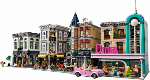
I still haven’t decided about getting the Diner. It’s a very different style, and neither the style nor the colors match the other modulars. Some days I want to get it, other days I think I will just skip this one. What do you guys think?
Personally for my own LEGO City I prefer a much wider variety when it comes to divergent styles. This keeps it from being a bit drab in tone.
I’d probably have problems with the Downtown Diner if it wasn’t for the fact it is based in reality.
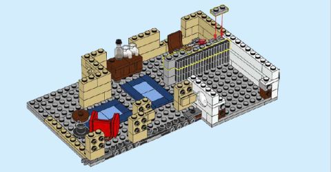
As for play, the inclusion of a gym and recording studio seems like interesting additions to me as well.
I guess my question to you is what are you looking for in your own modular city?
Will, thanks for responding. I like the interior very much. It’s that teal and pink that’s making me nervous. None of the other modulars have those colors, which make this building really stand out. Both the style and the colors being so unusual is what’s my problem with the set. If it would be just one thing, I would get it in a heartbeat.
I’m not Will, but here is my suggestion. I see where you’re coming from, and I agree that the Diner can look out of place next to some of the Modulars (especially the older ones). But it looks great next to some of the newer Modulars like the Detective’s Office and Assembly Square. So, you can put the DIner in your city wherever it doesn’t clash as much. And frankly, even in real life, Art Deco buildings are odd. This is why many people don’t like the style.
If I’d make a city, I’d probably use a lot of wilder colors to break up the monotony…
Yes, don’t be afraid to be wild! 😈
I like your approach. And it is true that some of the Modulars don’t look the best next to each other, but when you put them in another position they are just fine. The Diner is no different in this regard. So yeah, just put it next to a building where it fits the best. Or put it around the corner, or on a new block. There are plenty of options. 🙂
Judging on the research I did but didn’t bring up, I think what they were trying to simulate was lots of neon light. But the shapes in the various transparent colors are still fairly limited. Plus I don’t think using hoses would look that great.
So the color is an approximation and a compromise.
But I do think others have very good suggestions, especially when it comes to pairing the building with the right buildings.
Keep in mind that teal is an interesting color in that it’s between blue and green. So if you want one color to stand out more you can put it next to a building of the chosen color. For example sticking it next to the Green Grocer makes it look more green.
Another suggestion is to actually keep this building apart from others since many diners with this type of architecture were road side atractions and weren’t really near anything else. Think of it like a hardrock café that figs drive to when they want something different.
Just know that real life city planners have to make the same decisions as you are right now. There’s no mistaking it this is a rather gaudy building.
Good luck with your choice!
So using negative space is considered a legal technique even though the piece inside is not connected to anything and is just propped up by the surrounding pieces like the arches here? The criteria for this technique is that the piece can’t fall out? Anything else?
I will let William answer that for you. 😉
Ultimately that is the long and short of the technique.
At least that’s what it is when used as a “building” technique.
Many times negative space is used as a staging ground for an action element like when rocks fall.
Negative space can also be used as a decorative enhancement, the gumballs in the gumball machine are a good example of this. Technically they are locked in place but they aren’t used specifically for building anything. Rather LEGO uses the transparent properties of the clear dome to display the negative space it has.
I guess if you want to add anything else to the technique’s description is that negative space is found in areas where connections aren’t intended to be made.
That way you are designing more by composition rather than connection.
I hope to get this set someday. Very unique style. And the advanced features makes me want it even more.
Speaking of Smiley Heads, they’re also easily found on BrickLink…
Yes, and if you have a LEGO store near you, they are often in the minifig bins as well. 🙂
Such a unique set! I like your point about abstraction. I sometimes think that a building looks like something, but I thought it was just by accident, and didn’t know it was an actual technique architects used!
Oh, yes, for sure! My dad is an architect and he got inspiration from all kinds of objects; an old radio, a weird tool, one of our toys, a kitchen appliance, a rickety old cabinet… so many things. 😀
Makes sense since I feel architecture is just one other type of artistic expression. And like with any art piece it helps to have a muse.
Of course the LEGO designer was probably getting inspiration from Hardrock Cafes which definitely use the abstraction technique and typically take the form of musical instruments for their building design.
Hey Admin do you think you could recreate some of your dad’s designs in a small architectural type scale?
Hm… he is into building giant tents these days for airports, stadiums, large public pools, etc., which would be sort of hard to re-create in a small scale. A larger scale would work however, using techniques like in the LEGO Sidney Opera House. Basically his tents look like the white top section of the Opera House. 🙂