If you visited the LEGO’s main website or the Online LEGO Shop in the past week or so, you may have noticed that they have gone through some significant changes. These changes have been gradually implemented over several weeks, and then finalized with changing the domain names as well. I have been following the development closely, so I thought I share some of the most significant changes I have seen so far.

The previous address of the main LEGO website was LEGO.com. This is where you would find information about the various LEGO themes as well as fun activities for kids. Once you clicked on a theme you were interested in (for example, LEGO Star Wars), you were taken to the dedicated micro-site of that theme (for our example that is LEGO.com/Themes/Star-Wars) with lots of information about that particular theme, along with pictures, videos, downloadable content, interviews with designers, back stories, alternate builds, fun activities for kids, and more. Every micro-site also had links to the Online LEGO Shop, so if you wanted to purchase a set you found at the main LEGO website, you were redirected to the Online LEGO Shop (for our example that is Shop.LEGO.com/Category/Star-Wars).
The Online LEGO Shop had its own separate dedicated website at Shop.LEGO.com. This is where you could purchase all the currently available LEGO sets, books, gift items, and more, And, if you are a LEGO VIP member, you could also look up information about your account, earn and redeem VIP points, track your orders, look at your order history, etc. With the recent changes, almost everything has been switched around, but don’t panic, with a little bit of poking and searching you should still be able to find most of the features of the old website.
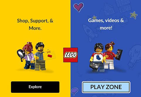
Now, when you visit LEGO.com you are given two choices; SHOP, SUPPORT & MORE, which is basically the grown-ups section of the site, and the PLAY ZONE, which is the kids section of the site. In my experience, this choice is only shown the first time you visit LEGO.com, or when your session cookies expire, or when you use a different browser, or sometimes when you visit a section of the site you haven’t accessed before. Otherwise, the next time you visit LEGO.com, you will be taken to the site of your initial choice. But don’t worry, you can always switch over. If you originally selected the grown-ups zone (which is mostly the Online LEGO Shop), you can go over the PLAY ZONE by clicking on the blue KIDZ ZONE button at the top navigation bar. And, if you are in the PLAY ZONE, you can go over to the shop and other grown-up oriented sections of the site by clicking on the FOR GROWN-UPS link.
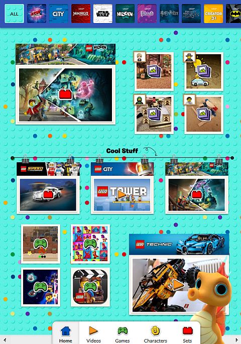
In simple terms this means that now LEGO.com accesses the Online LEGO Shop, and LEGO.com/Kids is the PLAY ZONE specifically targeting kids. At least to me as an adult, the PLAY ZONE looks like an unusable and un-navigable mess with an awful jumble of clickable tiles. It reminds me of the LEGO Life app, which looks and feels equally bewildering. But maybe that’s what kids like these days.
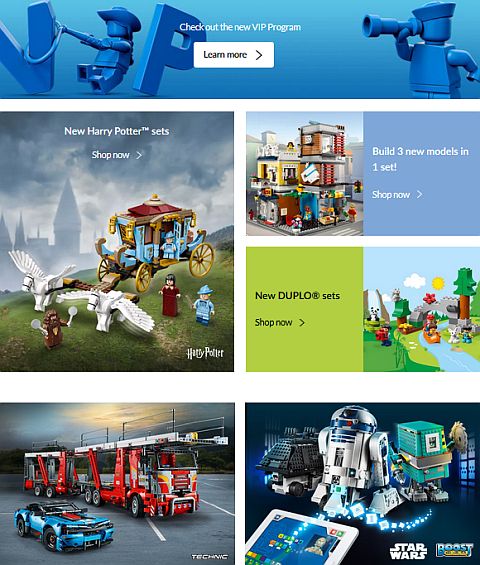
Thankfully, LEGO.com, which is now the Online LEGO Shop, is laid out in a lot more logical way, but there are changes here as well. Let’s start with the top navigation bar. The CHANGE REGION tab is where you can change your country. The ABOUT US tab give you access to the history of the LEGO Group, the Newsroom, the Media Library, links to annual financial reports, job listings, and more. All the serious stuff you would want to know about LEGO.
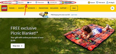
The VIP tab redirects you to the new LEGO VIP portal, which is now on a separate website at Rewards.LEGO.com. We talked about the changes to the LEGO VIP program extensively in previous articles (see links at the end of this post). The FIND A STORE tab lets you search for official LEGO stores by city, zip code, or country, and you can also view the current LEGO Store Calendar. The LEGO LIFE tab allows you to sign up your child to the LEGO Life Magazine, download the latest issue of the magazine as a PDF, and gives you information about the LEGO Life app.

Also in the top banner are your ACCOUNT INFO (where you can check your order status and look at your order history), your WISH LIST, and your SHOPPING CART.
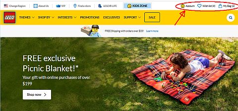
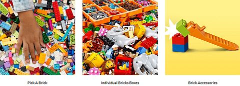
How LEGO sets are organized in the new Online LEGO Shop is also different. The main tabs are THEMES, SHOP BY, INTERESTS, PROMOTIONS, EXCLUSIVES, SUPPORT, and SALE. I’m not going to walk you though all the tabs, as many of them are self-explanatory, but I will point out some of the major changes I found from the previous version of the site. If you are looking for a list of all the new sets, sets by age range, and sets by price, they are now under the SHOP BY tab. Books, storage solutions, watches, key-chains, apparel and accessories are also under the SHOP BY tab under PRODUCT TYPE. Another important section of the SHOP BY tab is BRICKS, which gives you access to the online LEGO Pick-A-Brick shop, baseplates, etc.
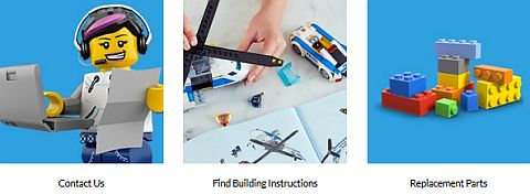
The INTERESTS tab basically just provides a different way to look for sets. The most important is the SEASONAL items sub-tab, as it doesn’t appear anywhere else. The PROMOTIONS tab shows you all the current freebies and other specials, SUPPORT gives you access to the robust Customer Service website (we talked about what’s here a few days ago – see links at the end of this post). The main selections here are contacting customer service, downloading building instructions, and accessing LEGO Bricks & Pieces for replacement parts and ordering loose LEGO elements. The SALES tab is an easy one; that’s where you find all the sets on sale!
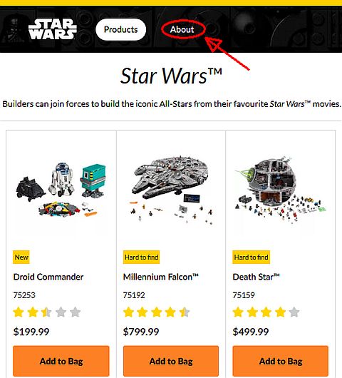
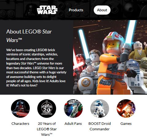
An interesting new feature of the Online LEGO Shop is that the information that was previously available at the themes’ micro-sites are now integrated into the Online LEGO Shop. To stay with our example of LEGO Star Wars, when you select LEGO Star Wars from under the THEMES tab at the Online LEGO Shop, you will see all the currently available sets by default. But there is also a banner at the top of the page with a PRODUCTS and an ABOUT tab. If you click on ABOUT, you will be taken to what was formerly known as the LEGO Star Wars micro-site. This is where you will find designer-videos, interviews, alternate builds, fun and informational videos, info about the theme’s characters, and much more.
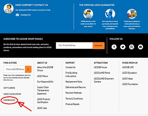
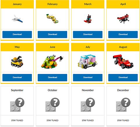
Another section that has been moved around is the building instructions for the MONTHLY MINI BUILDS. They are now accessible from the very bottom of any page of Shop.LEGO.com. There are some other links here that are worth exploring as well. Some are the same as what we found under the top navigation banners, but there are also links to the LEGO House, LEGOLAND Parks, LEGOLAND Discovery Centers, LEGO Education, LEGO Ideas, the LEGO Foundation, and LEGO’s social media channels.
And that concludes our short tour of the new LEGO.com website and related sites. Please note that if you are used to using shop.LEGO.com, or you have bookmarked/saved pages, most of them will automatically redirect to the new location of those pages. I do encourage you to look around based on the info I shared here, and also explore a little on your own. I find the new website significantly faster loading and better organized compared to the old site, except for the KIDS ZONE, which I can’t understand at all. It’s probably designed that way on purpose to keep grown-ups out…
What do you think? Have you had a chance to check out the new LEGO.com site and all the different parts of it? What do you like? What do you wish was different? Did you run into any trouble in navigating the site or finding what you were looking for? Feel free to share and discuss in the comment section below!
And you might also like to check out the following related posts:





Thanks for writing about this. I noticed some of the changes and the new site does load faster. Now I just have to spend some time to see where everything is.
Wow the kids site is truly horrible. What where they thinking? You can’t even navigate the thing. But I like that they put the afol content right on the shop pages and the shop loads faster now.
The new shop is mostly okay. I did notice that the homepage loads faster. But that cover page keeps appearing at random pages and it’s so annoying! Is there a way to make it permanently go away?
This. Just please make that splash page go away! I don’t want to keep seeing it. The Kid Zone is awful, and I just want to get to the online shop. The pictures are still too small, but the pages load faster.
Yeah, I ran into that too, and so did others. I’m fairly certain that they are only doing it temporarily until people get used to the new navigation. At least that’s the hope…
Finally used some VIP points using the new system and it was a bit of a chore.
Had to make sure I was redeeming the correct code, since in-store and over the phone is diferent than online.
I also used points for cash off the purchase and one of the physical rewards. You have to put those codes in at different times during checkout. The physical gift is right in the shopping cart and needs to go in right away, while the money off codes go in the payment portion of checking out.
At least you can use as many dollar off codes as you like.
I also noticed that in the “Earn Points” section of the VIP area there is a place to redeem codes to get 100 VIP points. I’m guessing this might be a reward LEGO issues from time to time.
Overall, it feels like work.
Yeah, dang… I’ll see if it would work easier for in-store purchases, although the new system feels like a hassle…
Thanks for sharing that! At least you were able to check out and get your rewards. Some people are still reporting that they can’t use their reward codes or they lost their points. 🙁
I have the same issue with that initial page keep popping up. They should make it so we can turn it off. That’s for showing where the old dedicated sites are. I was pulling my hair out that I was worried that I couldn’t find the extra Technic instructions and other info anywhere. I thought they made them go away for good. And yes, the kid’s site is horrible.
Thanks for this guide. I too was wondering what happened to the microsites. I’m glad they are still there. The shop pages are mostly okay. I usually go by categories or the set number. I just wish the font and pictures were larger on desktop mode. There is too much white space. I didn’t dare to redeem any of my points yet, hoping that they will sort out the issues other people reported.
One of the problems is that not all pages get redirected when you search for something on google. For example, when you go to pages of the different themes, it won’t redirect you to the new location, but just give you an error message. That should not be happening. I find it baffling that a company as big and rich as Lego can’t hire a proper team to develop and manage their websites.