

While watching the American version of the LEGO Masters competition TV series, one thing that stood out for me the most is how often Amie Corbett and Jamie Berald – LEGO Senior Designers and judges of the show – emphasized the importance of color. They encouraged contestants to use more colors, use colors to tell a story, and to combine colors to highlight important details of a LEGO project (photo below by Nathan Francis).

Since watching the show, I have been paying a lot more attention to colors in my own builds, and I’m also paying more attention to how color is used in official LEGO sets. So I thought to talk about this topic a bit and ask your opinions and experiences as well.
In the early days of LEGO, there were only a handful of colors. White, tan, yellow, orange, red, blue, green, grays, black, and some translucent colors were introduced back in the 1950s and ’60s. LEGO fans (and LEGO’s own designers) were limited to this narrow color-palette. The downside of this was that they could not make their models very realistic; everything from houses to spaceships was built with the same few colors. On the positive side, children could focus on play, and did not have to spend much time thinking about color theories. (Just for the of historic accuracy, I would add here that the old LEGO Modulex line with tiny bricks that was specifically developed for architects did include some beautiful earth tones and subtle hues.)
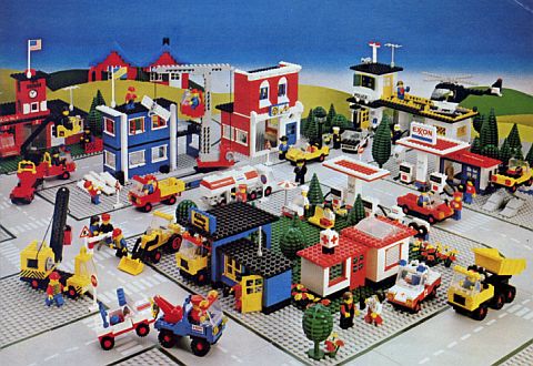
Through the following decades, more colors were added. Some were short lived, while others we still have to this day. By adding more colors, LEGO also started using colors in a more strategic way. Baddies got dark and scary colors like dark-red and black, good guys got what kids usually consider awesome colors like gold, girl-oriented sets used pastel shades, and sets for the youngest kids stayed with bright primary colors. During these years, LEGO sets and custom models started to look more sophisticated, but they were still clearly recognizable as LEGO.
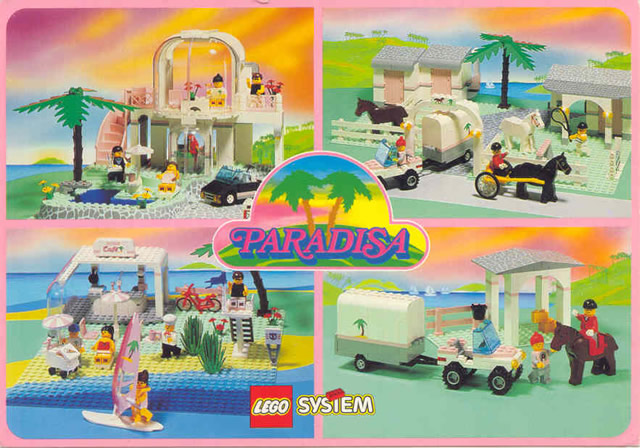
Things really started to change when LEGO introduced some of the more subtle colors like sand-blue and sand green, and many shades of the same color including yellows, oranges, blues, greens, purples, etc. In particular, the great variety of greens, blues, and browns allowed building landscapes that rivaled Thomas Kinkade paintings. It was LEGO fans who first started experimenting with this realistic style of building. When you see thumbnails of such builds, you will think it’s a photograph or painting. LEGO mosaics also greatly improved by the addition of so many subtle hues. Although LEGO introduced many new colors, official LEGO sets still tended to stay with a somewhat childish building style of bright colors and strong contrasts.
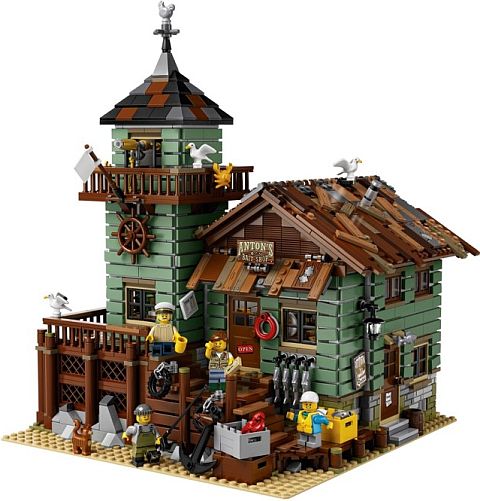
However, just a few years ago, LEGO also started to release sets with more mature and realistic color combinations (and techniques!). The LEGO Modular Buildings and the LEGO Architecture series are prime examples, as well as sets like the #21310 LEGO Ideas Old Fishing Store, and #21318 LEGO Ideas Tree House. These sets are mostly targeting adult LEGO fans, and adults have a greater desire for realism. They also tend to use LEGO as a creative medium and home/office décor rather than a toy. With LEGO’s ramped-up focus on their adult fans, and the new 18+ oriented collections, we will continue to see more of these types of refined sets.
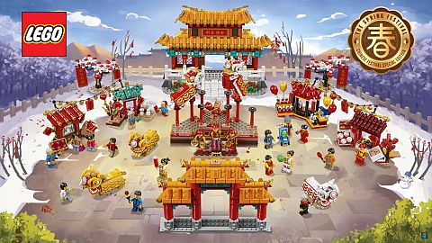
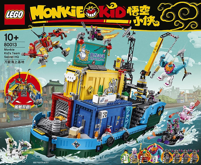
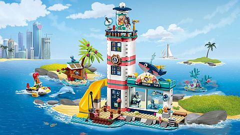
Interestingly, the color combination of kid-oriented sets also greatly improved in the past few years. For example, take a look at LEGO Ninjago, LEGO Monkie Kid, LEGO Hidden Side, LEGO DOTS, and the LEGO Chinese New Year sets. They all use carefully selected color palettes that match the theme and tell a story. LEGO Friends is another interesting theme worth paying attention to. LEGO Friends introduced many of the new colors that later spread to other themes, but the way they are combined is often considered a hit or miss (at least from an adult’s perspective). On the other hand, an offshoot of LEGO Friends, LEGO Elves, was universally praised for its pleasing color combinations and beautiful details.

So how can we take advantage of all these new colors and learn how to combine them? We can start by recognizing where we’re at and what we want to achieve. Many older LEGO fans who grew up with a limited color selection continue to build with just a few colors and feel intimidated or confused by all the colors available today. There is nothing wrong with using basic colors as they have their own charm. At the same time, we may also want to expand our color palette or freshen up our own builds.
Even those who grew up in a more colorful era in LEGO’s history, often limit themselves to their favorite colors and color combination. This is often evidenced by LEGO fans making all their spaceships, landscapes, and buildings by reusing the same colors that worked for them in the past. Again, there is nothing wrong with this, but if we want to learn, we will have to step out of our comfort zone and acquire new skills.
One of the easiest ways to learn new skills is by watching the masters. As I mentioned at the beginning, LEGO designers Amie and Jamie talked a lot about the use of color in the LEGO Masters TV show. It was interesting that even the super skilled contestants sometimes stuck to their favorite colors without taking advantage of other options (they had access to practically unlimited LEGO bricks!), and overlooked the importance of color to make their project stand out. You can also learn by studying the models of LEGO fans via their photo albums or social media accounts.
Another way to learn about the use of color is to study the colors of official LEGO sets. You may not even be interested in the theme or the set itself, but you can look at how LEGO designers pull together colors for a pleasing effect. You could be building a spaceship, and you may find a LEGO Friends house that has the perfect color combination for your ship. So don’t just look at sets for the cool designs and unique minifigs! Pay attention to the colors too! Once you find a color combination that you like, practice with it, and see how you can adopt it to your own model.
If you spot a color that you would like to work with, but you aren’t sure how to combine it with other colors, look at the Color Guide in the Bricklink Catalog. It will show you all the sets the color appears in, and you can study their color combinations. The Bricklink Color Guide also shows you all the pieces made in that color, so you know if you can get everything for your project.
My current favorite sets for learning color combinations are LEGO DOTS, LEGO Monkie Kid, the LEGO Chinese New Year sets, and some of the LEGO Friends sets (although as I said, LEGO Friends is a hit or miss).
What about you? Do you pay attention to colors and color combinations in your own builds? Are there any LEGO sets or themes you really like for their color combinations? What is your favorite LEGO color? Feel free to share your thoughts and discuss in the comment section below!
If you want to learn more about the history of LEGO colors, I recommend the following resources:
- Understanding the LEGO Color Palette by the Brick Architect
- The Changing Palette of LEGO: 1975-2014 by the Brothers-Brick
- LEGO Color Chart Reference by New Elementary
- LEGO Color Stream by Ryan Howerter


The new colors have been great! I just wish they were more consistent. The dark colors like dark red, dark blue and dark green are especially problematic. Oh, and reddish brown. But yes, the new colors are appreciated.
My favorites are the teals from light aqua to dark teal. I don’t know why, but they liven up any moc. Oh, and light yellow!
everything is awesome
Dots have been my favorite this year. It comes with so many pretty pastel colors, many of them I wasn’t even aware of existed. I believe it’s having so so many shades of the same color that helps with realism. This is especially visible when building trees. In nature, trees aren’t just one color green. With all the new shades, we can do better replicating what we see in nature.
I liked the simplicity of the old sets. You didn’t have to worry so much about having just the right color. Having said that, the new colors are nice, but I feel there are so many choices it’s easy to get overwhelmed. How do others deal with this?
I know what you mean, and there is no easy solution. How I deal with it is that I try to have a good quantity of very basic mostly neutral colors like grays, white, tans, browns and black – enough to build pretty much any project. Then, if I do commit to a project, I will purchase the pieces in the “right” colors from BrickLink to finish it.
Also, as I’m a builder and not so much a collector, when I purchase sets, I focus on the pieces and colors a set include. I will prioritize them by which ones I would consider most useful for my own projects based on their content.
I found it interesting that Lego also taken color risks like the early Harry Potter sets. Using sand green for the rooftops of Hogwarts Castle. Then recently using dark gray instead of the sand green to put the two of the same theme together looks odd because of the different color combination. However, the next harry potter set wave is having a combination of dark gray and sand green combined. An interesting color risk and yet Lego somehow wants to make it work and in some cases it does. I keep thinking of nexo knights and the color risk that was use for that theme later on. The purple and the gray for the bad guys in that theme. So we also have to remember that this is also imagination so there are no rules. It’s when adults or young adults look at the colors and say that doesn’t match and that it doesn’t look right would be odd to us but then again like I said before imagination doesn’t have any rules and just go with the flow. I have noticed that I’ve gotten used to those odd color combinations overtime because it’s no longer different it’s no longer something new anymore. However I do believe Lego may try something else new and I’m looking forward to it.
Does anybody collect Lego colors? I would love to get a sample of each. Like on the first picture with the 2×4 bricks
I have been collecting 2×2 bricks and even have some unreleased, super rare, and unnamed colors. But I haven’t been keeping up with it in the past couple of years as diligently as I used to. The color-palette just exploded and it’s hard to keep up. 😀
Elspeth de Montes does a lot of color collection. 2x4s:
https://www.flickr.com/photos/azurebrick/44753278264/in/dateposted/
A color I would like to try out but haven’t had a chance yet (I only have a few pieces in that color) is coral. Friends have been using it extensively, but I think it has potential for other neat builds.
That’s a color I’m curious about too and haven’t used enough yet. It’s so bright and bold! 😀
True. As close to terracotta as you gonna get. Many haciendas built in that colour – also used in some art=deco builds. That could be a nice project to look into!
While I have little need for them (the new colours) in the type of things that I build, I definitely appreciate the variety of colours available nowadays (sometimes needed for little details). The only problem I have with such a wide palette is given the wide array of parts, it is sometimes (often) difficult to have all the required parts in a given colour. As far as colour combination goes, there are numerous website design pages which will give you a group of colours that are aesthetically pleasing together = worth giving it a try!
Learning to have an eye for color has been one of the biggest things for me in building – first it was just figuring out what I was doing with basic, common colors, then I had to get out of my comfort zones and try new colors. Part selection in previously rare colors has gotten better and better lately, so that helps too.
It was neat to hear the the LEGO Masters judges put a lot of emphasis on color, since that’s something I’ve been working on improving for my own builds. Of course there is always the extreme of overwhelming the beholder with too many colors, but including a few bright colors in a tasteful way really brings a creation to life. Strangely easy to overlook that step though and just go with the “normal” colors – normal for me being greys and browns and low-key colors in general.
I guess a lot of spacers stick to familiar colors due to the “retro-” or “neo-” traditions of updating the old themes with new construction styles, a school sometimes bordering on pastiches.
Second, I have to concur with Hobbes’ criticism that some colors might be hard to use practically due to the scarcity of parts or since they’ve been cancelled before having much useful parts introduced.