In the first part of our review of the recently released #75978 LEGO Harry Potter Diagon Alley set, we focused on what’s in the box, including instructions, stickers, parts, minifigs, rarities, and more. If you haven’t read it you can find it here: LEGO Harry Potter Diagon Alley Review – Part 1. Today, we will talk about each of the four structures, and in the final part, we will discuss display options and compatibility with the LEGO Modular Buildings series and other LEGO city style layouts.

OLLIVANDERS WAND SHOP & SCRIBBULUS (BAGS 1-5)
As mentioned in the first part of our review, the set comes with four instruction books; one for each section of the layout. You can build them in any order you want, but just for the sake of simplicity, we will go by the order the books and bags are numbered. Therefore, we will start with Ollivanders Wand Shop and the Scribbulus Stationary Shop.
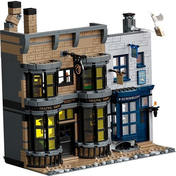
If this is the first building you start with, you get introduced to the pattern of the whole layout; each of the structures are built on a 16×32 stud dark-gray baseplate, with an open-backed building taking up the back section, and a cobblestone pathway at the front.
Another pattern that you get introduced to with the first building is that each section has Technic pinholes and pins both at the sides and the back. This is so that you can clip the segments together into a long street layout, or you can attach them back to back to create a full block of buildings. (It’s worth noting that the pinholes and pins at the sides fully align with the positioning of the pinholes and pins of the LEGO Modular Buildings.)
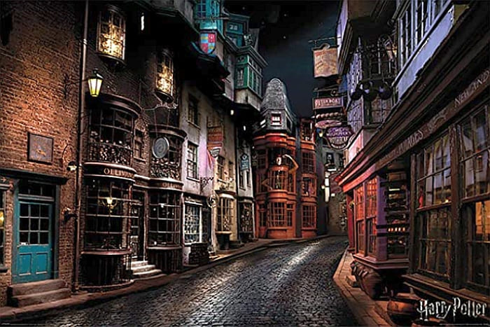
Ollivanders is a remarkably close match to the first two stories of the building from the films, where young wizards have a chance to purchase their very own wand. It’s a very old shop, and the dark color-scheme and exposed bricks (you get fifty-six 1×2 dark-tan masonry bricks!) convey the age of the building well. The main colors are dark-gray, dark-tan, and black, with translucent-yellow windowpanes. Although the windows of the real building aren’t yellow, I believe LEGO designers choose this color to mimic the warm yellowish glow that emanates from the interior lights.
One issue I found is that if you aren’t building on a perfectly flat and hard surface, it’s easy for the window frames to dislocate from their position. As this is not a modular building with easily removable floors, it’s a major pain to take the building apart and put the windows back. Baseplates in general are flimsy, but this is especially true for the narrow 16×32 variety used here. Keep this in mind when you are building the set, or when you’re picking it up to move it to a different location.

The interior of Ollivanders is split into two stories, with boxes of wands on shelves, displays, and even under the steps. The steps can be folded out so minifigs can walk up to the second floor, and that we can easily access the first floor with our big human hands.
As a side note, I feel that the 8-10 stud depth of all the Diagon Alley buildings is just right. They are deep enough to include quite a bit of detail without getting too tedious or repetitive, and still allow easy access from the back without knocking things over.
I can tell you right now that by the time you finish building all the Diagon Alley shops, you will be an expert at shelf building! Shelves for wand, shelves for books, shelves for uniforms, and other various wizarding accessories will take up a fair amount of time due to the intricate designs with small parts. Even though this activity is repetitive, I found the process enjoyable and I learned several new techniques.
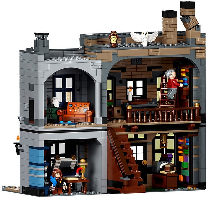
Ollivanders occupies most of the baseplate and the rest is taken up by the Scibbulus Stationary Shop. This little shop appears in Harry Potter and the Chamber of Secrets, and Harry Potter and the Half-Blood Prince. It’s where wizard and witches can find all the writing supplies they need, including ink and inkwells, feather quills, parchment, and writing paper.
The color-scheme is muted with mostly dark-blue and light-gray pieces, and this building is also aged with masonry bricks. The first floor is the stationary shop, and second floor is a small apartment with a couch, a small table, fireplace, and rug. They are simple builds, but are nicely done. I especially like the couch.
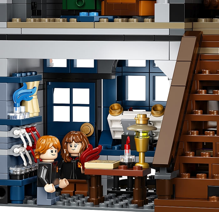
Overall, building Ollivanders Wand Shop & Scribbulus was a satisfying experience that took about two hours. Even though this section has the darkest colors, the buildings are well designed with an excellent selection of useful parts and a good mix of simple and complex building techniques. I do feel though that the second story, and especially the roof section of Scribbulus, could be improved. The building from the film has a peaked roof that gives it a charming finish. This feature is completely absent here. Ollivanders is also cut short with the upper floors missing, but I do feel the roof section was finished more satisfyingly.
QUIDDITCH SUPPLIES & DAILY PROPHET (BAGS 6-9)
The second instruction book also includes two shops; Quality Quidditch Supplies and the Daily Prophet newspaper’s headquarters. What you will immediately notice about this structure is how pink it is. Looking at images of the shop from the films, I do see a pinkish hue on the second floor, but maybe not so overwhelming and not so much. I actually like the choice of pink as it balances out some of the darker buildings on the street. However, I feel the building could be greatly improved by giving a second floor to the Daily Prophet using another color. And this is not just to reduce the use of pink, but also to add more texture to the wall that appears too flat and square as it is right now.
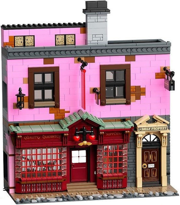
Even though the second floor could be improved, the first floor for Quidditch Supplies is excellent with great looks and surprising building techniques. You basically build the whole storefront as a separate unit, and then hang it up with two Technic pins. This allows the section to fall in place and position the windows at an inward leaning angle. It’s brilliant.
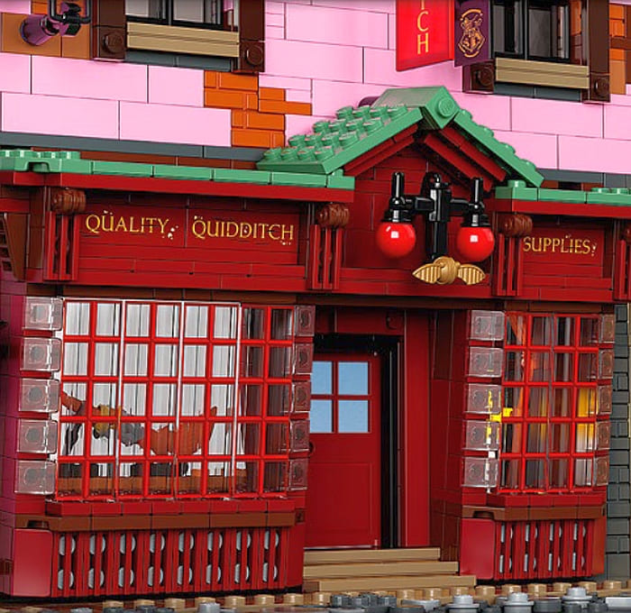
The Daily Prophet is just a tan door over dark-gray walls, but it looks nicely detailed. On the inside, the Daily Prophet is hollow with just a stack of papers and a spider web. It doesn’t even have a second floor. It was kind of disappointing.
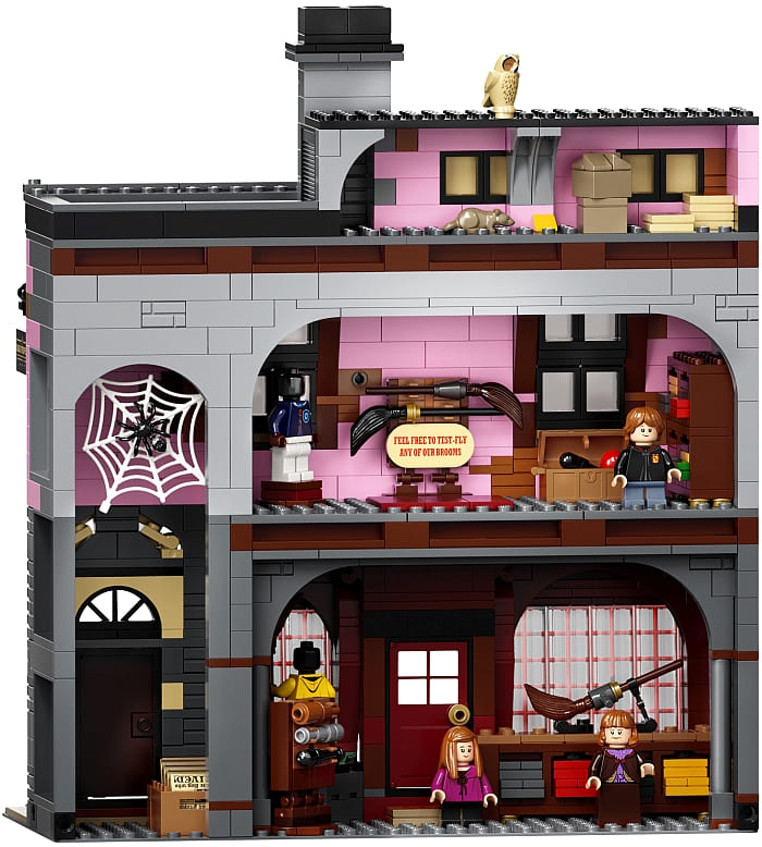
On the other hand, Quality Quidditch Supplied has two full floors and even a small attic storage space. Here again, you will do lots of shelf building, as well as build stacks of uniforms to place on the shelves. There are also display stands for brooms and bats.

My overall opinion on this section of Diagon Alley is mixed. I really like the storefront of the main shop, and the entrance to the Daily Prophet looks good too. But the second floor is too plain and too pink, and the interior of both sections feels somewhat uninspired and more on the boring side.
BOOKSTORE & ICE CREAM PARLOR (BAGS 10-14)
The third instruction book gives us the Flourish & Blotts Book Store and the Florean Fortescue’s Ice Cream Parlor. I guess I will just say it right from the beginning; this is my favorite section of the entire set. Both buildings are lovely, and they work so well next to each other. Also, both buildings have a full roof, which makes them look more finished then some of the other buildings we already talked about. The colors also work really well together; light-yellow, olive-green, dark-brown, and a little bit of dark-red for the ice cream parlor, and sand-green, dark, green and black for the book shop.
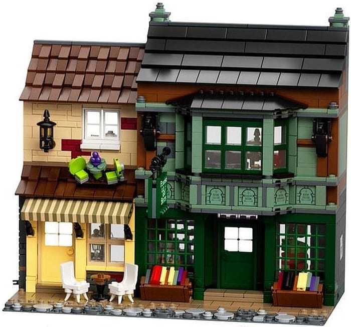
The ice cream parlor uses several clever techniques; the rods for holding up the awning use lipstick pieces in black, the couple of white chairs at the front use horns for their legs, and the brick-built sign has sort of a forced-perspective look to it due to the angle.
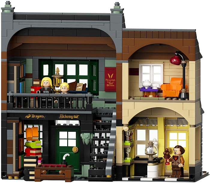
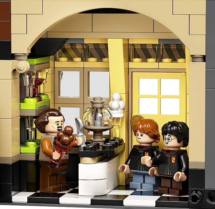
The inside of the ice cream parlor is pretty simple, with a black and white checkered floor, a small counter, and some glasses on shelves for serving ice cream. The second floor is a small apartment with a recliner, a small table with tea and teacup, a lamp and a rug. I love how all the colors come together in both the first and second floors!
The bookshop is equally pleasing on the inside. If you have made it to this point in the build, you might be getting a little tired of building shelves, but the bookshelves found in this building are the best in my opinion. They are really great little builds, and could be easily repurposed (or copied) to use in your other creations. The stacked up books also use some nice techniques. The second floor of the bookshop can be accessed via a staircase that can be folded away when not in use.

The outside of the bookshop is also full of great details. The big display windows are printed elements, the bay window above uses some clever sideways building techniques, and I love the brick-built gargoyles using the Ninjago dragon sword hilts in black for their heads. Can’t say enough good things about this section of the build and I can’t find any negatives. The whole thing is just lovely.
WEASLEY’S WIZARD WHEEZES & KNOCKTURN ALLEY
Although this structure has the most outlandish colors, it is quite accurate compared to the real building that we first saw in Harry Potter and the Half Blood Prince. It is actually a corner building with entrances both facing the front and the left side. Next to the entrance on the left, is a gate that represents the entrance to Knockturn Alley with a crooked sign and crooked window on the second floor. It’s a simple, two stud deep structure, but it serves its purpose.

The Weasley Brothers’ joke shop looks super bright on the outside, but it actually uses only two colors; orange and lavender with a little bit of light-gray here and there. Lavender is mostly a color used in LEGO Friends and LEGO Disney sets, and I would have never thought of using it for a commercial building, but it works surprisingly well. It has sort of an old-building-with-nondescript-faded-color look, especially with the addition of those masonry bricks (you get twenty 1×4 masonry bricks in lavender). It’s a color worth exploring for similar uses.
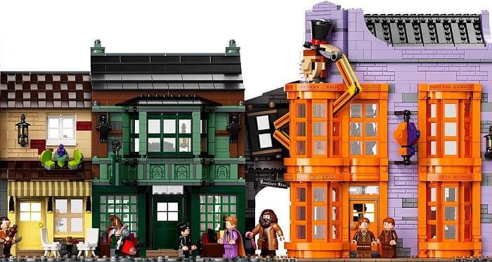
The outside of the joke shop is the only store with a built-in play feature. The brick-built figure that looks like it’s standing inside the building with his head and arms sticking out can lift his hat via a simple lever mechanism.
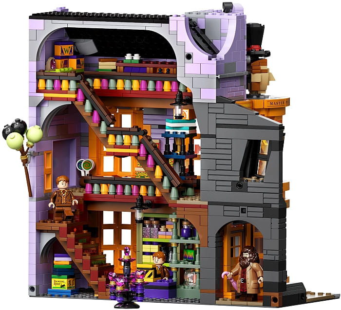
As the building takes up almost the entire baseplate and it is also the tallest, the inside is much larger than the other shops. It has three full stories and an atrium with two staircases. Here, again, you build a bunch of shelves, which are then filled with various items to entertain wizards. Most of these items are built up of the smallest size bricks, plates, and tiles and then decorated with stickers.
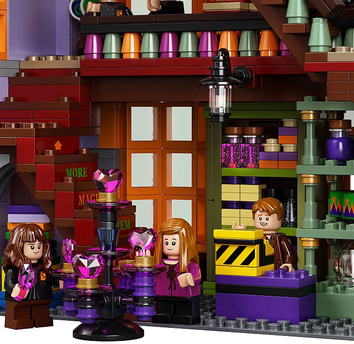
Because this is a corner building, there are some advanced building techniques to bring together all the angles. Some of the most interesting sections are the bay windows at the corner, as well as how the different angles of the roof come together
Due to the unusual colors, this building may not appeal to everyone, but even if you feel this way, I encourage you to study the building techniques. There is only one section of the building that I don’t like. Although the third floor is nicely built and well stocked with wizarding items, due to the lack of windows and the black roof, it is very dark. Without shining a flashlight on it, you can’t even see what’s there. You could potentially build a skylight for it, or add some LEGO or third-party lights. I think this would greatly improve the look.


Since the designer-video is now available, I thought this is a good place to include it. You can watch and listen as LEGO Designer Marcos Bessa and LEGO Graphic Designer Djordje Djordjevic talk about working on the set.
In summary, I’m happy with the #75978 LEGO Harry Potter Diagon Alley set. The parts-selection is fantastic even for non-Harry Potter fans. Not all the buildings are perfect, but they all include some elements that has potential for either improvement or for using them in other settings. I know many people are put off by the number of stickers that come with the set, but if you like the buildings, this shouldn’t be a deterrent. Only a few stickers are what I would consider essential. The rest of them are optional decorations. The price is good too. You get 5,544 pieces for $400, which is about the same size and price of two LEGO Modular Buildings. The price per piece is 7.2 cents, which is also in line with the Modulars. We will talk more about the Diagon Alley set’s compatibility with the LEGO Modular Buildings as well as other display ideas in the next part of this review. If you would like to get it yourself, it’s available at the LEGO Harry Potter section of the Online LEGO Shop.

What do you think? How do you like the LEGO Diagon Alley set so far? Are you planning to get it? Or do you have it already? Feel free to share your thoughts and own reviews in the comment section below!
And you might also like to check out the following related posts:




I saw on facebook a picture of someone replacing the pink with nougat. It looked really good.
I would like to see that. Do you have a link?
It was in the amaing modular buildings facebook group. Here is the link, but I think you need to be a member of the group to see it: https://www.facebook.com/photo?fbid=10221273223878386&set=gm.1763788217124410
Yeah, dang. You don’t know if it’s been posted anywhere else?
Hm… let me see if I can extract the image for you, as it does look good as an alternative.
I like this better! The best would have been sand red, but since they no longer make that color, I think this is better than pink.
Oh, yeah. It clearly is a lot less garish…
I kinda wish they sold these as separate buildings because they have a lot of charm, but the Quidditch shop and the Weasley shop genuinely hurt my eyes to look at. Well, at least it lets me know to not paint my bedroom lavender and orange! 😀
This set is an incredible parts pack for modular builders. But it’s a lot of money to fork over at one time.
That’s interesting what you say about lavender and its potential for industrial and old buildings. It seems that it could be as effective as the sand colors. I wonder what the wizard shop would look like with the orange taken out.
It’s something I plan to explore some more. I may build something with all the lavender bricks from the set so I can show you guys what it looks like without the orange distraction. 😀
There is a typo, which is easy to do. The price per piece is 7.2 cents, not 72 cents. Thanks for your great review and your other posts. I really enjoy them.
Thank you, Pam, for catching that. Had it fixed. 🙂
In the designer video they say that originally they were going to make less shops but bigger. I wonder if there is an image of their early designs anywhere. I’m curious to see what they had in mind.
I would love to see that too! And designers sometimes do share prototypes. Let’s see if we can find anything.
I like the set as a partspack, but as Diagon Alley, I feel that it’s missing the charm of the street. I agree with admin that some of the walls seem to plain and flat and the roofline could be improved too.
I have seen pictures where the buildings face each other really close, and that makes them look better than the long horizontal layout they display on the box.
Oh, I was wondering why they used yellow window panes in the wand shop! It makes sense that they represent the light shining thru. I should use that technique! Is this the only set with the yellow windows?
Tanner, there are only three more sets with the translucent-yellow window panes. One is the Joker’s Manor (4 window panes), and the other two are small sets with two window panes each. Diagon Alley has 32! 😀
Am I the only one who had a terrible time getting the chairs and ice cream on the awning? I can’t get the chair on the left to snap in and the other prices kept popping out. It was incredibly frustrating. It appears that I have the awning right, on the left side. What a pain.
Rebecca, that shouldn’t be happening. My guess is that you have the chairs turned wrong. They should be slightly angled. Or it’s possible that you have them attached to the wrong stud. They are on a 2×4 surface, and they should be sitting at the two front corner studs, with the table in between the middle studs. My suggestion would be to carefully look at the instruction pages again to make sure everything is attached correctly. There should be no pieces popping out in that construction. If you have any more trouble with this, just let me know. 🙂