(Written by William)
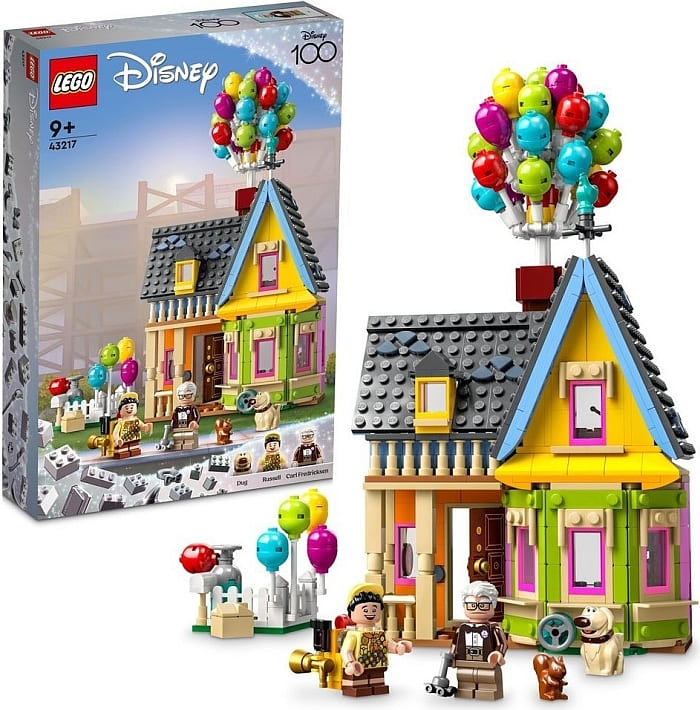
The #43217 LEGO Disney Up House got two reactions from me when I first heard about its release. I really wanted it, but I was worried it will be too big and complex, and thus expensive. I got lost in the many adult-oriented sets LEGO has been putting out in recent years, and my budget ran thin. Turns out, the Up House is much smaller than I expected, and thus reasonably priced. But then I had a new worry, would this set live up to my expectations as an adult builder? After all, it’s recommended for ages 9 and up.

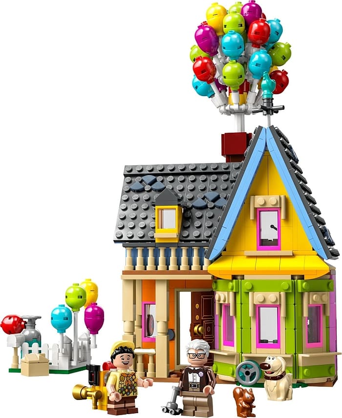
The Up House, of course, is more abbreviated than larger models, but I found myself engaged with the building experience all the way through. Plus, it really felt like LEGO designers didn’t take any shortcuts with large pre-moulded parts. You can see this plainly given the wide range of bright colors used in the house’s walls. And even the accessories, like Russell’s overstuffed backpack and Carl’s cane, are brick-built. On top of all this, LEGO designers even managed to use some interesting building techniques. We’ll be getting into those in a moment.

Overall, I think the biggest concern adult fans will have with this set is that it may leave them wanting more; more balloons, more house, even more balloons… you get the idea. This might prompt people to purchase several copies of the set for themselves to create expansions. And considering all the useful parts and vibrant colors, this set will also make an ideal parts-pack. The downside of this is that you may have a hard time finding the set in stores. Even at the Online LEGO Shop, it’s currently shown as temporarily out of stock. But if you like it, hopefully, you can get your hands on it and have a truly “Up” lifting experience.
LEGO DISNEY UP HOUSE – VERTICAL STRUT
When I first hear about this set, my first thought was, “I wonder if I can hang it to display it?” Turns out, you can. And based on the header for this section, you even get an idea of how it can be done.

For the most part, this house is built pretty much like your standard LEGO building. In fact, some of the walls are less interlocked than we normally see. So, how in the world could this hold up to being dangled? It all comes down to one of the last structural elements you add to the house.
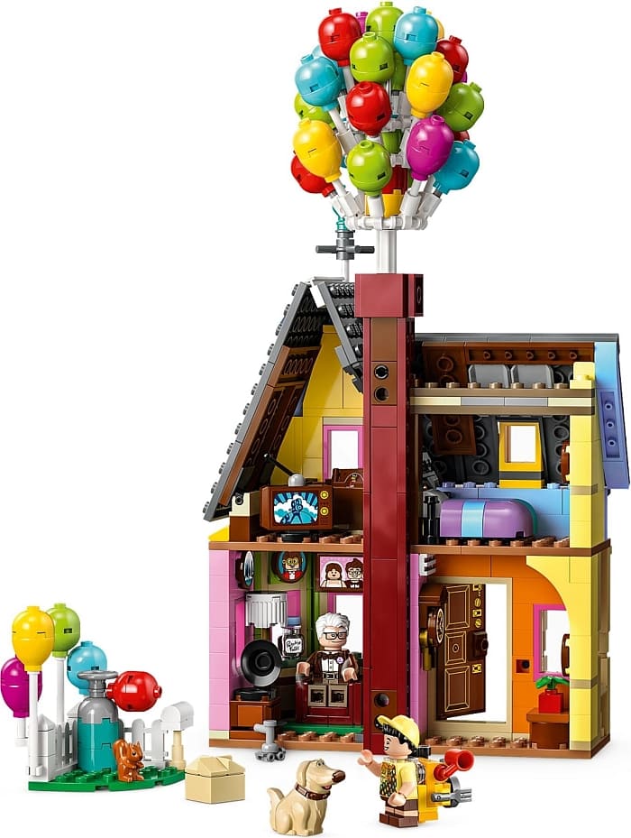
Over the course of the build, there are a couple of LEGO Technic pins that stick out the backside of the building. Then you attach a long interlocked section to these pins to form a chimney. This will also be where you build the tower of balloons. But if you look closely, this feature also gives the house some unique characteristics.

First, it connects the first and second floors together. This lends the whole construction some much-needed stability. Second, it is centrally located along the longest section of the house. Sure, it is in the back so it’s not balanced front to back, but it is balanced side to side. Finally, the very top of the chimney is reinforced with multiple brackets and tiles securing the model in multiple directions. For all intents and purposes, this long interlocked section represents a handle you can hold.
The result is a chimney you can tie some fishing line onto and lift without being worried it will fall apart. Keep in mind that the front may sag a bit, but since this is the prettier side of the house, that probably won’t bother people all that much.
This is what a single vertical strut can offer a small creation. By changing the orientation of the pieces from up and down to side-to-side, the strain goes directly to the parts themselves instead of their connection points where they are designed to come apart. It’s a clever feature that gives fans more display options along with more play features.
LEGO UP HOUSE – CURVING WALLS WITH SLOPES
Anytime a building comes with a curved window, I pay attention. I like nontraditional curves in my models. For the most part, LEGO designers will use a hinge connection and then add some sort of pillar to fill in the gaps. However, this time, the bay window has a much more solid appearance.

This is all thanks to the use of slopes and the degrees at which they slope. If you ever shopped for LEGO on a secondary marketplace like BrickLink.com, you may have noticed that for slopes the degree of angle is added for identification. In this case, the cheese wedge-type slopes offer a 30-degree plane compared to their flat side. So, how is this helpful?
Well, if you know how much of an angle you want to bend, you can use the appropriate number of slopes to achieve this angle. For example, this window starts at one wall, curves around, and makes a full half circle. In other words, it makes a 180-degree turn. Now, take your 30-degree mini-slopes and divide them into 180. This gives you 6. That means you will need six instances of these slopes to turn that full 180 degrees. Sure enough, this window/wall section is comprised of three wall segments. Each segment has two slopes, one on the left and one on the right. Altogether, that makes the six angled elements we need.
But wait, what if you want to try a different angle? Let’s say you just want to round a corner. That would only be 90 degrees. By using the same 30-degree slopes and dividing them into 90, you’d see we’d only need three. Now let’s look back at the bay window in this set. Notice how the middle section is flat to us? It represents a 90-degree turn from the left and right walls. Additionally, look to those segments attached to its right and left. They each have two sloped edges and the middle segment has one. This means there are the 3 segments needed to form the 90-degree turn.
However, there are some complications in using this technique. You will have to figure out what method you will use to hinge various segments together. This has its own issues of figuring out how far to stick out the edges. And this level of design is going to change based on your model. The good news is you have some idea as to what slopes might help you achieve when you’re building curved walls.
LEGO UP HOUSE – FINAL THOUGHTS
As I mentioned at the beginning, when I first heard that the Up House was going to be released, I was concerned. I figured it will be yet another massive set I didn’t have a budget for. So, I kind of kept my head down and tried not to think about it. But this meant that I missed the official announcement with all the details and pricing information. And when I did find out those details, I was worried that it wasn’t going to be a fulfilling building experience. Turns out, my worries were unfounded. LEGO found an excellent blend of good design and affordability.
You can find nifty builds like the gramophone that uses a special hat to form the horn on the player. And there are even larger techniques that are interesting like the two I mentioned above. And I found the accessories for both Russel and Carl to be absolutely charming. On the down side, the set has a fair number of stickers, many of them on round tiles, which are trickier to apply. Next, the house is more or less a façade of a building and not a full house. This may lead many to buy multiple copies of the set so they can build something larger. And finally – and this is something I’ve already heard from many LEGO fans – there are enough balloons. I know LEGO designers didn’t add more because there was just no place to attach them, but I fully expect to see modified models with a lot more balloons. In the video below, I will discuss the set in a bit more detail.
All in all, this is a great model for $60 USD. It is much better than the $200+ price tag I was bracing for, given the recent influx of large and expensive sets. I think this size and price makes it available for most everyone. My only concern is that it may be a bit hard to find since it will be a day one buy for many. I guess you’ll just have to remain vigilant like Doug the dog and… Squirrel! If you want to check it out, visit the LEGO Disney section of the Online LEGO Shop.

What do you think? How do you like the LEGO Disney Up House? And what do you think of the techniques we discussed? Feel free to share your thoughts and own reviews in the comment section below!
And you might also like to check out the following related posts:


I like both this and the Madrigal House. Such great colors and details in a small package!
This seems pretty typical of most Lego buildings, and vehicles too really. Because the minifigs aren’t quite correctly proportioned to a human body, there’s a bit of a range to what “minifig scale” means while looking visually proportional. Due to cost and playability, they always skew to the smaller end of this scale except for things like the UCS Star Wars vehicles. And other than the “modular” style with removable floors, building are generally “dollhouse” style where there’s only the front with the back open to the interior rooms, or at best a hinge where the back splits open. It’s always a trippy optical illusion to see the exterior look about right, while the interior is obviously cramped compared to what the “real thing” should be. The balloons here only make blindingly obvious that Lego pieces really do have some insurmountable limitations compared to real-world construction.
I tend to like Lego dollhouses, though. They feel quite toyetic…
That’s really cute! And I like that it’s small. I have no more room for big sets.
A crazy idea. What about using real helium balloons to hang the house? 😀
It is possible. Of course, by the time you have enough balloons, I’m not sure it could fit in a normal room.
Maybe if you have a two story house and one of those rooms that has a really high ceiling? That might work.
This was a great build for my 11 year old who loves the movie. The 2 things that disappointed him were that the mailbox didn’t have the names and handprint details and they didn’t include Ellie’s chair. Other than that though our whole family thought it’s a very cute build