(Written by William)
Normally, I’ve not been too keen on the LEGO Creator 3-in-1 sets. But for whatever reason, this year I’ve found myself picking up more of them than any other year before. Perhaps it has to do with how innovative the parts have become? I remember the days when LEGO Creator 3-in-1 sets were rarely more than standard bricks, plates, and slopes. But now they are a lot more interesting with a greater variety of parts and techniques.
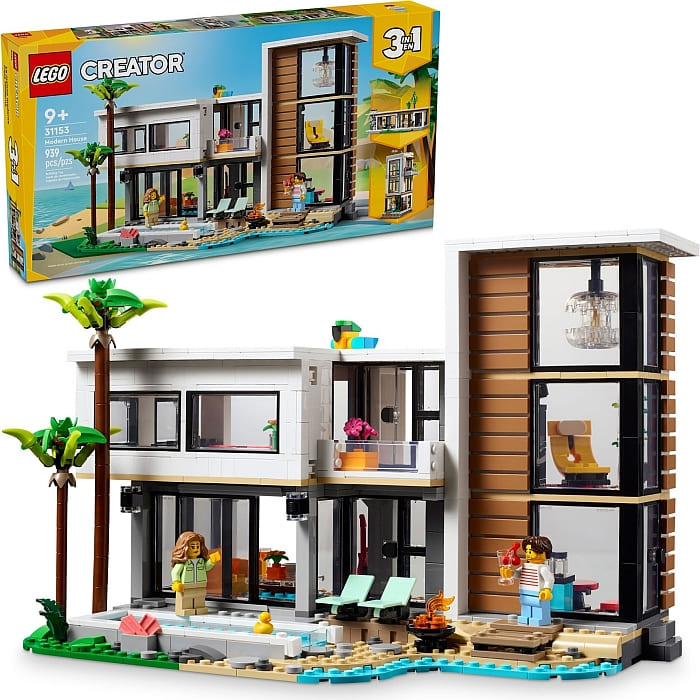
I did find sections of the #31153 LEGO Creator Modern House rather simple. Place a giant window here, a skinny brick there, and another big window there, and most of the room is done. The good news is that this made getting to the interesting parts easier and faster. I came away with a sizable model that valued my time, which I found rather refreshing. I also found a couple of innovative building techniques, so let’s look at those before I give my final thoughts on the set.
LEGO MODERN HOUSE – MODULAR BUILD NOT MODULAR PLAY
One thing I learned over the years when building large display models is that making giant creations that are one solid piece is a bad idea. This puts a massive strain on the LEGO elements. This becomes especially apparent when you try to move the model. Plus, if you build dense, the model can get heavy.
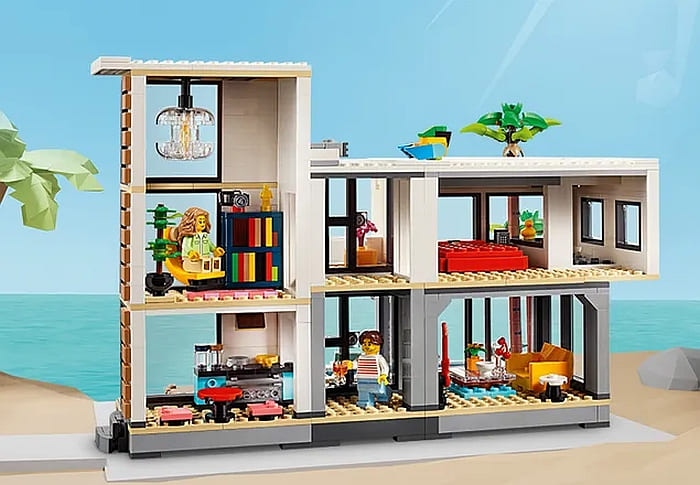
The simplest solution to this is to build modularly. This is a different type of modularity than what you find in the popular LEGO Modular Buildings series. Those are built modularly for the express purpose of having access – or as I like to put it – for play.
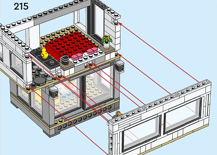
The LEGO Creator Modern House gives us an example of using modularity differently. The model is separated into clearly defined sections. Once a section is done, it clicks together, usually with LEGO Technic pins at the bottom, and then the sections are sealed together at the top.
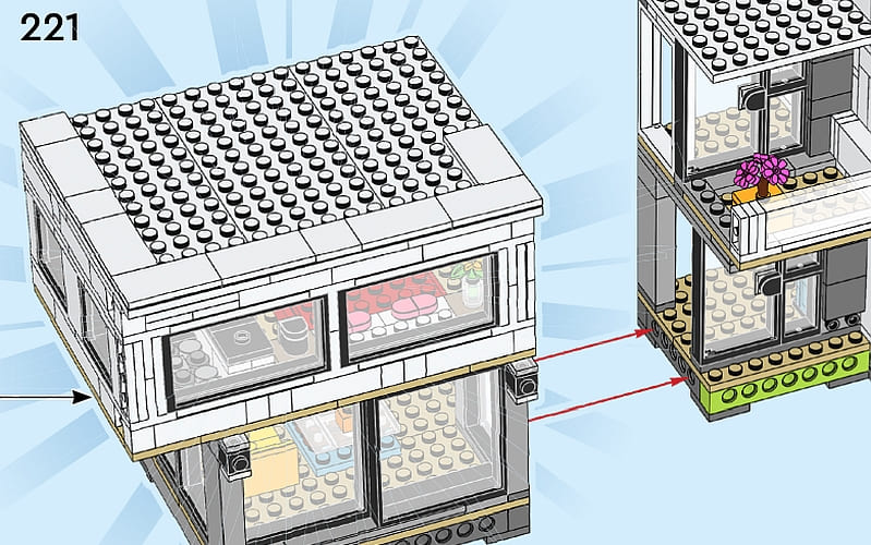
A nice feature is that this model demonstrates how to build solid connections with sturdy friction pins on the house and half pins and half axles on the front area. This is important since sometimes you might have large thin sections that do not have a lot of weight. In those cases, trying to line up and connect friction pins might be impossible and kind of unnecessary. Either way, you look at it, this model is a great example when you’re looking to upscale one of your own creations.
LEGO MODERN HOUSE – SHOWCASING THE INTERIOR
I absolutely love the furniture in this model. Mind you, it’s not a style I’d ever want for my home, but each piece is dripping with character. The bold color choices and the strong sense of geometric shapes really give character to the home.
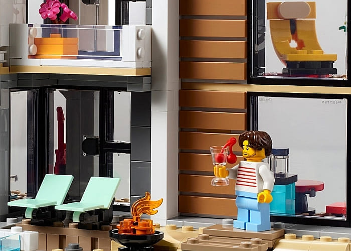
This is important because if you take all these pieces away, the house is quite boring. It may have an odd design element or two, but in general, it’s a lot of glass and straight lines. The high visibility allows these interior pieces to play a much bigger role in the overall look. This is because these interior elements are chosen to draw the eye. Compared to many other buildings I’ve built, this one is actually pretty empty. However, it doesn’t feel empty.
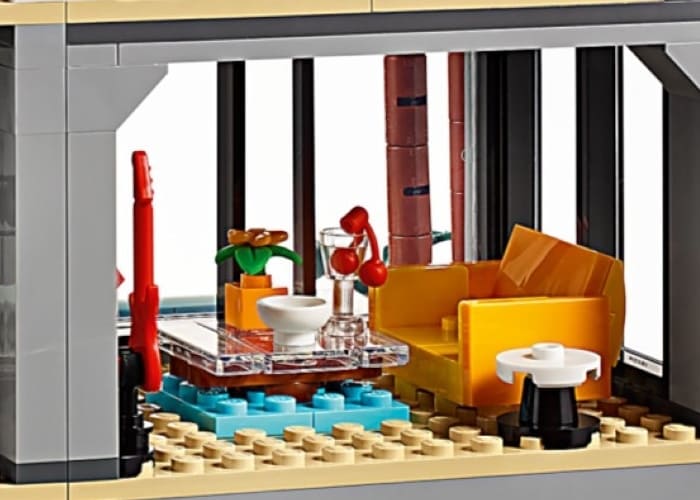
In short, this is one of those techniques where less is more. By choosing bold interior elements that stand out, you can fill the space without crowding it. Many times, I try to cram as much detail as possible only to find that I’ve ruined the effect I was going for. Too many small details put too close together can make it very hard to appreciate anything much less see some clever design.
LEGO MODERN HOUSE – FINAL THOUGHTS
This turned out to be a much more interesting set than I was expecting. Although I wouldn’t call it a modern house, it feels more like a vacation home. There is just something about this building that doesn’t give off a home vibe, but rather a beachfront property you might rent. This is not bad, it’s just something I noticed.
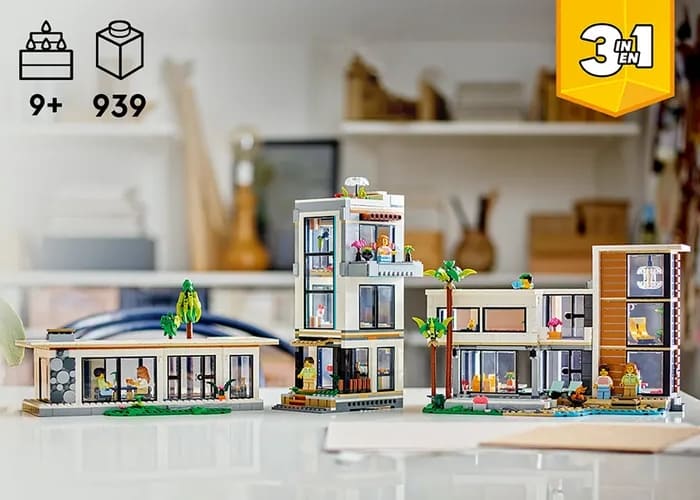
As for the parts, this is a solid set. Sometimes it can be hard to source a good number of large windows, but this set has plenty of them. Pieces are also in a variety of neutral colors, for the most part, so it makes a decent parts pack.
And as for the build, it is simple. In fact, I think the age rating of 9+ might be set a tad high. However, there are some smart designs in the model. The lawn chairs feel fresh and new, clipping on the second-floor sidewall is interesting, and the palm trees are nicely done. Also, the model is a good size, so you feel like you’re getting a substantial building for your money. Overall, I wasn’t as disappointed with the building experience as I thought I might have been.
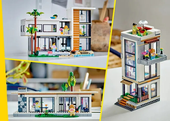
In the end, the impression I’m left with is that this is a classy place. It manages to do this not by being gaudy or over-elaborate, but by its simple choices. There are features in this home that I would shake my head at if this was a real building, thinking that they are totally impractical, but home makeover shows often feature such design elements and often cost a ridiculous amount of money. And for that silly reason, this set is pretty awesome. In the video below, I talk a bit more about the set.
There are also two alternate models; a 3-story city building with a hot tub room and rooftop terrace, and a forest cabin with an opening roof. For everything you get, I feel that the $99.99 price tag is reasonable. If you want to check it out, is already available in some countries and will be available in North America later this summer at the LEGO Creator section of the Online LEGO Shop.
What do you think? How do you like the LEGO Creator Modern House? Do you have this set already? Or plant to get it? And what do you think of the building techniques we discussed here? Are there any other interesting techniques you noticed in the set? Feel free to share your thoughts and own reviews in the comment section below!
And you might also like to check out the following related posts:


I like the paneling on the side. I think there was an earlier Creator set with similar paneling, which I also liked.
I assume by “modern” here they are referring to the architectural style, in which case “brutalist house” might be more descriptive.
Ironically enough, while being ghastly itself, the style does lend itself incredibly well to Lego pieces.
Isn’t brutalism all gray and heavy though? This house seems more light and airy. At least that’s what I remember from many years ago when I studied art history.
Yeah, this looks more like updated Frank Lloyd Wright or something.
Brutalism tends to be gray and blocky. (That extremely high-ceiling room with the lamp strikes me as a city kid. Way too unfunctional and ostentatious for brutalism…)
Or Malibu Modernism, even moreso.
(Although arguably, I guess it could be considered a slicker offshoot of Frank Lloyd Wright…)
You know what theme has really good houses? Friends!
But I’m surprised how large this one is. It looked smaller on pictures.
I like the picture with the three versions together. This would make a nice modern neighborhood setup.
There is another form of modularity they tried previously. I can’t remember what was the name of the theme, but I think it was under Creator (or maybe City?). It included pods (rooms), that could be stacked in different ways. It was a few years back and I don’t think it was very popular.
It doesn’t ring a bell. Initially, it feels more like a Playmobil move or something…
Lego is the perfect medium for houses like this. Even though they may not the most practical in real life. I like the contrast between the plainness of the house and the colorful furniture.