(Written by William)
I’ve got to be honest when the Botanical Garden project on LEGO Ideas was selected as a future LEGO Ideas set, I was surprised. Just last year we got the #41757 LEGO Friends Botanical Garden, so this felt a bit redundant to get another set with the same subject. For this reason, I didn’t pay any attention to the project. However, I was still curious enough to accept the offer when LEGO offered it for review. I’m not a big fan of mini-dolls, so having a minifigure version was appealing to me at the very least. What I wasn’t expecting was that this set ended up being one of the best models I’ve ever had the pleasure of putting together.
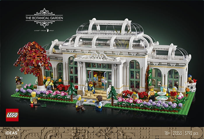
The size of the #21353 LEGO Ideas Botanical Garden is a bit more than I expected. Priced at $329.99, it will exceed many people’s budgets. However, it works hard to earn that price. The skill level of the build experience is on par with any expert-level set that LEGO produces. Additionally, the model does not have a bad viewing angle. This is something even LEGO Modular Buildings struggle with delivering. It also provides plenty of access to the various parts of the building without compromising any of the aesthetics.
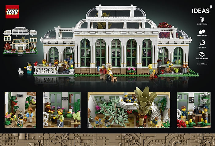
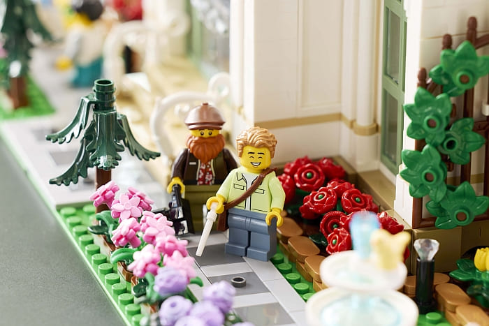
Given the fact that the fan who designed the original submission is an architect, it is safe to say she knew how to maximize every inch of the model. And if that weren’t enough, this set did its homework on the plants. The set showcases a whopping 35 unique plants. The variety goes far beyond plants that are just a different color as well. This high level of detail makes for a very entertaining building experience.
The pacing of the build goes back and forth between structural components and detail work. By the time you are starting to get tired of one or the other, it switches. I always found myself eager to move on to the next step and did not feel fatigued like I have experienced with other large sets.
I also ran across some interesting techniques while building the set. These were subtle touches that I might have missed if the set were smaller. Often, I find this to be the case with large models. The needs for certain methods of building differ when scaling up. So, let’s take a closer look at some of these and see how the techniques might improve your own creations.
LEGO BOTANICAL GARDEN – SOFTENED EDGES
When an architect is given free rein to design a building, there are many ways they can be inspired. However, the most common factor for an architect to consider is the purpose of a building. A good example of this is a building like a botanical garden that will need a lot of sunlight, therefore many windows will most likely be used for this function.
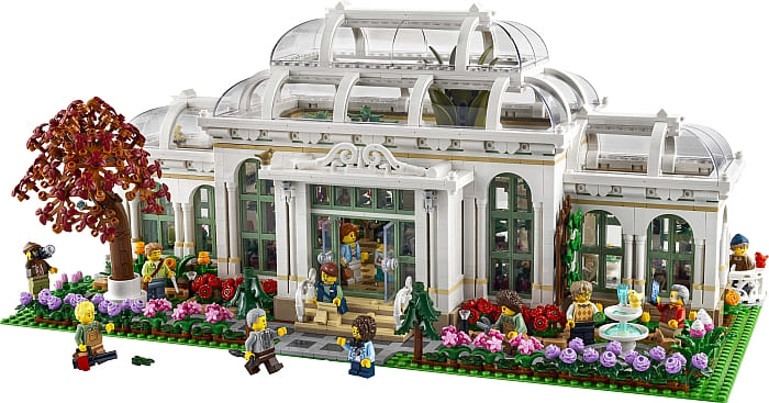
Beyond this, architects still have room for style. This element will give the place a sense of character and atmosphere for those who use the place. In the case of a botanical garden, it should be light and airy as well as having an impression of being alive. The first of these is accomplished with both the use of windows as well as the color palettes. The overwhelming white and light greens help brighten up the entire place.
As for the being alive aspect, we get here a lot of soft edges. The rounded roofs are the most obvious points where edges are softened, but others exist as well. The piping under the edge of the roof has plenty of curves. Additionally, the thin pillars that frame most of the windows further reduce any sharp angles the building might otherwise present. And then there’s the foundation.
It may be hard to see from a finished image, but if we look at the footprint of the building before we add walls and more raised foundations, we can spy more subtle curves and rounded edging in the building’s lowest level.
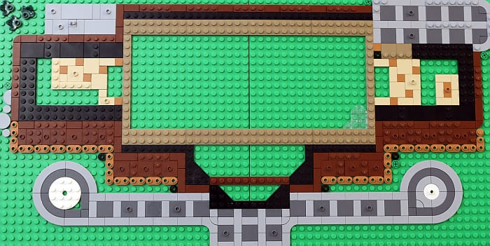
All this subtle design works well with a place that houses so many plants. Generally, plants aren’t all that straight in terms of direct linear lines. Instead, they grow and bend and twist around things, hence softer curves feel more appropriate.
As a side benefit, the rounded curves feel more open. This works well for that light and airy design. This is because the viewer sees slightly less surface area when it comes to features like pillars. Consider if each pillar was square instead of rounded. The front of this building would look more like a castle because you’d see a lot of flat surfaces filling up the space and thus crowding the design. Reducing the flat surfaces and rounding things out, it opens up the design creating more space.
LEGO BOTANICAL GARDEN – COUNTER-SINKING
Designing realistic plants can be a tricky thing. To do it right, you not only need to consider the shape and color of parts, but they will also need to be oriented in the perfect position. Because minifigures are only so tall, builders often end up with a problem. How do you create the right connection for a design when you just don’t have enough space?
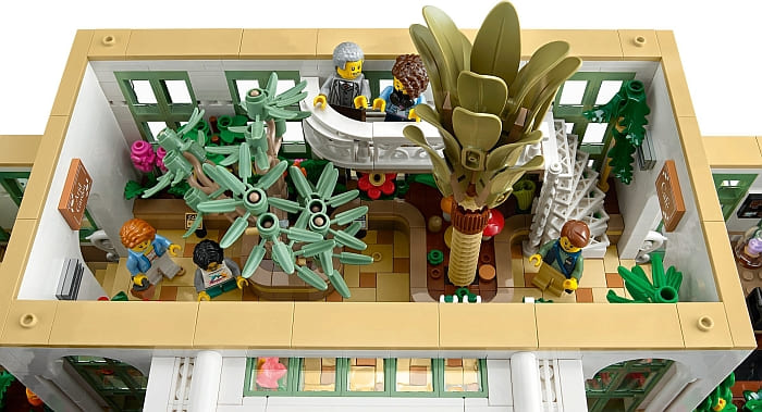
Well, this set offers an interesting solution. While building several planters inside the building, several holes were left. The purpose of these spaces was to allow the builder to create better connections for their designs. These blocks then fit inside the holes – kind of like when you fit an appliance in your kitchen. Many times, these appliances are designed to be counter-sunk so that they look like they are a continuation of a counter’s surface with only some minor discrepancies.
Each time this is done, the surface is technically not perfectly level. Most of the time, the exact difference is off by half a plate’s thickness, but it works well for creating some great-looking plants. The best examples of this being used are the three plants along the back wall of the main atrium, the bamboo in one corner, and the two removable trees in the main atrium.
This is a great technique to try when you have a rough idea as to what you want, but you’re not sure how to go about doing it at the moment. By allowing yourself to skip over more involved detail work you can keep yourself in a much more consistent building rhythm and not shortchange a key point you really want to shine.
I was actually impressed with how smooth this made the entire model feel when it came to building. Many of the heavier constructional elements were separated from the fine detail work, making everything have an excellent sense of pacing.
LEGO BOTANICAL GARDEN – MULTI-MODULARITY
It is safe to say, there’s a lot going on in this model. Every inch is packed with impressive details. This does mean that the space fills up quickly and makes it hard to reach into the tighter spaces of the building. This is why LEGO designers employed multi-modularity.
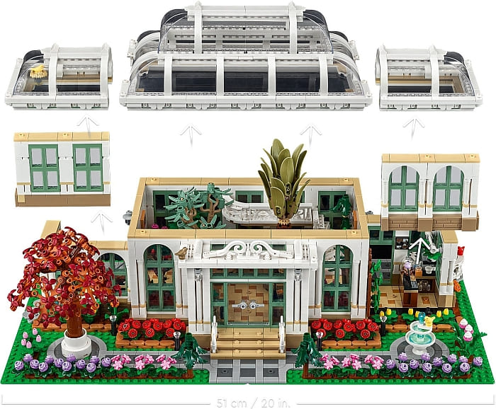
Not only do the roofs come off of the three sections, but each area has additional components to remove. Each of the sides has a wall that can come off to make play possible for those with larger hands. And in the central atrium, the two trees in the middle can be easily pulled out, allowing access to the main interior.
This is a technique that is not usually used in models as each element that can be removed reduces the structural integrity of a building. However, the reason why it works here is that the building is pretty much just one floor. This means there is less need for stability since there is not a lot the walls need to support. In the main atrium where there is a second-floor observation platform, the wall it is attached to is not modular. This is why the trees were chosen as the modular component since they only had themselves to support.
It is honestly rare to see a LEGO set sprawl over this much space. That is probably why we don’t often see much in the way of multiple levels of modularity in a set. The best we see are breakaway walls for action-play elements, but even these are kept small and confined. It’s good to see it being used and done in a way that teaches good restraint.
LEGO BOTANICAL GARDEN – FINAL THOUGHTS
Flat out, the #21353 LEGO Ideas Botanical Garden is absolutely gorgeous. The build experience is on par with any expert-level set I’ve ever built. The pacing of how things come together is also very well thought out. By the time I got tired of building something structural, the model changed to a heavy focus on detail work. Then, when I get tired of that, it switches back. I can’t say I was ever bored building this set.
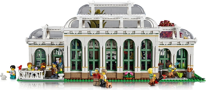
Additionally, nothing feels neglected. Even the best LEGO Modular Buildings will have a side that is often rough, to put it nicely. You tend to have to pay a bit more for something that looks great from every angle, and that’s exactly what you get with this one. You could place it in the middle of a room and it will look amazing no matter where you stand.
Builders will love the sheer number of windows and plants found in this model. We get new large curved corner panels that help make up the roofs of the three sections. It’s also nice to get a selection of interesting colors for the new rose piece and tulip flowers. The green banana peels and pumpkin, and green eggs are also great additions to the part selection.
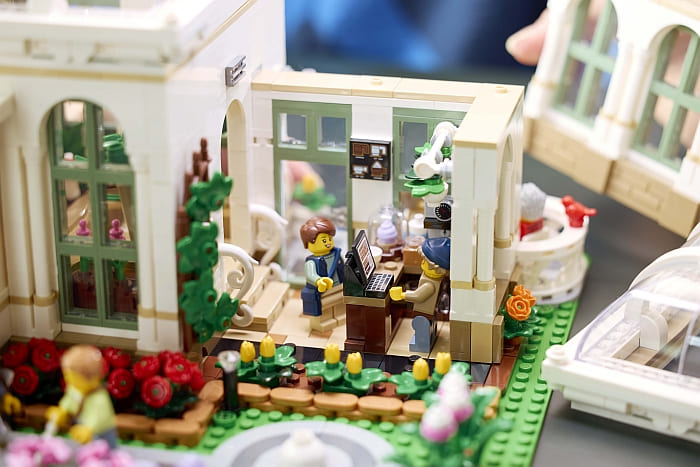
There are a few stickers, including the two computer monitors, the signs leading out from the main atrium, and a pinboard that is behind the front desk, which is hard to see. That’s a surprisingly small number of stickers given the size of this set.
Printed tiles include four leaf clovers scattered around the garden, a beetle hiding in one of the trees, and little signs inside the building describing the various plants. Beyond these, there are more common printed elements like keyboards for computers and a cell phone for one of the minifigures. All in all, the printing is minor and made more for detail work. In the video below, I will walk you through the set, then we will wrap up this review.
Ultimately, there’s only one bad thing about this set and it’s the price. At $329.99, it is just out of so many people’s budgets. Keep in mind, I don’t think this set is overpriced. Honestly, I can’t think of a prettier set I’ve ever put together. Most of the time when sets get this pricey, I don’t feel like they are worth it. But that’s just not the case with this one.
Despite it not having the LEGO Modular Building connections, LEGO does consider it part of the modular building line. I can’t think of any higher praise for a set that costs this much and is not connected to any sort of intellectual property. Hands down, this one is worth saving up for to add to your collection. If you want to check it out, it will be available beginning of November at the LEGO Ideas section of the Online LEGO Shop.
What do you think? How do you like the new LEGO Botanical Garden set? Are you planning to add it to your collection? And what do you think of the building techniques we discussed here? Are there any other interesting techniques that you noticed in the set? Feel free to share and discuss in the comment section below!
And you might also like to check out the following related posts:


What a stunning set! Very expensive though. But I would love to get all those flower shapes and colors.
There are some rumors that the next modular is going to be a townhouse. I guess We will find out for sure soon.
But yes, this set would look great at a central park amongst the modulars. It’s beautiful.
A townhouse? That would be awesome! We need more residential building.
I kinda preferred the square shape of the original submission. It’s more stocky and cute.
This is why I like the Friends version too, which I already have.
But I would love o have all the flowers from this one! The Friends one doesn’t have as many.
The removable walls and plants are a really good idea. I have done this in some of my modulars. They to be much better access and also makes it easier to pose minifig.
This reminds me of the Brick Bank. Nice colors and architecture, but way too big for me. I appreciate that they didn’t make the building experience boring though.
That’s really smart how they have the plants slide in there. I haven’t seen that technique before.