
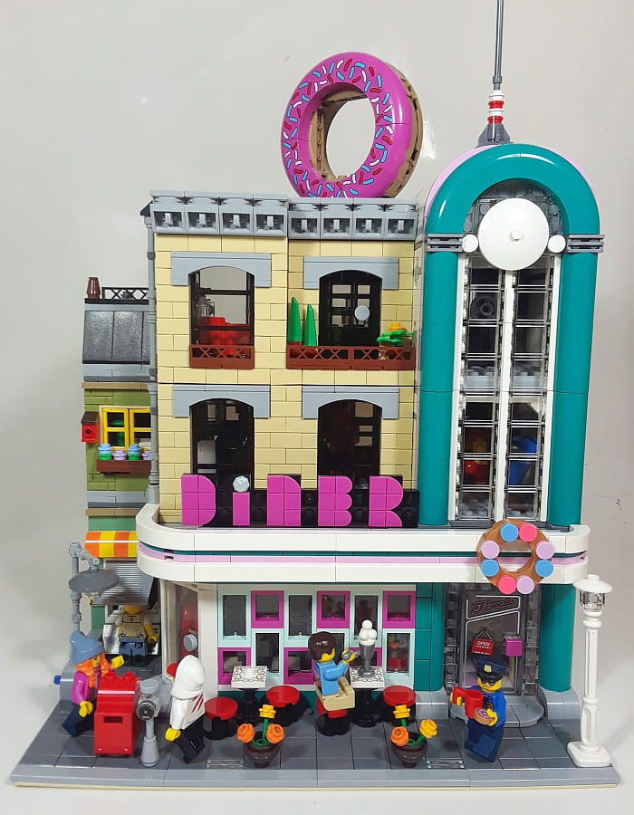
Like many LEGO fans, I have a conflicting relationship with the #10260 LEGO Creator Downtown Diner. It’s one of the best LEGO Modular Buildings in terms of building experience, it’s full of interesting building techniques, it never gets boring during the building process, and it overall looks great. On the other hand, the Art Deco/Streamline Moderne architecture is a bit too much for some. Streamline Moderne is an architectural style that’s either loved or hated, and it doesn’t blend well with anything with its bold curves, long horizontal lines, and unusual colors. In fact, most Streamline Moderne buildings look best as standalone structures, or in a row of similar buildings. Although LEGO designers tried to tone down the style by wrapping it around a neutral brick building, the Downtown Diner still stands out as unusual amongst the other LEGO Modulars.
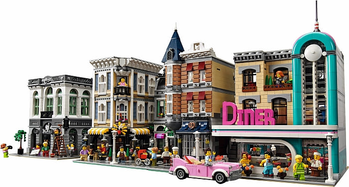
Even though I got the LEGO Creator Downtown Diner back in 2018, I didn’t build it until just recently. I’m one of those people who don’t really like the Art Deco style, and since I have limited space for my Modulars, I didn’t want to “waste space” with this set. My plan was to build it just for the learning experience, than take it apart for parts. However, I had such a positive experience building it, and there are so many sections I really like, I decided that it was worth trying to “save it” by toning down the Art Deco elements.
The sections that I do like in Downtown Diner is the tan building (it’s simple, but very nice), the tall tower looking section on the right with its porthole windows (it looks really good next to several of the other Modulars), the color combinations, and pretty much all of the interior. The sections I didn’t like are the long horizontal overhang that spans the entire width of the building, the bold curves that wrap around the windows on the ground floor, the oversized lettering, and the significant gap that the steps create on the left (this makes it difficult to place the set next to other Modulars without exposing some ugly sidewalls). I also felt that the diner was too big compared to the interior spaces of the other Modular buildings, and it could be split into two separate sections.
So, my goals were as follows: 1.) Make the overhang shorter 2.) Remove the curves from around the windows on the ground floor 3.) Make the lettering smaller 4.) Replace the steps with a narrow building 5.) And split the diner into two smaller retail spaces. Below, I will explain in a bit more detail what I did for solving each of the problems.
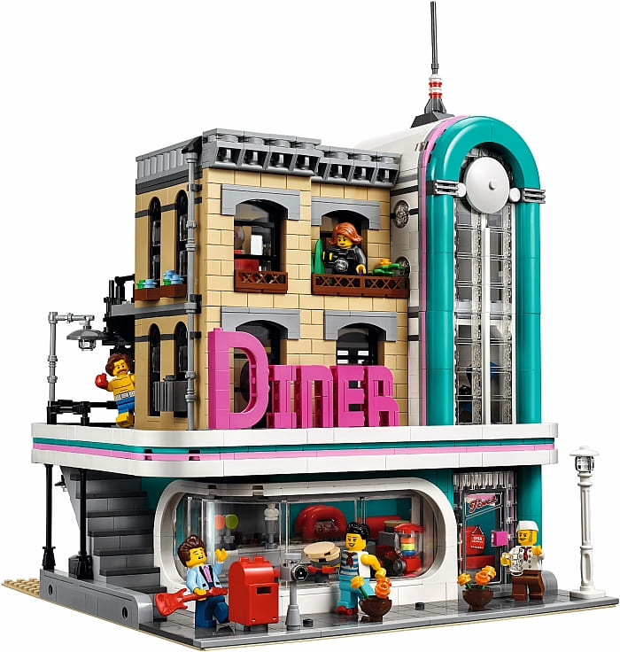
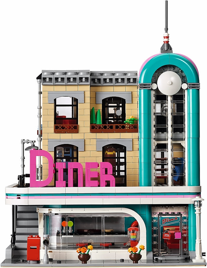
Making the overhang shorter was fairly easy. I just removed the section that expanded over the steps. I still wanted it to wrap around the side a bit as I was going to place a door there for the smaller diner. I basically locked in the ends where the narrow building begins. I also had to adjust the roof drain pipe a bit.
Removing the curves from around the windows was also fairly easy, but this exposed some very plain looking windows. A set that I really like and always wanted to utilize in a Modular Building is the #41336 LEGO Friends Emma’s Art Café. It has a really nice color-scheme of white, light-aqua, dark-pink, and two shades of purple, and I love the arrangement of the windows. I initially considered replacing the overhang of the diner with the awning of the art café, but then decided against it, when I discovered that the shorter overhang was working out just fine. So, the only feature I ended up using from the art café is the corner entrance and the arrangement of the aqua and dark-pink windows. (This shows just how much ideas can change as you build!)
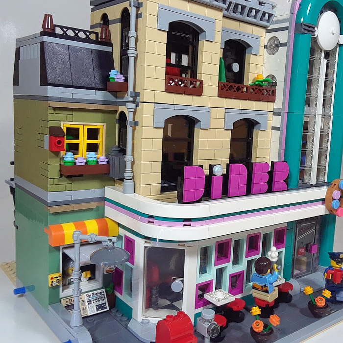
As far as making the lettering smaller, I have been collecting all of the LEGO DOTS bracelets and LEGO DOTS extra packs, so I had plenty of colorful tiles to work with. I kept the original dark-pink color as I liked it, but made the letters about half the size using a simple “lettering with tiles” technique. I like it so much better this way!
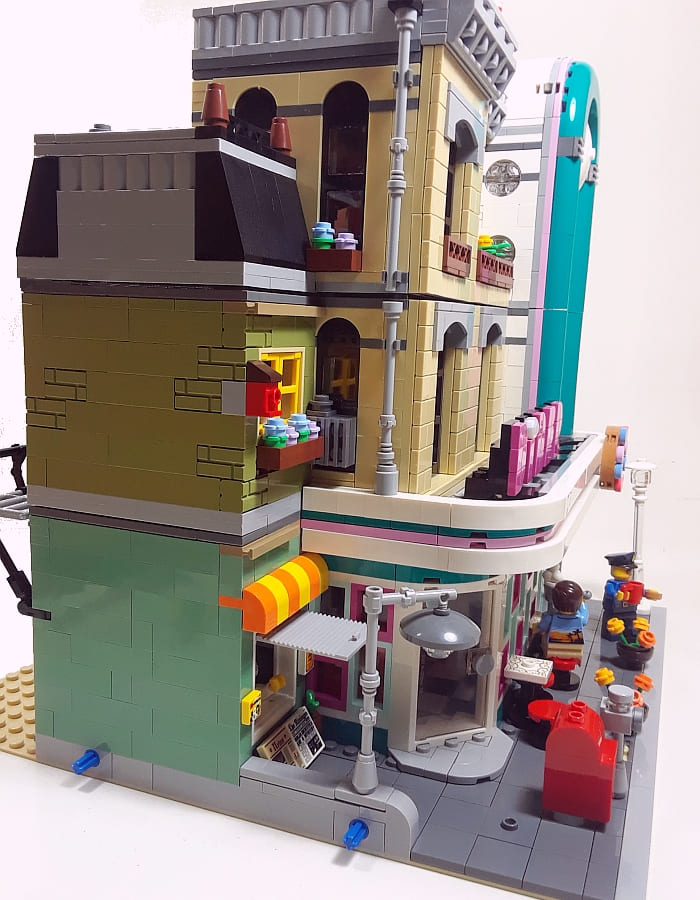
My inspiration for the narrow building came from the #21310 LEGO Ideas Old Fishing Store. I used the same sand-green and olive-green bricks for walls, and the second-story small office is right out of that set.
The first story ended up becoming a small newsstand, and under the high roof there is a small attic storage area. I wanted to keep this building fairly neutral in color as it’s next to the bold colors of the diner, but I also didn’t want it to disappear in the shadows. Thus, I added the yellow and orange awning over the newsstand, the yellow window, the flowers, and the red birdhouse.
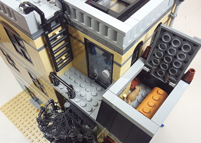
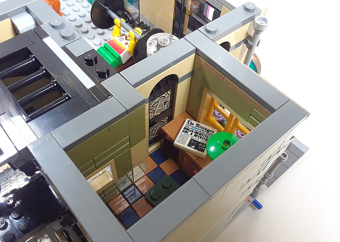
Because I removed the original steps to the second floor, and because now I had an extra two-story building, I had to install a new staircase at the back. One other change I made here is adding the meters on the back wall, which is something directly out of the #21310 LEGO Ideas Old Fishing Store that I really liked.
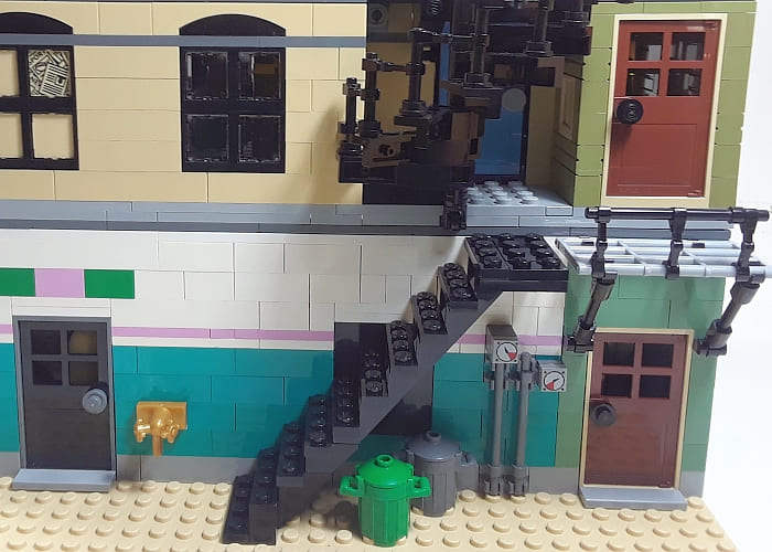
The last item to tackle was spitting the diner into two retail spaces. I was going back and forth as far as how to split the diner. Should I leave the entrance in its original position, and just make a small shop on the left? Or should I shift the diner to the left and put something else to the right? What kind of shop should I add? I eventually put the diner to the left, and made the original diner entry the entrance to a separate space.
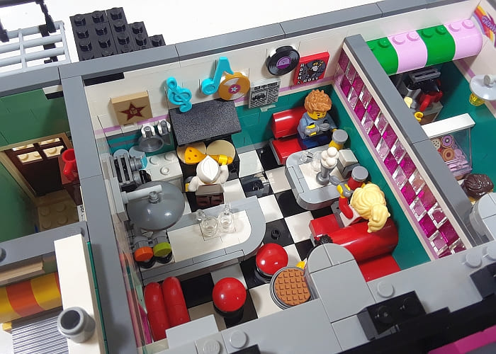
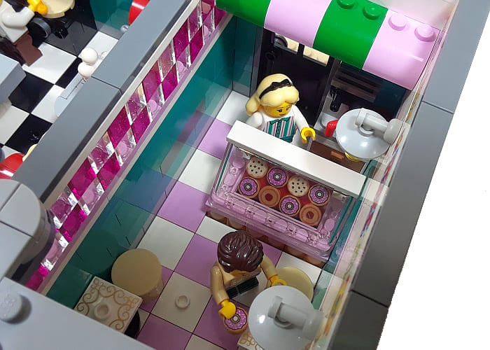
I originally considered putting a surf shop here, but then somehow I ended up with a donut shop. It just sort of happened when I put in the dividing wall between the two spaces and came up with the translucent-pink and clear checkered pattern. It looked like a better match for a donut shop rather than a surf shop. Plus, putting a donut shop in this space also gave me an excuse to use the giant donut from the #60233 LEGO City Donut Shop Opening – something I have wanted to do for a long time. I also added outside seating for the diner just to make the front a little bit more interesting.
Making the diner side of the building smaller took a bit of rearranging. The booths remained the same, but the jukebox had to move, and the long counter and the range with the hood had to shrink from their original size. (The long counter is a fairly complex sideways build. Just know that if you want to make it shorter, you will need this new centered bracket piece in white.) Still, everything is still there, and I also added some additional memorabilia on the back wall – like it’s often done in 1950s diners.
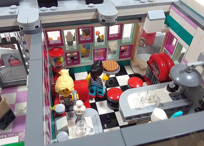
I kept the boxing studio on the second floor and recording studio on the third floor pretty much the same, as I like these spaces as is. Here is an overall shot of how the updated diner set looks on my street.

So, I was able to accomplish all my initial goals, and I’m much happier with the #10260 LEGO Creator Downtown Diner this way. It’s still colorful, but the shapes are not so outlandish. This project was fairly quick; it only took a few evenings to come up with the new arrangements, and a couple of extra days to receive the light-aqua windows and some other pieces I didn’t have. If you have been thinking about modifying the #10260 LEGO Creator Downtown Diner, I hope this narration gives you some ideas. And if you don’t have the set yet, but would like to give it a try, you can get it at the LEGO Creator section of the Online LEGO Shop.

What do you think? How do you like the LEGO Creator Downtown Diner? Do you have the set already? What do you think of the style? Did you make any modifications yourself? Feel free to share and discuss in the comment section below!
And here are a couple of other Modular Buildings I recently worked on:


Oh, I like it so much better this way. I especially like the windows of the diner!
I really like the dividing wall with the translucent pink and clear bricks!
Where did you get those printed 2×2 jumpers in the donut shop that you use as table tops?
They’re apparently to be found in several Disney Storybook Adventure sets, I see.
https://www.bricklink.com/catalogItemIn.asp?P=87580pb002&in=S
Yes, if I remember correctly, there is at least one in each of the Storybook Adventure sets. I have all four, so got a bunch. They are very pretty. 🙂
I like it. It reminds me of the diners in downtown Manhattan. Of course every time I see this Diner I think about the back to the future movie scene. When it takes place in the 50s. All I did is add more bookshelves to the Bookshop. But, I didn’t have to take things apart to do it. I also add Furniture in the pet shop /apartment building modular building set. Now I have a family living there. So, I added a few things do the various modular buildings. The other fun thing I built is a combination fire station / Coast Guard Station. I used one of the base plates from an hospital set ( it was the one that you used a ramp to get to the parking garage as well as to the building itself). The top level of the base plate has the builds ( one side Coast Guard and the other fire station). The lower level has a dock that leads to the water and a landing pad for the fire helicopter. On the side by the fire station is where the fire boat docks and on the front lower level where the dock is is where the Coast Guard boats dock. So I guess you can say I had a lot of fun putting this together.😁.
Interesting idea for a combo! The job of firefighters and the Coast Guard often overlap in seaport locations, so it makes sense! 😀
I prefer this lettering over the original. But frankly, I still don’t like the outside colors of the diner. I think it’s the dark teal that bothers me. 1950s buildings often use teal, but in a softer format. Like seafoam.
About the lettering. Is the dot on the “I” a new gem? I don’t recognize that piece at all. It also has a strange color. What is it?
It looks like the octagon jewel that comes in 41903 bracelet. The BrickLink part is #65092
Yep, it comes with several of the DOTS sets. It has sort of an opaque color and a nice shape. 🙂
Henry, yes, I live in Florida, and we have buildings like these all over. The color combination of teal and pink is common, but as you said they are washed out colors, not bright like in this set. The light-pink could pass, however aqua or light-teal would be much more accurate than the strong dark-teal LEGO designers used. Unfortunately, the big curved pieces at the top of the “tower” section aren’t available in those colors (or very many colors in general).
I really like the meters at the back. I’m going to steal that! 😀
Well, it’s not my idea, it’s from the Old Fishing Store, so go ahead and steal it. 😀
Haha! You removed the oversized lettering, but then put an oversized donut on top! The diner wants to stand out and there is nothing we can do about it! 😀
I have been wanting to put that donut somewhere, and it seemed like a perfect place. 😀
Shortening the overhang was a great idea. It always bothered me how the curves at the end of the overhang fit next to other buildings. Especially on the side where the steps are. It’s a tough building to work with, and you did a great job.
Thanks! Yes, that’s one of the reasons I shortened the overhang. And yes, it’s a difficult set to blend in with those weird shapes and colors! 😀
I like the small building a lot. I have seen small buildings like that squeezed in between larger (usually newer) buildings in my city. It often happens when the property owner doesn’t want to sell, and new buildings go up around.
And I have a suggestion. You should add one more of those brick looking bricks on the second floor under where the third floor starts. It’s a small thing, but it would balance it out.
I just learned from a comment on Facebook, that they are called spite buildings. When someone builds something weird out of spite. 😀
As far as your suggestion, I like it, and just made that change. 🙂
I like your solution. It’s very creative. I had trouble placing my diner as well. I had put a valet parking lot next to it to give it a stand alone feel. When the bookstore came out the apartment side is the same color as the diner and is the perfect transition building. It looks really good next to the diner.
Just a suggestion. 👍
One of the reasons I kept the Diner instead of parting it out is because of the apartment side of the Book Shop. Mine is further down the street, but I agree that the two balance each other out quite well. I’m going to try your idea of placing them next to each other. 🙂
I like your suggestion for putting a parking lot next to the Diner. I lucked out as my Diner is on the far left of the shelf I have my modular buildings on so it sits a short distance from the wall, hence no need to put another building next to it on the left. If I ever have need to change things I’ll try to keep that parking lot idea in mind
I like your changes, especially on the inside of the first floor. Where did you get those musical notes on the back wall? Are they from a set?
The musical notes are from the LEGO Trolls sets. I only have one small polybag I think I got as a freebie. They are great little pieces to use for decoration! 🙂
Pretty weird theme, overall, but the note pieces look great!
What I’ve done is fishing shop and space for a tan base plate (for that beach affect.) Then next to the tan base plate I put in one gray road base plate ( the one that has a cross walk). Next to that is the diner. Followed by the 50s Cinema and next to that a pizza shop. I put the detective office next to the pizza shop. The pet shop next to the detective office and the apartment building next to the pet shop . The Parisian Restaurant is next to the apartment building and the court house (which has been converted into a museum) is next to the Parisian Restaurant. Then I just kept the book store and the townhouse the same together. On the very end of my city is the Hospital / fire station and the police department. This is from right to left. From left to right is basically blue base plates ( of which I would have fishing boats) and then the prison Island. Which would follow ( when I get it) the deep sea exploration base and then of course the coastguard/fire station that i told you about earlier. I’ll probably make a park and a bike shop next to it. It’s still a work in progress.
Which pizza shop are you using?
It’s the one that came with the bike shop and I believe a yellow city bus. ( I think ) I could use the the sanctum sanatorium set from the infinity Wars but it might take too much space. I like the big building small building and then big building again set up. But no it’s the red and with a black roof pizza shop.
Oh, yes, I do remember that pizza shop. I’m kind of bummed I missed out on the Sanctum Sanctorum. It seems to be a great building between the smaller City buildings and the larger Creator ones. And I like the colors. It’s interesting that none of the Modular Buildings use Dark Tan.
I like the original design, but I thought you did an excellent and creative job in your custom build!
I love the dividing wall! Great job! And there are so many other great details. Too bad the pictures aren’t sharper. They feel kind of washed out.
Yeah, sorry about that the pictures are not more clear. My windows are facing North and East, and our house is under big trees, plus it was raining that day! It’s always a challenge for me to take pictures, but I did use some extra lamps and tried to clean them up a bit afterwards. 😀
I very much like what you did with this, especially, of course, the giant donut on top. 😀 At first I was surprised you thought the tall teal window section was keepable, but taking out some of the other art deco stuff really did tone it down.
Hey, Geneva, always nice to hear from ya! Initially, I was planning to change the teal tower section to something different. However, after I built the set, I saw that it actually looks really good next to the other Modulars. The vertical lines of the “tower” nicely frame other buildings, and the colors are nice too.
Then, I thought about it some more, and concluded that what really bothered me was not the “tower” but the long overhang and the excessive curves around the windows. They are beautifully designed, but I just really don’t like the style either in real life or in LEGO. At this point, I was still open to the idea of redesigning the “tower”, but once I removed the curves and shortened the overhang, I liked the rest, so just kept them all. 🙂
Having said that, I have seen some successful redesigns of the “tower” section. Even just changing the color from teal to one of the other colors those pieces come in make a difference. And, of course, it could be completely redesigned too to look like a regular tall and narrow building, similar to the blue section of the Detective’s Office. Anyway, there are always lots of options with LEGO. 🙂
It’s pretty funny seeing this now, and knowing that we are about to get both a donut shop and a newsstand in the new Police Building modular!