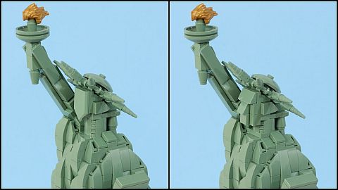
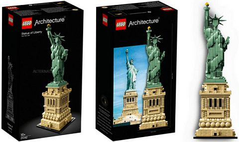
When we talked about the #21042 LEGO Architecture Statue of Liberty(see: LEGO Architecture Statue of Liberty Review), we discussed that while both the pedestal and the statue itself had beautiful and impressive designs, the flat face and unusually long neck appeared somewhat odd. I was hoping that someone will come up with a good alternate design, and sure enough, we didn’t have to wait long. 🙂

The face of the LEGO Sisyphus and LEGO Lawnmower Man by Jason Allemann (a.k.a. JKBrickWorks) is the same scale as the face of the Statue of Liberty, so Jason himself decided to demonstrate how to swap them out. As a plus, all of the sand-green pieces needed for altering the face are available in the #21042 LEGO Architecture Statue of Liberty set either as extra pieces, or as pieces that can be easily changed out. Jason also discusses how to do this in the video below.
These simple yet effective changes to the face make a big difference, and they are also more in line with the overall design of the statue. And what I found even more surprisingly effective is swapping out one of the 2×2 round plates used for the neck into a 2×2 square plate (as shown by Jason in the video). This alteration makes the neck much more proportionate, and it also smoothes out the transition between the neck and shoulders. It’s amazing what one simple piece can do!

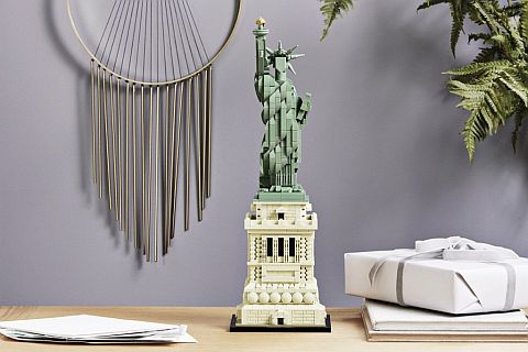
If you like the #21042 LEGO Architecture Statue of Liberty as is, then there is no need to make any changes. However, if you are one of those LEGO fans who was hesitant to buy the set because of the flat face, these simple alterations may make the set more attractive to you. Whichever version of the face you choose to use, the set is an impressive display-piece that would look good on a desk or shelf at home or at the office. If you want to check it out, it is available at the LEGO Architecture section of the Online LEGO Shop.

What do you think? How do you like the LEGO Architecture Statute of Liberty? Are you planning to get it? Or do you have it already? And what do you think of the face and neck changes? Feel free to share your thoughts and discuss in the comment section below! 😉
And you might also like to check out the following related posts:


Oh, wow! So much better! I actually like this!
The face is a bit too masculine, but at this scale, this is as good as it gets. It’s great that no extra pieces are needed. Thank you, Jason!
I like the modified face a lot. Matches the rest of the statue perfectly. Even more so, I like the modification of the neck. It’s amazing what a difference swapping out one piece can do.
Yeah, the modification of the neck is surprisingly effective. Amazing how one piece can make such a big difference! 😀
So much better than the original. I don’t know why they used that weird shield piece.
The altered face is too much like the Easter Island statues, but I still like it better than the shield. I suppose that the best that can be done with current pieces.
Yeah, it does look somewhat like the Easter Island statues! 😀
Just used the video tutorial to make the changes and I really like it. I was always a little bummed out that such a great set had such a blaw/blank face. Now she has a face which add quite well to the overall look. Thanks for doing this. I have this set displayed in my dinning room.
Steve, thanks for sharing! Yeah, this set is definitely dining-room-display-worthy. Especially with the updated face! 🙂
Thumbs up for the altered version here too! 😀
Great to see an improved version! So much better than the original!
I was hesitant to buy this set because of the blank face. After I bought it I still wasn’t sure if I could build to a blank face. I was so glad I found this site with the simple modifications to make a face, only then did I decide to build the set. Though the face is boxy, it’s far better than blank. Thank you Jason for your innovative LEGO skills.
Hey, Mike, I’m glad the modification helped! Yes, the modification looks so much better than the blank face! 🙂