(Written by William)
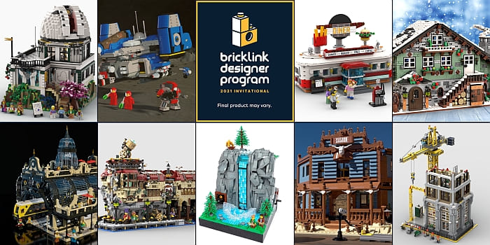
In the past few months, we have been discussing several of the LEGO Ideas projects that were released via the BrickLink Designed Program. So far, we reviewed the #910016 LEGO Sheriff’s Safe designed by Il Buono (see: Brick Breakdown: LEGO BrickLink Set – Sheriff’s Safe), the #910028 LEGO Pursuit of Flight by JKBrickWorks (see: Brick Breakdown: LEGO BrickLink Set – Pursuit of Flight), the #910001 LEGO Castle in the Forest by povoq (see: Brick Breakdown: LEGO BrickLink Set – Castle in the Forest), the #910010 LEGO Great Fishing Boat by EdouardClo (see: Brick Breakdown: LEGO BrickLink Set – Fishing Boat), the #910015 LEGO Clockwork Aquarium by Farquar (see: Brick Breakdown: LEGO BrickLink Set – Aquarium) and the #910009 Modular LEGO Store by Krisnow (see: (see: Brick Breakdown: LEGO BrickLink Set – Modular LEGO Store). And today, we will discuss the #910011 1950s Diner by pix027.
It’s sad to say, but my previous experiences with the Bricklink Designer Program sets have been a hit or miss. For this reason, when Round 3 took place, I was a bit skittish about diving into getting more models. Part of it was the uncertainty of quality, the other part was the sheer price of the sets in Round 3. They were mostly so big and expensive! So, I stayed conservative and only picked up one set.
The 1950s Diner created by pix027 seemed to be a sensible choice. For one, the price didn’t break the bank and the model looked to have a good deal of nice detailing. Plus, you also got a car with the model. Thus, I figured it was likely that the set will provide a variety of interesting techniques. After all, vehicles and buildings are rather different when it comes to construction.
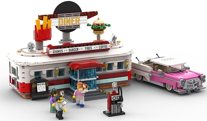
When the set arrived, I wanted to get to building it right away. Either I was going to get through the pain as fast as possible (haha!) or I’d be pleasantly surprised. To save you from the suspense, it was the latter! Not only did pix027 deliver an expert-level building experience, but they did it for both the vehicle and the building. And to add a cherry on top, the instructions were excellently laid out.
This, from top to bottom, is a professionally put-together model. And what I like is that I can tell that it is still a fan design. Not because of anything odd, but because pix027 did not cut any corners. They made sure that even the less visible elements were still fully detailed. All in all, this is one of the best models I built from this program. So let’s take a closer look and see what caught my attention.
LEGO 1950s DINER – THE CAR
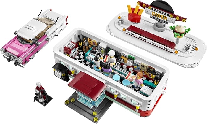
This set starts off with a pink and white Cadillac. If you’ve built the #10260 LEGO Modular Downtown Diner, you may get some similar vibes from this vehicle. However, thankfully, there are also plenty of differences. For one, this is not a convertible and it has a much different style (especially on the sides of the vehicle).
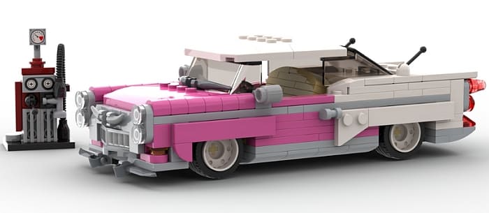
The car is done as an eight-stud wide design, very similar to many of the current LEGO Speed Champion vehicles. This is fantastic since it gives the designer plenty of room to add nice details.
I personally like the use of pirate cutlasses to help form the front bumper. I also like the use of various gray horns around the front hood to add an additional level of trim. Plus, it was nice to see how they partially covered up the wheels on the sides with tiles to give the car a very distinct look.
Generally, the construction was also well thought-out and sturdy, save for a few decorative detail elements that are only connected by a single stud. It is a shame there is no functionality like opening doors and hood or trunk space, but these are trade-offs for a very sleek body design.
Overall, I was very satisfied with this part of the build. Though it did make me a little worried too. If the designer is this good at vehicles, were they equally as good with buildings? Many builders I’ve met are often excellent in one area and only so-so in others. Personally, I’m pretty good at buildings, but struggle with vehicles. And given my past hit-or-miss experience with Bricklink Designer Program sets, was I going to find a much different experience with the diner itself?
LEGO 1950s DINER – THE DINER
If I have any complaint with this set, it’s the naming. That’s because I’d call it the 1950s Road Side Diner and not just the 1950s Diner. That’s it. This building is crazy good and the level of detail feels like it is undersold by the name.
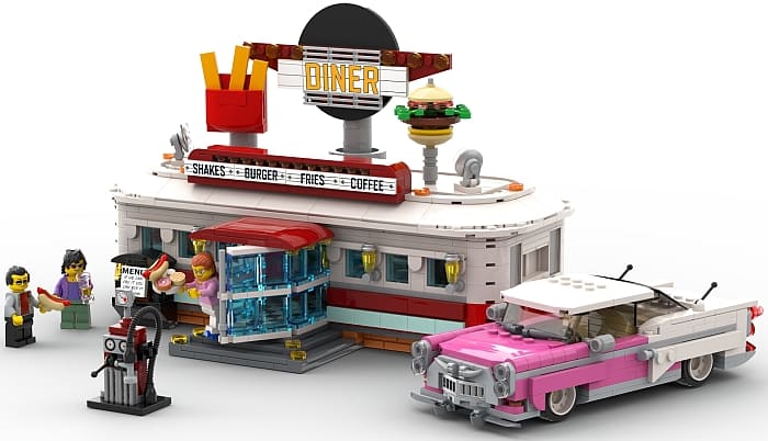
Let’s start with the fact that the designer is heavy-handed in all the right places. They don’t sell you short with a flimsy base, but give you a foundation that provides both heft and stability. Added to this, the designer has structured the build in a very smart way. They are methodical and are very aware of sight lines to the parts that need to be added. Plus, they are no slouch when it comes to details.
The design also has some subtle aspects borrowing elements from real life. The diner looks to be a modular unit that was driven into place and then modified to suit its current purpose. Notice how the entire building sits up on a raised foundation? It is often that once a modular unit is brought in, a foundation is then built around the base to finish off the construction. And just like in real life, these foundations won’t necessarily line up straight with the building, which is recreated with a slight offset in the set.
Next, the shape of a modular unit tends to be simple in nature. Rectangular buildings that are long can more easily fit on the back of a truck. Long rectangle is the exact way I’d use to describe this diner.
Then you got the doors. And I’m not talking about the one in front where patrons come into the restaurant. That one actually looks like modification construction workers did to cut into the side of the module. Rather, there is something on either side of the building’s short ends. At first, I wasn’t sure why the sides had a little bar connection just sticking out. Then it hit me; those were once door handles! And the reason they are built into a wall is because those used to be doors that were later sealed shut. Honestly, it’s amazing how this model can give such slight clues to its own backstory that almost overshadows the more obvious details.
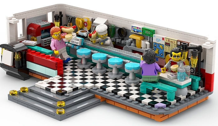
Notice how I said almost. Through and through, this building screams Americana. The back wall is crowded with so many objects found in this style of a restaurant for the given time period. The designer was also clever in using different types of connectors for sideways building. Using both traditional studs-not-on-top (SNOT) bricks and brackets allows for a greater feeling of depth in what would otherwise be a flat wall of tiles.
Detail work is continued with a uniform lighting style, both inside and out of the building. It looks like the designer enjoys the inverted cone, so its use is prominent in the model. They even capture the rounded aesthetic of the more art deco sensibilities of the time period. And then there’s the floor.
I know checkerboard has always been a popular floor style for old diners. I just didn’t think what it would mean if a fan designer got a chance to use it. In short, they are fanatical about making the floor a true checkerboard. Even the parts you can’t see all that well continue the color-scheme. I think there were only a couple of instances in the corners where a rounded corner tile was used and wasn’t in black or white. Otherwise, this is where a good portion of the part count goes into.
As for the outside of the building, it also has a very strong distinct style. The top of the building has the oversized burger and fries along with a stylized sign with an open-wing aesthetic. Topping all this off is a color-scheme that is primarily red, white, and blue. It’s loud, it’s patriotic, and it’s classic, this is truly a perfect recreation of a 1950s roadside diner experience.
LEGO 1950s DINER – FINAL THOUGHTS
From its overall style to its building techniques, this set is fantastic. Not only does it feel like a model LEGO would avoid doing, but it is built with the quality you expect from a LEGO set. Combine these two factors together and you get a very unique building experience. I’ve built a number of sets from the Bricklink Designer Program and it’s often evident where a builder has a weakness. However, the 1950s Diner manages to highlight all the strengths in a very good-looking model.
I should point out that this model is big on reducing the number of studs visible. That means you may have a tough time posing a minifigure or some of the accessories. I know this is a very popular style of building in fan circles, but if you want to have minifigures inside the model, you may want to consider swapping some of the tiles for plates in the right colors just to have points to anchor your characters. In the video below, I will show you the set in more detail.
Sadly, due to the limited nature of this set, it won’t be cheap to pick it up on the secondary market. However, most of the parts in this set are fairly easy to come by and the instructions are freely available, so you could attempt getting the parts and building it on your own. However, there are nine stickers with eight different designs that will prevent you from making an exact replica. And unfortunately, seven of these stickers make up the large signage on top of the building, so they will be rather noticeable if absent. As for colors, the pink in the car might be tricky to source and a few of the blues are slightly less common, but I can see many LEGO fans getting the instructions and making slightly altered versions of this set.
And I’d say this set is worth recreating if you like the initial pictures. It has a fresh take on a diner and shouldn’t be too expensive to source all the necessary parts. I must admit, given the other sets I put together from this program, I’ve been a bit apprehensive. Fortunately, this is one of the gems I’ve experienced. Here’s hoping you can enjoy it as well, at a reasonable price.
What do you think? Have you gotten any of the BrickLink Designer Program sets? Which one is your favorite? And what do you think of the 1950s Diner? Feel free to share your thoughts and discuss in the comment section below!
And you might also like to check out the following related posts:
- Brick Breakdown: LEGO BrickLink Set – Modular LEGO Store
- Brick Breakdown: LEGO BrickLink Set – Aquarium
- Brick Breakdown: LEGO BrickLink Set – Fishing Boat
- Brick Breakdown: LEGO BrickLink Set – Castle in the Forest
- Brick Breakdown: LEGO BrickLink Set – Sheriff’s Safe
- Brick Breakdown: LEGO BrickLink Set – Pursuit of Flight
- BrickLink Designer Program Round 1 Final Designs
- BrickLink Designer Program Crowdfunding Round
- BrickLink Designer Program Round 1 Reopens Today!
- BrickLink Designer Program – Round 1 Update
- BrickLink Designer Program First Round Funding
- BrickLink Designer Program Details Revealed
- More LEGO Ideas Projects Coming via BrickLink!









The video shows as a gray box. Just FYI. I would love to watch it.
Sorry about that. The video does play, but for some reason, it’s missing its cover image. But if you click the red arrow button, it will play just fine. I will tinker with this more tomorrow to see if I can make the cover appear.
Okay, I got it fixed. You should see the image now. 🙂
I have thought about getting this one, but I already have the Downtown Diner, so then decided against it. But I did steal some of the elements when I customized my diner.
That’s really cool what you said about this being a mobile unit. I would have never noticed that. Was that common with these diners? Mobile units?
https://www.atlasobscura.com/articles/why-do-diners-look-like-trains
Oh, wow! That’s really cool info! Thanks!
What an interesting history! And I love the examples they showed! Now I want to build a diner! 😀