(Written by George Kotlik)
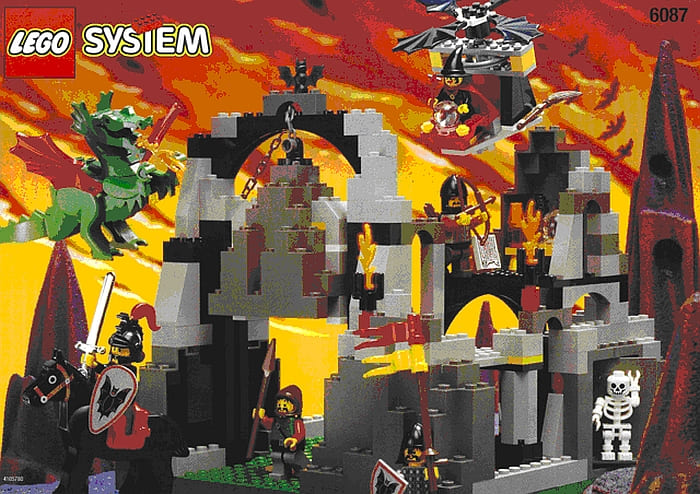
In 1997, LEGO System released set #6087, Witch’s Magic Manor. Witch’s Magic Manor, under the Fright Knights LEGO Castle product line, featured 6 minifigures, 228 parts, and weighed 916g (Bricklink, n.d.).[1] The set is the second-largest in the Fright Knights line LEGO ever made. Only three Fright Knights sets contain more than 100 pieces (Goldfyre, 2023), making Witch’s Magic Manor an important set to the Fright Knights product line and lore. Figure 1, below, features #6087.

Figure 1: Witch’s Magic Manor (#6087) – Image source: Bricklink.com
Witch’s Magic Manor appears to be a hollowed-out cave/cavern or collection of large boulders. There are two floors in the build. Willa’s potion “laboratory” (for lack of a better word here) is on the second floor. There is a dungeon/prison on the first floor. A collapsible boulder can entrap or crush unsuspecting minifigures walking under the large arch or entryway. If you do not already own Witch’s Magic Manor and want to visualize the build, check out one or several reviews of the set on YouTube (DuckBricks, 2022; Bricks of Imagination, 2021; Old Lego Guy, 2023 – see links at the end of this article in the references section).
Since its release, LEGO fans have been critical of Witch’s Magic Manor. Reviews, in general, lean negative. Nightlord_Builds claims, “I think we can all agree Witch’s Magic Manor is probably one of the worst castle sets of all time” (Nightlord_Builds, n.d.). Reddit user Keepitsimplezxc, writes, “I remember realizing that it [the set] sucked just after building it” (Keepitsimplezxc, 2020). Legolander found that “a lot of reviewers hate this set” (Legolander, 2007). Goldfyre says 6087 is “hands down one of the worst Castle sets ever made and I don’t think that’s controversial to say!” (Goldfyre, 2023).
A year later, Goldfyre posted another video on YouTube, this one titled “The Worst Castles LEGO Ever Made!” (Goldfyre, 2024).[2] Brads Archives says Witch’s Magic Manor is “the most hated set in LEGO Castle” (Brads Archives, 2025). If #6087 really is a manor, Brads Archives asserts, “it doesn’t really look like it” (Brads Archives, 2025). Bricks of Imagination posted a YouTube video review of the set titled, “Review #6087 Witch’s Magic Manor, Perhaps the Worst LEGO Castle Ever” (Bricks of Imagination, 2021). Bricks of Imagination especially took aim at Willa’s helicopter… thing, calling the build “one of the weirdest things ever made by LEGO” and wondering how the helicopter “made it through quality control at LEGO” (Bricks of Imagination, 2021).[3]
Critics especially took issue with the set name, Witch’s Magic Manor. While the build is called a manor, it looks nothing like a medieval-style manor. AETerry writes, “[i]’m looking at the name and looking at the set… and I have to wonder how LEGO could justify calling this set a manor” (AETerry, 2012). He goes on to say that “calling this a manor is very much so a misnaming of this set. I wouldn’t even call it a Fortress or Stronghold” (AETerry, 2012). AFTerry prefers to describe the set as “a random mountain setting” (AETerry, 2012). Reviewers Novelty and A_Brickset_user employ air quotations to refer to the “manor”, indicating that they are not convinced this set accurately depicts a manor at all (Novelty, 2007; A_Brickset_user, 2004). Timberalex25 writes, “I think it [the set, #6087] looks like what it was meant to be, which is a thrown-together (or perhaps destroyed) fortress/structure of some sort” (Timberalex25, 2016). Joseph Gonzalez describes the set as “a small mountain” or “a bunch of rocks thrown together rather than a man-made structure” (Gonzalez, 1997).[4]
To date, I believe reviewers have only shallowly interpreted #6087 and have not done it proper justice in their reviews. This is just one reason why I believe Witch’s Magic Manor (#6087) is one of the most, if not “the” most, interesting LEGO sets ever made. What makes #6087 so interesting is the fact that the set is so misunderstood. LEGO buried the sets’ true meaning, character, and identity traits within the LEGO Fright Knights Castle lore. Understanding #6087 necessitates a reinterpretation of #6087, which I invite you, the reader, to do with me now.
Witch’s Magic Manor (#6087): A Misunderstood Set
LEGO metaphorically calls Witch’s Magic Manor (#6087) a manor, because, technically, the build “is” a manor. LEGO tapped into LEGO Fright Knights Castle lore to develop this set, and so, in order to understand where LEGO was coming from, it is necessary to delve into the Fright Knights lore.
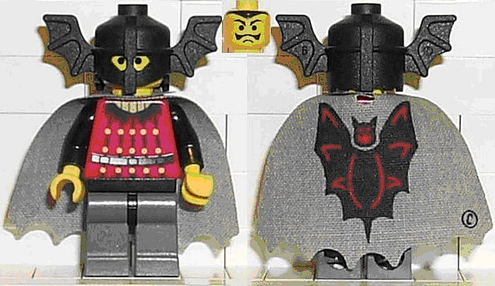
For context, the Fright Knights are a LEGO Castle faction ruled by Basil the Bat Lord, who rides a Black Dragon named Draco (Brickipedia, n.d.a; Brickipedia, n.d.b). Figure 2, below, depicts Basil the Bat Lord.

Figure 2: Basil the Bat Lord – Image source: Bricklink.com
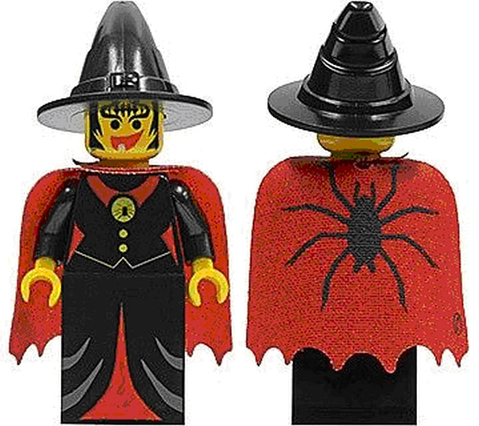
Basil’s iconic winged helmet and dark grey cape featuring a bat printing sets this minifigure apart from others within the LEGO universe. It has been established in LEGO lore through LEGO Legacy that Basil was originally a regular warlord, but then he later turned into a Vampiric tyrant (Brads Archives, 2025). The exact cause of Basil’s Vampiric transition is not elaborated upon, and LEGO fans are left to speculate on what caused his transition. Brads Archives believes that Willa the Witch cursed Basil and turned him into a Vampire (Brads Archives, 2025).[5] Figure 3, below, features Willa the Witch.

Figure 3: Willa the Witch – Image source: Bricklink.com
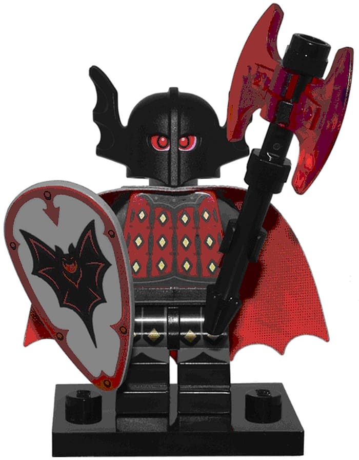
In 2024, LEGO redesigned Basil, calling him the Vampire Knight, for the Series 25 LEGO Collectible Minifigures wave. Unlike the twentieth-century Basil the Bat Lord, the 2024 Vampire Knight sports a white head with red eyes and fangs, cementing the minifigure’s vampiric identity (Brickipedia, n.d.a). See Figure 4, below, for an image of the Vampire Knight.

Figure 4: Vampire Knight, Series 25 LEGO Collectible Minifigures – Image source: Bricklink.com
While I do not believe Willa turned Basil into a Vampire, there is no doubting the importance of Basil and Willa’s relationship in Fright Knights lore. Basil and Willa’s relational origin story featured in “A Fright Night Tale” told in the LEGO Mania Magazine (Brickipedia, n.d.a; Brickipedia, n.d.c). In A Fright Night Tale.
“Basil wandered into Willa’s castle one cold, stormy night, mistakenly believing that the castle was abandoned and could provide shelter from the storm. After being frightened by bats and skeletons, Basil was confronted by Willa, who cast a spell over him and transformed him into her loyal Bat Lord” (Brickipedia, n.d.a; Brickipedia, n.d.c).
Willa clearly exercises control over pre-Vampiric Basil, but her control over the warlord does not appear to be absolute since Basil is sometimes able to shake off her influence for a short period of time, after which “he fights back against Willa” (Brads Archives, 2025). Basil and Willa’s complicated relationship is actually rather important considering the fact that the Fright Knights never really had “an antagonist faction, with the Royal Knights being the closest thing to an enemy they [the Fright Knights] had” (Goldfyre, 2023).[6] I believe #6087 explores a darker aspect of Basil and Willa’s relationship with notable impact on the LEGO Fright Knights lore. My argument stands in stark contrast to Goldfyre’s belief that “there’s just nothing going on for this set” (Goldfyre, 2023). Nothing could be further from the truth.
According to my interpretation of the Fright Knights lore, Basil sought to become a Vampire. He approached Willa and asked that she turn him into a Vampire, but she denied his request. Willa’s motivation for not turning Basil into a Vampire stems from her own self-interest and self-preservation. If Basil turned Vampire, he would have grown powerful enough to free himself from Willa’s magic influence. It is also possible, although unlikely, that Willa perhaps sought to protect the LEGO universe from a potential Vampire apocalypse.
In the North American version of the Fright Knights lore, Willa is not considered a villain and is “more of a mischievous trickster” and undecided on whether she wants to be good or evil (Brickipedia, n.d.c).[7] Perhaps Willa foresaw or drew an ethical/moralistic line in the sand, so to speak, against granting a warlord Vampiric powers he could turn around and abuse for his own imperial expansionist ambitions. Whatever Willa’s reason(s), personal or otherwise, her rejection of Basil’s aspirations to turn Vampire caused the Baron to turn sour on her and want her dead.
Discovering Basil’s plot to murder her, Willa fled the Night Lord’s Castle. Basil suspected Willa had elected to hide at her manor house, so he hired a Dark Forestman to track the sorceress down. For a sack of coins, the Dark Forestman led three Fright Knights on an expedition to find and kill Willa the Witch.[8] While the expedition found Willa, expedition members could not locate Willa’s manor house because there was/is no manor house. Instead of finding a manor house, expedition members stumble upon a make-shift camp somewhere in a small valley high up in the mountains by a Green Dragon’s cave. Willa lays a trap for the soldiers and uses magic to influence her dragon to kill the Fright Knights – the Dark Forestman is spared.[9]
What happens to the Dark Forestman next is open to interpretation. Does Willa release him so he can warn the others about what happened in a bid to get the Fright Knights to leave her alone? Does she hire him to spy on Basil? You decide what happens! The important aspect of the Fright Knights lore here is that, technically, while the set does not look like a manor, it is a manor to the unsuspecting Fright Knights. The Witch’s Magic Manor, then, is a set advertised from the perspective of the Fright Knights. Otherwise, if it were advertised from Willa’s perspective, it would/should have been more appropriately called Witch’s Magic Trap or Ambush.
LEGO buried this interpretation of the Fright Knights lore for builders/fans to find. Clues to this story, however, lie in the Fright Knights lore and require some interpretation by the LEGO builder and fan. Contrary to critics’ reviews, the LEGO Fright Knights set, Witch’s Magic Manor (#6087): (1) centralizes the importance of Basil and Willa’s relationship; (2) is, technically, a manor from the perspective of lost Fright Knights who end up ensnared in Willa’s trap/ambush; and (3) reveals that Willa did not turn Basil into a Vampire.
In the end, LEGO did not misrepresent Witch’s Magic Manor (#6087). LEGO creators were quite accurate in their description of the set; they just gave more imaginative interpretive credit to their fan base than what they were given in return for their efforts. All of this is to say that #6087 is a more interesting set with deeper implications for the Fright Knights lore than LEGO fans have been aware of to date. By reinterpreting our perspective toward #6087, a new story emerges from the Fright Knights lore that is more interesting, violent, and open to interpretation and imagination than LEGO fans have considered.
References


