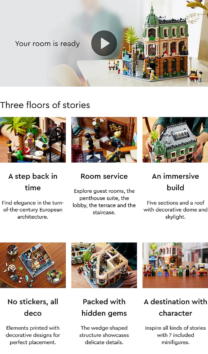
As we discussed already, the 2022 LEGO Modular Building is now available! The #10297 LEGO Boutique Hotel has an unusual triangular geometry and elegant decor, inspired by opulent turn-of-the-century European architecture. If you would like to learn more about the inspirations for this set and see some early prototype models, check out this interesting interview with LEGO Designer Anderson Ward Grubb and LEGO Graphic Designer Ashwin Visser at the BrickArchitect.com.
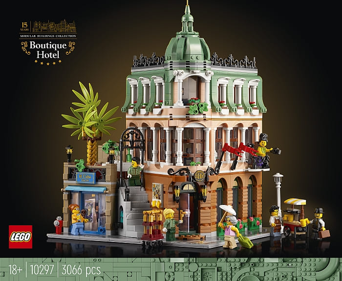
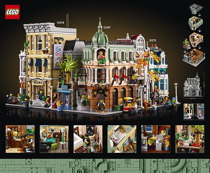
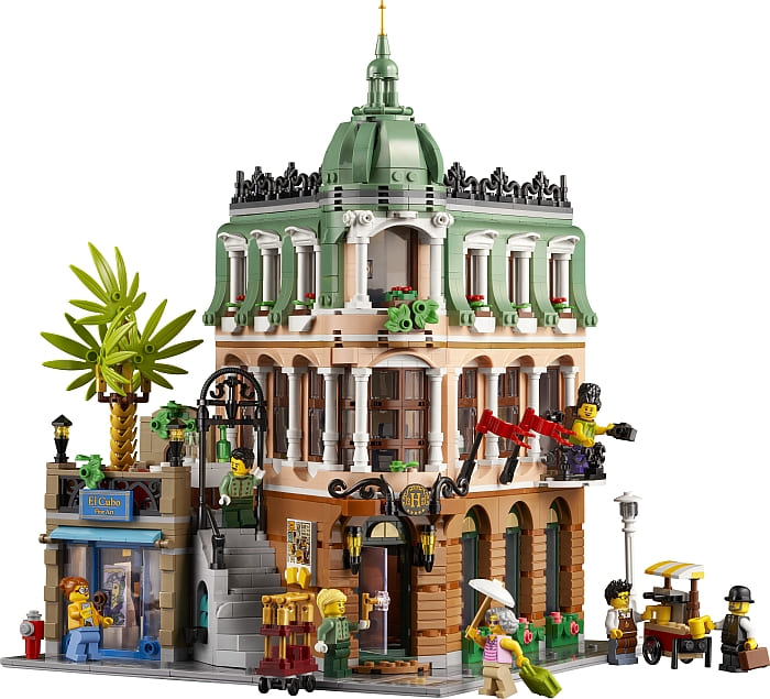
The #10297 LEGO Boutique Hotel is a corner building, which already limits placement possibilities in a LEGO City layout as it has to be placed at the end of a block. In addition, the triangular shape causes extra challenges. The unusually angled left wall and the small terrace/art gallery create unexpected and unsightly gaps and openings when placed next to other buildings.
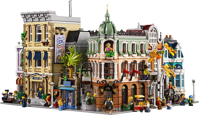
In promotional materials, the #10297 LEGO Boutique Hotel is placed next to the #10278 LEGO Police Station on the left (the angled side), and the #10270 LEGO Bookshopon the right. This placement looks fairly decent, especially as it keeps the large sign at the side of the Police Station visible.
However, not everyone has the Police Station or like this placement. To help you visualize other possibilities, I have included a couple of videos below by LEGO fans who demonstrate what the set looks like in various positions in a large LEGO City layout.
My personal opinion is that the #10297 LEGO Boutique Hotel looks too busy and unusual to be next to anything on the left. It needs some breathing room. Perhaps it could be placed next to a park or lake, or as the tip of a single row double-sided block of buildings. Unfortunately, I haven’t seen anyone try out these layouts as of yet, so we will have to wait for more examples.
What do you think? How do you like the new LEGO Modular Building? Are you planning to add it to your collection? And how/where would you add it in your city? Feel free to share your thoughts and discuss in the comment section below!
And you might also like to check out the following related posts:


I agree that the building is too busy. It needs open space next to it.
I’m toying with the idea of turning this into a regular 90-degree corner modular. Not that I don’t like the unusual angle, I do, and kudos to the designer for taking up such a challenging project. But as discussed here, it makes the set hard to place. Honestly, I don’t like any of the placements presented.
How do you mean? Removing the art gallery and terrace, and fill up the new interior space with something else?
I don’t really have the space for modulars, myself, but since I bought the Daily Bugle, I might find the space for a four baseplate table with various New York-style buildings… Of course, that’s a major work in progress considering the present state of my cluttered apartment and unsorted Lego collection… =/
Yes, removing the art gallery and terrace. and basically copying the front at the side. Of course, the interior would have to be rearranged. Maybe the art gallery can go inside the lobby? I don’t know. I’m still playing with ideas.
I also like the idea of the single row, double sided modular block mentioned in the post. It would save so much space in open layouts (no need for back alleys and courtyards like with the other modulars).
The interview at the brick architect is very good. Thanks for linking.
I liked that too. Especially the reference pictures. Not my favorite type of architecture thought. It’s a little too fancy for my taste.