The #10297 LEGO Grand Boutique Hotel is the latest in the LEGO Modular Buildings series. The set comes with a unique color-scheme and an unusual triangular geometry. While these features make the building stand out, they also make it challenging to place in a LEGO city layout. Entire review articles and YouTube videos are dedicated to discussing how the hotel looks next to other LEGO Modular Buildings and what might be the most aesthetically pleasing and least unsightly positioning. We discussed some of these options in LEGO Boutique Hotel Placement Possibilities.
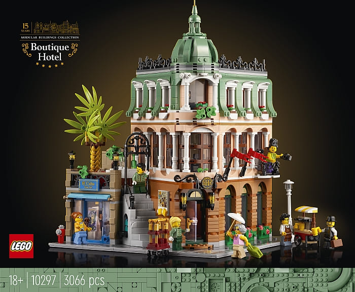
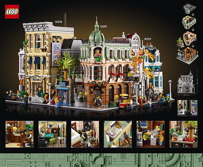
Besides figuring out how to line up the #10297 LEGO Grand Boutique Hotel with the other LEGO Modular Buildings, there are a couple of other options to consider. One is to create some transitional buildings in between the hotel and the other structures to fill up, hide, or smooth out the problematic areas, especially next to and behind the terrace. Building a custom structure like this is not an easy feat as it requires both design skills and lots of extra pieces to work with.
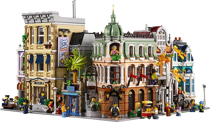
Another option we discussed previously is to place a small park or other open space next to the terraced side of the hotel and give all the unusual architectural elements some breathing room.
Yet another possibility is to expand the hotel and enclose the most problematic angles and gaps within its own design. This approach means that none of the unusual features of the hotel has to be hidden and the transition to surrounding buildings can be done in the more traditional way with rectangular shapes and higher walls.
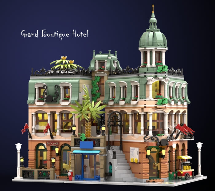
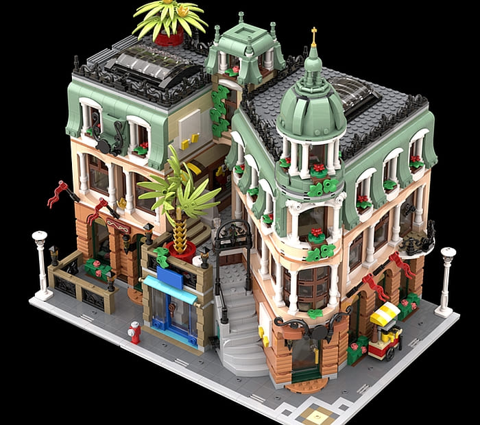
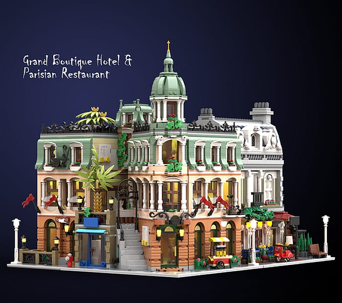
The best example of this that I have seen was done by a LEGO fan that goes by the user name Fanpeixi at Rebrickable. Their design uses two copies of the #10297 LEGO Grand Boutique Hotel plus a few extra pieces. The original set is virtually unchanged, and the second set is used to build a three-story structure of a similar style on a 32×16 baseplate. The two buildings are tied together with a tower bridge and raised dome.
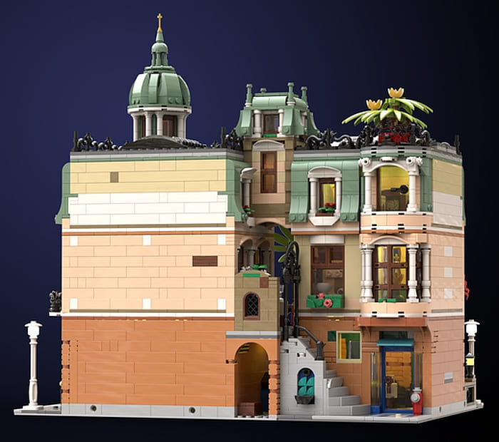
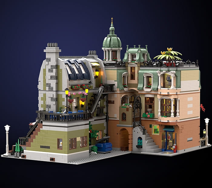
The custom three-story building comes with a coffee shop on the first floor, a bedroom on the second floor, and a lounge on the third floor for additional hotel guests. (On the third floor, there is a secret passage through a wardrobe, which leads to the bathroom of the building on the right through the tower bridge. You are encouraged to use your imagination to come up with a storyline for this feature.)
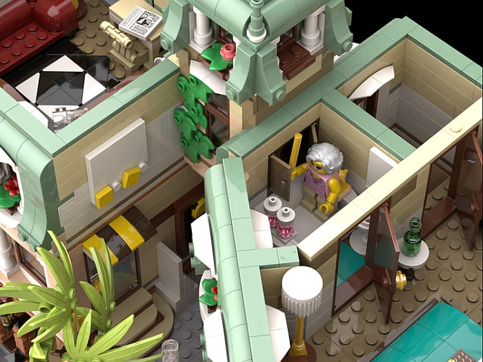
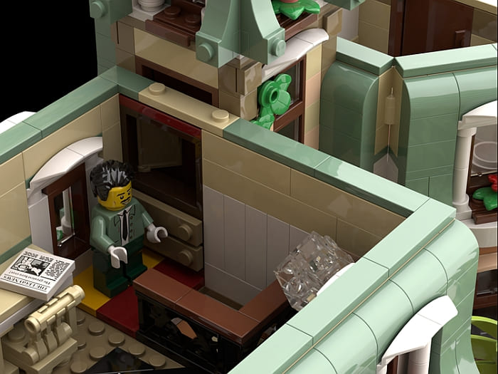
I really like how naturally this design accommodates the unusual layout of the original set while framing it in such a way as to seamlessly fit the other LEGO Modular Buildings. If you have been troubled by placing the hotel in your layout, you might consider giving this project a try. Downloadable instructions and a parts list are available at Rebrickable for a reasonable fee: LEGO GRAND BOUTIQUE HOTEL EXPANDED VERSION INSTRUCTIONS
And if you don’t have the #10297 LEGO Grand Boutique Hotel yet (perhaps you stayed away from it because of the placement issues), you can pick it up at the LEGO Creator Expert section of the Online LEGO Shop.
What do you think? How do you like this expanded version of the Grand Boutique Hotel? Would you be interested to build it? And what other modifications or placement solutions have you seen or tried? Feel free to share and discuss in the comment section below!
And you might also like to check out the following related posts:




This is the best mod I have seen so far. Looks fantastic! It’s still not my favorite modular, but this combo makes it much easier to add it to the street.
I agree. This is the best I have seen. It effectively hides the ugliness of that corner. Great work!
Good work! I like the bridge and tower they added to connect the two buildings. I’m still not convinced about the colors, but I like the architecture.
Like others said, this is the best i have seen. Great design! The only thing is that I’m already limited in space and this takes up a baseplate and a half.
What a great modification, turns it into more of a hotel size and it definitely seems like it would fit better in a modular building layout now.
This mod is fantastic! I have held off on buying the new set because I couldn’t figure out how it was going to fit in my crowded city. The odd styling really presents an integration challenge. I like the unique design, but it is very limiting. This mod is so cool and really makes the hotel look more grand. I’m going over to the buy instructions right now. Thanks for sharing this!
Su, I’m glad you found the project inspiring. Have fun! 🙂