(Written by Geneva – gid617)
A week or so ago, I reviewed the #21325 LEGO Ideas Medieval Blacksmith, and toward the end, I pointed out a few things that I didn’t like so much about an otherwise fantastic set. Of course, the beauty of LEGO is that if you don’t like it, you can rebuild it! So, I decided to go for it and see if I couldn’t make it better. The following was the result.
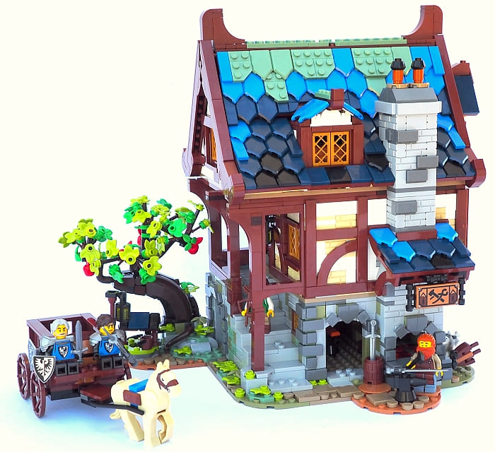
Above is a picture of the original, so you can play a game of spot the differences.
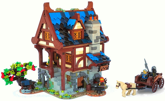
The first and most obvious change is the roof. I’m not the only one to have made negative comments about the sand-green moss; there’s just too much of it and it’s not the prettiest color when paired with blue. So I got a handful of dark-blue and black shield tiles (didn’t have any bright-blue in my collection) and took the moss off. However, I realized after taking all the green off, that it actually had done a nice job of tying the roof in visually with the landscaping. So I reintroduced just a tiny bit of moss on top. (Yes, we have some unattached pieces there…)
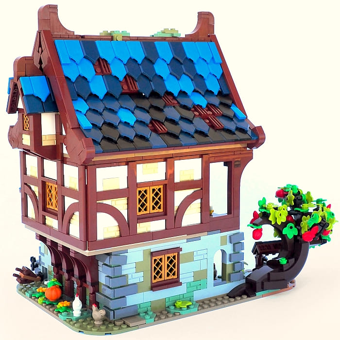
For the back, I added a few brown grill tiles to create more gaps in the roof. It helps make it more interesting for the eyes and saves on shield tiles too.
After this, I decided to touch up the smaller roofs. I wanted to bring them more into the style of the main roof, without the strict limitations a LEGO designer would have about being able to withstand play.
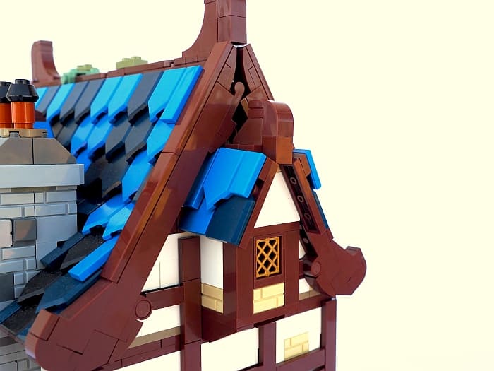
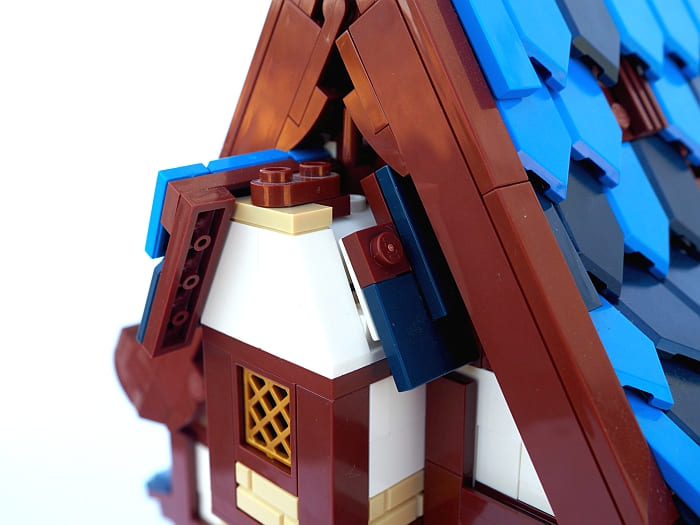
As you can see from the above picture of the inside of the construction, my solution is not attached by much, but it doesn’t fall off under normal circumstances.
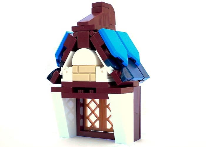
I also touched up the other small roof. I was originally thinking about doing something totally different when the obvious problem with the original roof hit me: it looks terribly incomplete, because the tips of the shields are hanging over the edge. The main roof ends in a straight line, so I fixed the small roof to end in a straight line too.
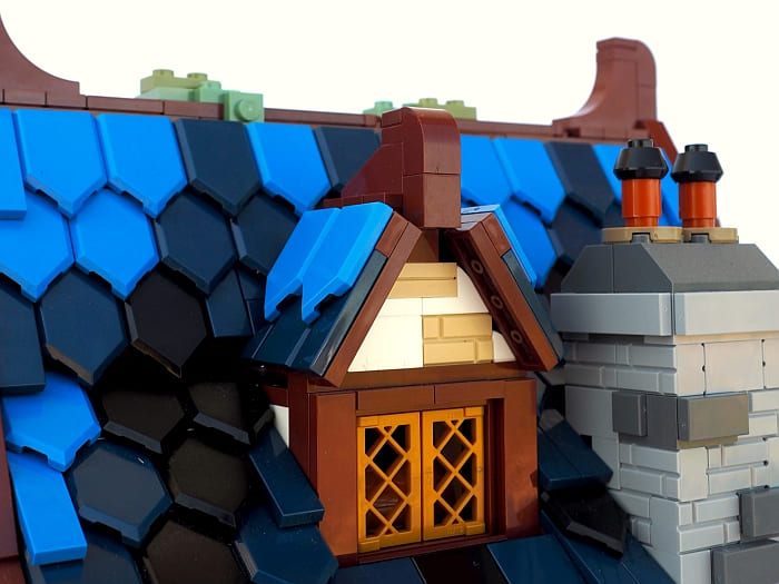
Of course, I had to find a few more shield tiles in order to pull this off. It’s also not quite as sturdy as the original solution. But this isn’t a spaceship, so it doesn’t need to resist being swooshed, does it?
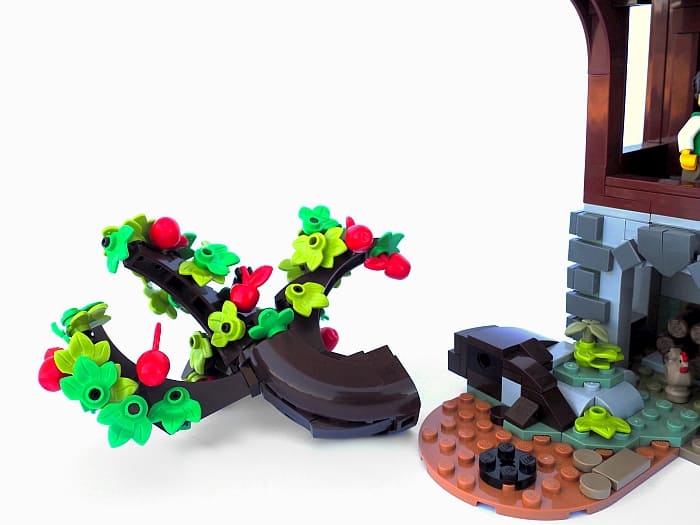
The next difference is the apple tree. I was far less than impressed by the original tree; it has some creepy angles and branches sticking out. For my tree, I took all the horns and stalks out, and tried to create something that looked a little more organic with arch bricks.

After all, apple trees are hard to build. I relied heavily on espresso plates (Bar 1L with 1 x 1 Round Plate with Hollow Stud) for attaching the leaves at organic angles. Also, note that I added four or five medium-green leaves, but mostly only used the ones that were in the set.
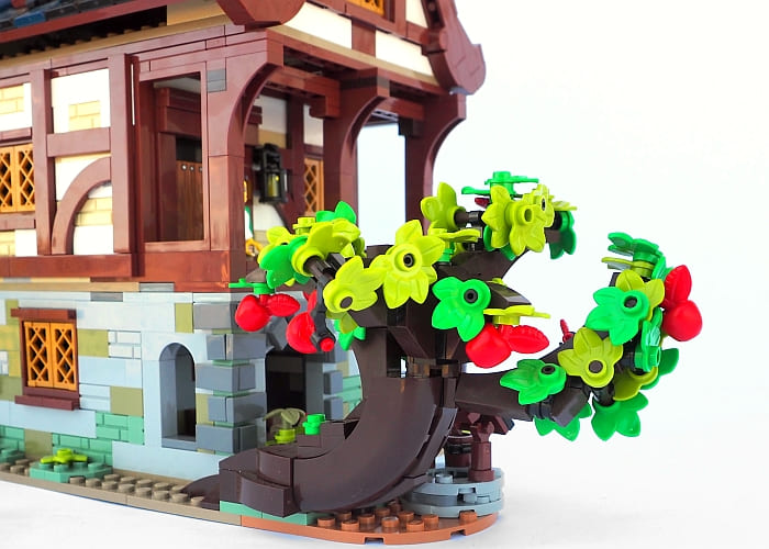
One thing I did like about the original apple tree was the use of those large dark-brown bow curves. They give some sturdiness to the lower trunk, although my version is in general much less sturdy than the original.
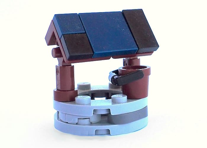
A relatively minor change was the well. I got rid of the lime-green round piece on top – who wants to drink out of a well with a rim that color?!
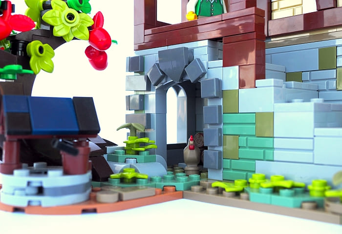
I switched the husky out for a few chickens, and made the very minor adjustment of taking out the olive 1×2 plates behind the decorative triangle on top of the arches (there are three of these on the bottom story in different places).
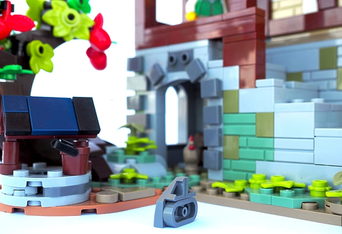
Last but not least, I gave the wagon a thorough overhaul. I even looked up some pictures of medieval wagons to get a feel for it!
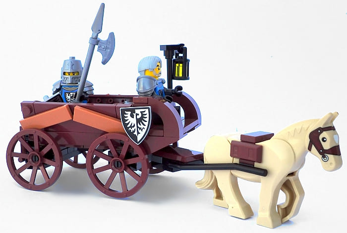
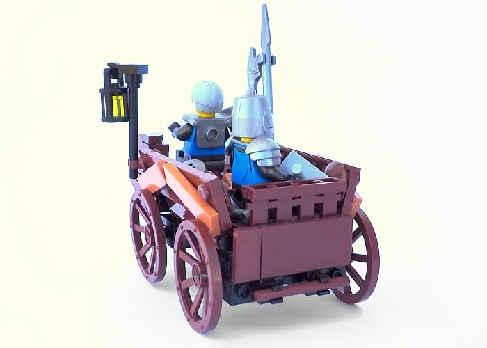
The original wagon seemed incredibly blocky to me; for this one, I got a subtle tilt on the sides and even managed to use one of the fence pieces on the first one as the back gate!
So these were my adjustments to the LEGO Ideas Medieval Blacksmith. This set has lots of potential and I’ve just scratched the surface. There’s a lot more you could do to it to make it fit your own medieval aesthetic. I especially recommend toning down the moss on the roof, and if you have a bit of patience, try working with the tree.
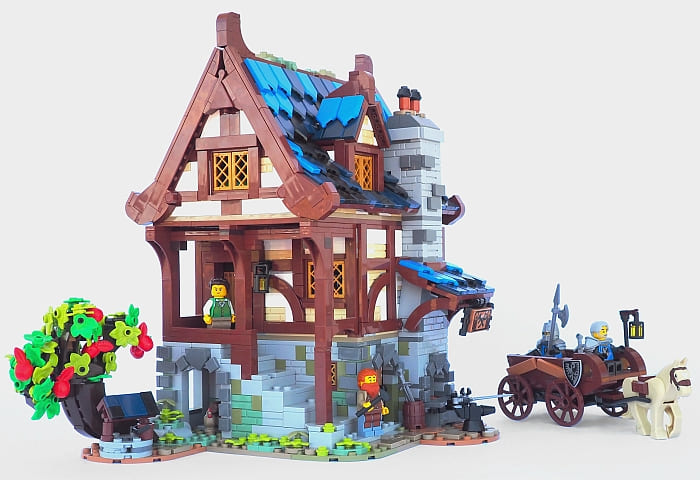
I hope it seeing the changes I made give you a better feel for what you’d like to do with this set. If you’re eager to get building, the Medieval Blacksmith is now available at the LEGO Ideas section of the Online LEGO Shop!
What do you think? Have you gotten the Medieval Blacksmith, or are you planning to? What adjustments would you like to make? Do you like the roof better with less moss? Feel free to share your thoughts and discuss in the comments section below!
And you might also like to check out the following related posts:


I like your changes to the roof, but I think the tree is now too compact. With a big trunk like that, it needs more branches and leaves.
Yes, that’s probably true. It’s really hard to make a good LEGO tree without going super intensive on parts. I tried to keep it down, but I agree that it looks weirdly small. I’ll be the first to admit that my version isn’t much if at all better than the original!
Such a great set! And I like what you did with the roof window and small roof. It looks much better like that.
Thank you! I’m honestly surprised the designers didn’t try to do something along the lines of what I did – the original side roofs looked strangely out of keeping with the main roof style.
What I don’t like about the tree is the trunk. What about replacing it with the bonsai tree? Shouldn’t it be about the right size? I like your cart with the slanted sides.
The bonsai tree? You don’t think it would be too large.
I kinda like trees with creepy angles and branches sticking out, though…
I’m pretty sure you’d have to expand the ground under it a little but you probably could make it work. I think the bonsai tree is actually not that big, and the blacksmith house is, so I don’t think it would look silly for that reason. But the style of the bonsai tree might clash.
I was watching the review video of this set by Jangbricks, and I was surprised by how large it was! It’s basically the size of the modulars! It looks so small and cute in pictures. Anyway, I like your changes to the roof, but personally I would take out all the regular blue and replace it dark blue or black. I don’t remember ever seeing blue roofs like this on medieval buildings.
Yes, I was surprised about the size too. So many people said they don’t like the set because it’s smaller than the original submission. They even said it’s like a Junior’s set. All of that is far from the truth. People have to stop being so negative without having first-hand experience, or at least watching a good review.
Yeah, this looks like a Tudor home of an affluent artisan, but slated roof tiles are rarely bright blue even nowadays, even though the price of color likely has gone down since the medieval times.
I saw someone turn the roof completely into black – https://www.instagram.com/p/CLK7rU4pIBW/?utm_source=ig_web_copy_link
I like the dash of blue color myself, but it is certainly rather bright for realism. Even dark blue doesn’t seem super realistic (did they have blue roofs back then?). Fortunately, black shield tiles are fairly common!
Oh, I like that! Thanks for sharing the link!
I think the best color for the roof would be dark green. But I don’t know if those shield pieces come in that color. But with dark green, the sand green moss wouldn’t clash so much. I appreciate your sharing the changes you made. They give me some ideas.
Yes, they do come in dark green – in four sets, including Sesame Street and the recent Haunted House. https://www.bricklink.com/v2/catalog/catalogitem.page?P=22385&name=Tile,%20Modified%202%20x%203%20Pentagonal&category=%5BTile,%20Modified%5D#T=S&C=80&O={%22color%22:80,%22iconly%22:0}
Hmm, Dark Green tiles would be relatively expensive on Bricklink, considering you’d require close to 200 of them. Maybe you could arrange a deal directly with Lego(?…)
(At least if you’re member of a Lug…)
I wish the knights had black armor like the original falcon knights. Dark metallic gray would be even better. Anyway, I like the changes to the blacksmith, but I still don’t like the tree. There is something weird about it.
Yeah, possibly the allotted budget didn’t allow any recolors for the helmet molds…
Yeah, the tree didn’t turn out quite like I had envisioned. I’ll have to take another stab at it! 😉
I’m in the middle of building this set ( in fact , I have just finished the middle part of this set literally). My problem is the apple tree. It keeps falling apart on me. I went over the instructions countless of times and it’s just that fragile I guess. I may pull it out and rebuild a different version of it .
Hmm, I don’t recall having fragility issues – in fact, I thought it was remarkably sturdy. You do have to push some of the stalks and so on really hard though to get them to actually stick.
Hello Legostuff14, I had the problem to until I realized that when attaching the four loaded headlight clusters it is much better to remove the elephant trunk part then while holding that part firmly with one hand attach the foliage cluster with the other hand. Then reattach the whole thing to the tree trunk. Also you have to keep the main trunk halves firmly pressed together when handling or the whole thing falls apart. It may seem the designer did a poor job with this old growth apple tree but, to me at least, it was well worth it as the finished product looks fantastic!
I just realized the roof of the shop is colorful. LEGO fails again. A medieval building would not have had color. This is terrible. Why do they add primary color to so many things that normally would be earth tone in color.
I like most of what you did and I am going to copy your roof changes but I personally like the apple tree the way that LEGO made it. A lot of people complained that it is too spiny looking and craggly but that is precisely the way an old growth apple tree looks in real life.