(Written by William)
In the past few months, we have been discussing several of the LEGO Ideas projects that were released via the BrickLink Designed Program. So far, we reviewed the #910016 LEGO Sheriff’s Safe designed by Il Buono (see: Brick Breakdown: LEGO BrickLink Set – Sheriff’s Safe), the #910028 LEGO Pursuit of Flight by JKBrickWorks (see: Brick Breakdown: LEGO BrickLink Set – Pursuit of Flight), the #910001 LEGO Castle in the Forest by povoq (see: Brick Breakdown: LEGO BrickLink Set – Castle in the Forest), the #910010 LEGO Great Fishing Boat by EdouardClo (see: Brick Breakdown: LEGO BrickLink Set – Fishing Boat), and the #910015 LEGO Clockwork Aquarium by Farquar (see: Brick Breakdown: LEGO BrickLink Set – Aquarium). And today, we will discuss the #910009 Modular LEGO Store by Krisnow.
When the second round of the Bricklink Designer Program became available, I had not yet received the sets I ordered from the first round. So, I was taking a big chance at what I’d get from this program. At the time, I figured LEGO designers would work with the model creators, especially since these sets were marketed as rare collector’s items.
However, after I did receive and build several sets from the first round, the experience made me rather nervous about the sets from the second round. This is because I found the building experience of the sets from round one rather unpredictable. Some sets I had a blast putting together, with others I couldn’t wait for the experience to be over. My question then became, what was I in for in the second round?

Turns out, I had to go a lot slower at building these models since they were definitely larger scale. Plus, I needed to take a few things apart just to have room for the finished products. After the relatively great building experience I had with the Clockwork Aquarium, I decided to try the Modular LEGO Store.
This was one of the more popular sets in the second round and one of the first to sell out. Adult fans especially love their modular buildings and many of us have been begging for a LEGO store to be officially added to our cities. So, was this set worth it? In a word, no.
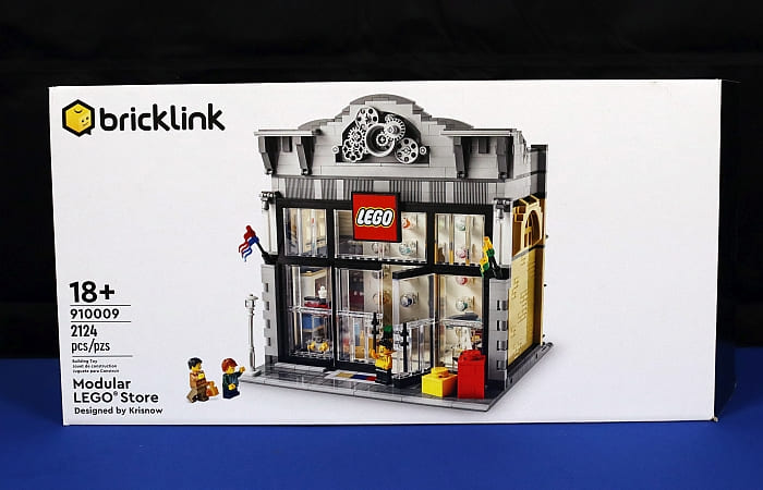
I don’t mean to bash the fan designer who poured themselves into this model. In fact, I’d say their skill level is probably equal to what I’d make, given the chance. Rather, LEGO Modular Buildings are some of the most intricate and high-level building experiences you can find, and they have a team of people working together to make sure they are the best. We, as individuals, all have weaknesses in our designs, and we are not professional LEGO designers. And this, unfortunately, becomes really noticeable in something like a fan-designed LEGO Modular Building.
So, before you spend your money on the secondary market to get this set, let me go over what I see as the good and bad sides. Perhaps, there are fans out there who don’t feel the same way I do. I’d just prefer people go in with their eyes wide open.
MODULAR LEGO STORE – THE GOOD…
It’s always nice to see projects that you know would make interesting LEGO sets actually getting released. For quite some time now, fans have been clamoring for a LEGO store that is compatible with the LEGO Modular Building series, and thanks to the BrickLink Designer Program, one such model is finally realized.
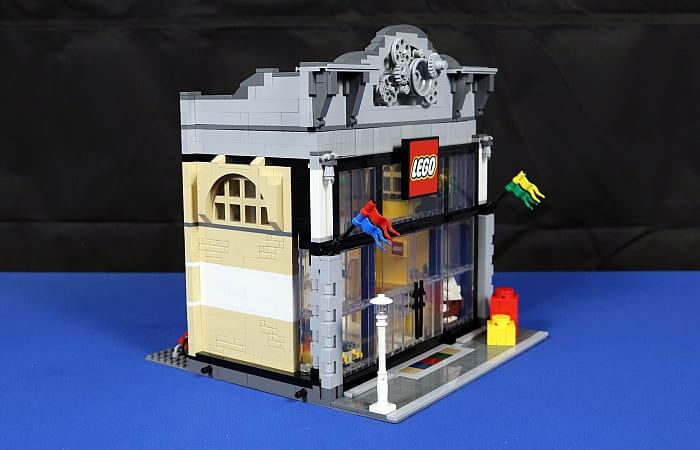
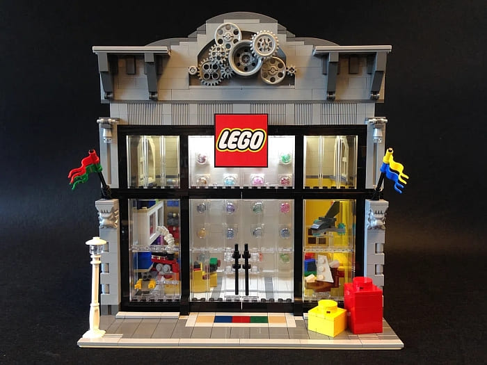
My local official LEGO store is inside a mall, but there are also stand-alone LEGO stores, which seem to be the inspiration for this model. The set uses colors in a very smart way. Brighter colors are present to liven up certain areas like the front step, the various LEGO sets displayed in the store, and the pieces on the Pick-A-Brick Wall. At the same time, the designer didn’t go overboard with bright colors and risk making the model look garish. The exterior walls still have sensible tan and gray colors that would be common in real-life buildings.
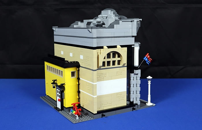
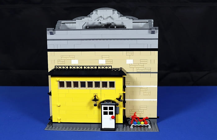
Another plus for the model is that it looks fairly good from most angles. Many times, the sides of Modular Buildings aren’t that detailed and even look a bit ugly with odd colors showing through from the interior. The designer of the Modular LEGO Store was careful not to have any random colors mar the face of the building.
Another bright spot is that all the windows let light into the model. Builders often forget that if they want the interior of their buildings to look inviting, they will need to let in more light. This model features plenty of windows to accomplish this very well. Couple this with the open layout and bright interior and the designer succeeded at recreating the light-hearted cheerfulness of a real-life LEGO store.

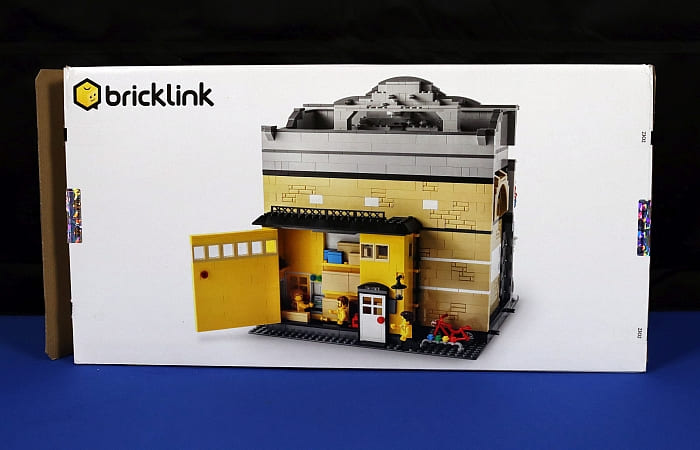
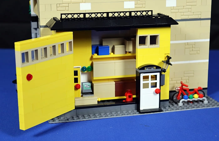
As for play space, there is plenty of room to fit your hands into the model. Even builders with larger hands shouldn’t have any issues reaching in and arranging the interior. The designer even hinged the skylight and back wall for additional access.
 And the included four LEGO store employee minifigs In matching yellow shirts, and two shoppers (father and son) are a nice addition. It looks like the little boy is not getting what he wants!

MODULAR LEGO STORE – THE BAD…
Considering this model sold out the quickest in the second round, it is not an easy set to come by, and prices are high on the secondary market. This is a major negative for most fans, but even those who are willing to save up to have this model, I urge a little caution.

This set was definitely one I was looking forward to. I love the LEGO Modular Buildings collection and wanted to see what a fan could add to the lineup. This is where I think my expectations were set a little too high. You see, there are two features of the Modular Buildings style that interests me the most. First is the novel intricate builds you find in these types of sets. The second is attention to scale. I’m always impressed with how LEGO designers balance the look of a feature but manage to fit it into a minifigure scale.
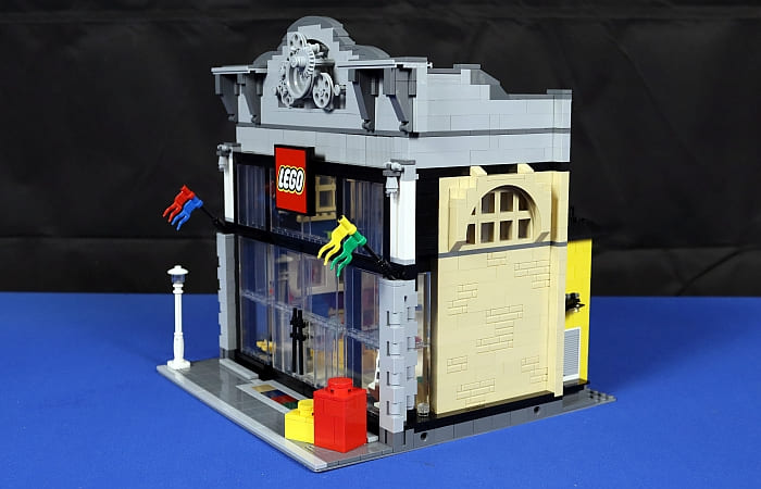
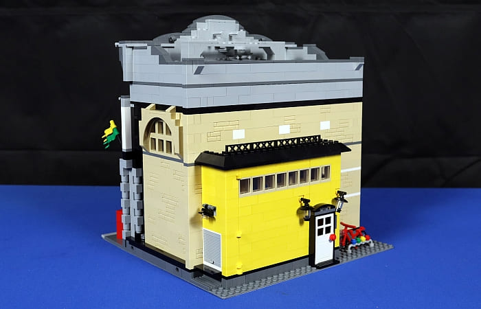
Sadly, I didn’t really get either of these experiences. The building itself looks okay, but there are some sections I’m really concerned aren’t very stable. The entire front face of the building, for instance, is mostly vertically stacked parts with only minor interlocking near the top. The small models in the windows are probably as advanced as the building experience gets for creative part usage and many of these mini models are designs I’ve seen before, whether it is from other fans or the LEGO Winter Village line.
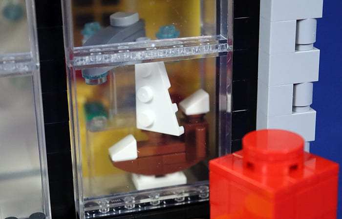
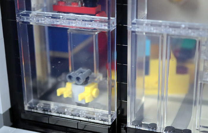
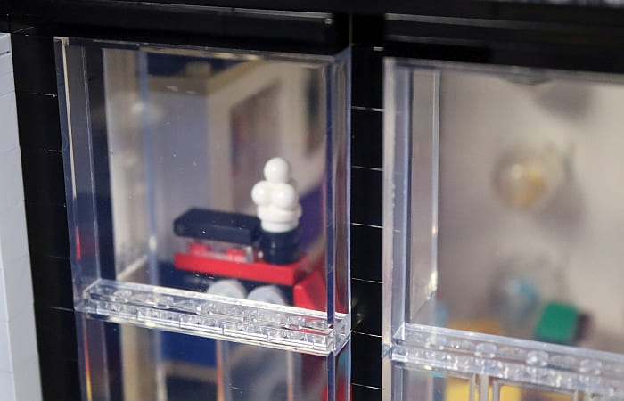
There is one red contraption located at the back warehouse section that helps stop the swinging back wall that looks like it should be something, but I couldn’t say what it is supposed to be. From there, the details get even more basic. The boxes that represent LEGO sets are just stacked bricks with tiles. I get there are limitations when it comes to printed elements, but this is what filled up a good section of the store.

And then there is the Pick-A-Brick Wall. It features a number of clear domes with parts in each dome. This does allow you to have a rounded shape and the ability to have loose parts in the model, but the amount I have to extend my suspension of disbelief is a bit too much for me to even recommend that this is a good idea. Ultimately, I had a much better experience with the smaller LEGO store sets released by the LEGO Group, and would recommend those over this one. And they are much cheaper too.

As far as the scale, considering the front doors and Pick-A-Brick Wall tower over every minifigure, there is really no scale applied here. This is especially odd since the doors at the back are normal minifigure doors. And this is the main issue why I won’t be displaying this model with my other LEGO Modular Buildings. Despite the common connector points, it just doesn’t look right.
MODULAR LEGO STORE – FINAL THOUGHTS…
This is a model created by an individual LEGO fan. This is important to state as this means that all their strengths and weaknesses as a builder are amplified. If I have one criticism of the BrickLink Designer Program is that there is no LEGO designer team to help polish these fan models. I know that I personally have weaknesses in my own building techniques and they’d show if I had to create a model this size. So, I don’t consider the builder to be bad in any way. The problem is that certain models come with expectations.
Modular Buildings are big draws to adult fans because of how high the standards are. For this reason, I have to admit that this set does not reach those expectations. Even the official LEGO Modular Buildings have their detractors just to emphasize how tough it is to please fans. And those sets have teams working together to make sure they are not substandard in any way.
The result is that this model is not very reflective of what you might expect from a LEGO Modular Building. It has a design that has more of a play rather than a display aspect. And many of the techniques are what I would call intermediate level rather than expert.
I hope this write-up and the video above give you an idea of how to value the set for your own collection. If you would like to build the set, you can find the building instructions at the LEGO Instructions app or download/print out the PDF version. Both can be accessed at the BrickLink Designed Program page.
What do you think? Have you gotten any of the BrickLink Designer Program sets? Which one is your favorite? And what do you think of the Modular LEGO Store? Feel free to share your thoughts and discuss in the comment section below!
And you might also like to check out the following related posts:
- Brick Breakdown: LEGO BrickLink Set – Aquarium
- Brick Breakdown: LEGO BrickLink Set – Fishing Boat
- Brick Breakdown: LEGO BrickLink Set – Castle in the Forest
- Brick Breakdown: LEGO BrickLink Set – Sheriff’s Safe
- Brick Breakdown: LEGO BrickLink Set – Pursuit of Flight
- BrickLink Designer Program Round 1 Final Designs
- BrickLink Designer Program Crowdfunding Round
- BrickLink Designer Program Round 1 Reopens Today!
- BrickLink Designer Program – Round 1 Update
- BrickLink Designer Program First Round Funding
- BrickLink Designer Program Details Revealed
- More LEGO Ideas Projects Coming via BrickLink!









As for the Pick-A-Brick Wall towering over actual minifigures that’s actually often the case in reality, since it’s largely set up for show. Only the bottom rows include containers with actual bricks to pick, though.
Cf. this page. https://www.reddit.com/r/lego/comments/43q0s6/the_pick_a_brick_wall_at_the_lego_store_at/
Thanks for the reference. I figured the designer was basing it off of something.
All I have to go on is the scaling of the minifigure which puts the wall around 20ft high or so.
Thanks for the detailed review on this. I was thinking of getting it, but then I decided against it. It’s just not up to modular standards.
I don’t understand what those gears are doing on top. They’re weird. And I didn’t notice the scale discrepancies you mentioned. But yes, that minifig looks ridiculous next to the door and PAB wall. The designers should have helped and this set could have been so good!
I do believe the gears up top are a design you can find in stand alone LEGO stores. They are meant for decoration.
Given that most of us know LEGO stores that are in malls, it’s something we don’t really see. And they look weird.
The only standalone Lego stores I have visited are the ones in Copenhagen. The main Vimmelskaftet store has pretty big glass door / windows at the entrance similar to this model, but no cog wheels on top. I don’t know if the designer has mentioned any actual stores that served as inspiration.
I wonder what else could have been used for the PAB wall. In smaller sets, they just use 1×1 round studs, but I suppose for a full size modular they would look too small.
The thing is, the colored rounds are to scale with minifigures.
The problem is this set has a ton of verticle space that needed filling up. In this case, imagine the first cubby you can reach into is at your stomach level and it is the size of your torso, Now the next cubby is above your head and there are still three more cubbies above it.
colored rounds would have been great here or even Technic bricks if you wanted the shape of the hole more than the pop of color.
I’m guessing the designer got caught between making a scale model and trying to get all the details they saw in their local LEGO store. The end result was this sort of stretching effect.
Minifig proportions are rather strange, so scaling would almost by necessity be somewhat off.
Then, it does appear that the design was chosen largely as an impressive semi-modular building that would grab attention, without a lot of interior details fully thought out, anyway…
I have only been to a standalone store, but this is not a good representation. It’s too big, boring, simple, and empty. And the PAB wall is not to scale. It’s too bad because the idea has potential. I can’t believe they never made an official modular Lego store.